 balick
Balick UI
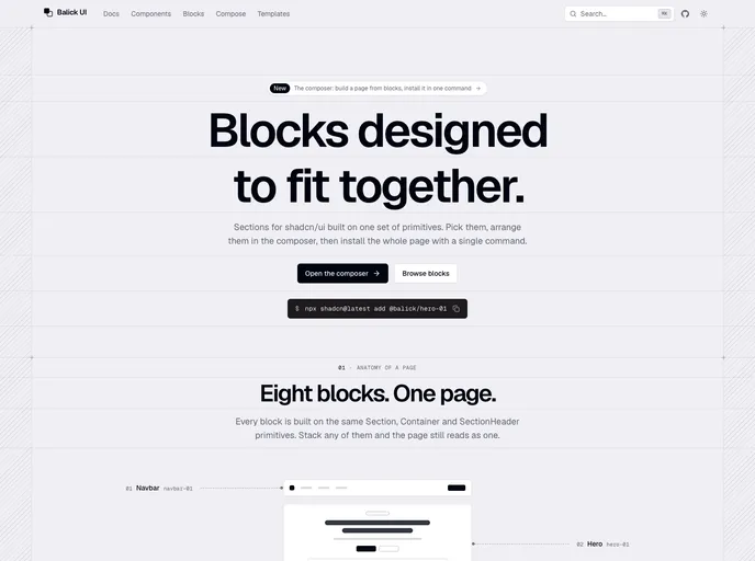
Blocks for shadcn/ui designed to fit together: compose a page, then install it with one command.
- Free
- Price
- Sep 29, 2026
- Listed
 Open Balick UI
Overview
Balick UI is an open-source set of blocks for shadcn/ui designed to be combined into full pages. Every block is built on the same Section, Container and SectionHeader primitives, so stacked sections share spacing and type scale. The site lists 27 blocks across 20 categories and 50 components.
Its main tool is a browser composer: pick sections, drag them into order, preview at desktop, tablet or phone width, then install the whole page and every block it uses with one shadcn command. The CLI copies source into the project, with no package to update. Blocks are designed for light and dark modes from 320px phones up.
Features
- Page composer: Builds a page in the browser and outputs a single
npx shadcn@latest add @balick/compose/...command. - Section categories: Navbar, hero, logos, stats, timeline, services, features, integrations, pricing, FAQ, blog, newsletter, contact, footer and more.
- Animated components: Blur fade, shimmer button, marquee, number ticker, typewriter, scramble text and similar pieces used inside the blocks.
- Backgrounds: Grid, dot, flickering grid, retro grid, aurora, light rays, grain and wave-line patterns.
- Button variants: Hold-to-confirm, status, magnetic, ripple, spotlight, copy and theme toggle buttons.
- Accessibility: Landmarks, labelled controls, keyboard support and motion that respects reduced-motion settings.
- Shared theme: A monochrome palette, radius and dark mode theme item used by all blocks.
Tech stack
- React, Tailwind CSS, shadcn/ui
- Motion, lucide-react, next-themes
Registry
Install via the shadcn CLI registry:
npx shadcn@latest add @balick/component-name