 caliper
Caliper UI
React components, blocks and complete product screens drawn to one specification. Accessible by default, with every state designed. Free parts are MIT and install as source you own.
- Free
- Price
- Oct 16, 2026
- Listed
 Open Caliper UI
Overview
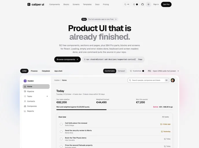
Caliper UI is a library of React components, blocks and complete product screens drawn to one specification. Every part ships with loading, empty, error, disabled and long-content states, plus keyboard and screen reader support, and meets AA contrast in both themes. Components are shadcn-compatible and install as source with one command.
The free tier is MIT licensed and includes 72 core components and 20 basic sections and pages; the site counts 92 free parts in total, and the full calendar app was recently made free. The registry serves 93 items. A paid Pro license adds 564 more parts and blocks, 43 product screens and six app templates such as CRM, helpdesk and finance suites.
Features
- Core components: Controls, overlays, navigation and charts, including donut, line and bar charts readable by pointer or keyboard.
- Designed states: Default, loading, empty, error, disabled and long-content variants are built into each file.
- Sections and pages: Headers, footers, contact, legal, blog grid, blog post, about and auth page templates.
- Calendar app: Day, week, month and agenda views with a month picker and a now line.
- Density and theming: Comfortable and compact density, with color, radius and motion tokens and a Tailwind adapter.
- AI tooling: MCP support for Claude Code and Cursor, and an llms.txt file.
Tech stack
- React, Tailwind CSS
- Radix UI primitives, lucide-react
- shadcn CLI registry
Registry
Install via the shadcn CLI registry:
npx shadcn@latest add @caliper/component-name