 knot-ui
A registry of animated, cinematic React components and UI blocks for shadcn — buttons, cards, folders, navbars and more, built with Tailwind CSS v4 and Motion.
- Free
- Price
- Sep 12, 2026
- Listed
 Open knot-ui
Overview
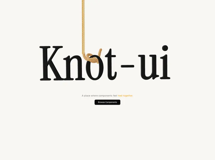
knot-ui is a shadcn registry of animated React components built with Tailwind CSS v4 and Motion. Its homepage describes it as "a place where components feel tied together," and the collection leans toward expressive, interaction-heavy pieces for landing pages and portfolios rather than standard form primitives.
The registry currently lists 15 components: eight button variants, a book-style flip card, a scroll-aware navbar, orbiting avatars, three folder animations and a hand toggle. Components depend on motion, lucide-react and next-themes.
Features
- Button variants: Canvas snowflake particle button, plus rise, glare, 3D flip, frosted glass, slide, slide-link and bracketed square buttons.
- Flip card: A book-style card with a spine tab that reveals on hover.
- Navbar: A floating navbar that shrinks and collapses into a pill on scroll.
- Orbiting avatars: A circle of avatar images that spins around a central call-to-action button.
- Folder animations: Fan, open and lift folders whose cards spread or rise on hover.
- Hand toggle: An animated toggle control.
Tech stack
- React, Tailwind CSS v4, Motion, lucide-react, next-themes
Registry
Install via the shadcn CLI registry:
npx shadcn@latest add @knot-ui/component-name