 moduix-react
Moduix React
Ark-first React components, blocks, and themes with native CSS, available as a package or a shadcn-compatible copy-owned registry.
- Free
- Price
- Jul 22, 2026
- Listed
 Open Moduix React
Overview
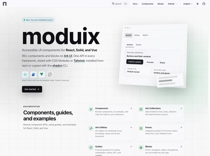
Moduix is a set of accessible UI components built on Ark UI, with one API shared across React, Solid and Vue (Svelte is planned). The site lists more than 80 components and blocks, styled with either CSS Modules or Tailwind CSS.
Components can be installed from npm as a package or copied into a project as owned source through the shadcn CLI. Alongside the component docs, Moduix documents Ark collections and utilities, and includes integration guides for Formisch, React Hook Form and TanStack Form. Installable blocks cover forms, navigation, tables and galleries, and the documentation is available in English, French and Russian.
Features
- Ark UI foundation: Focus management, keyboard navigation and composition come from Ark UI primitives.
- Multi-framework: The same component API across React, Solid and Vue.
- Two styling options: CSS Modules or Tailwind CSS.
- Two install paths: An npm package or copy-owned source via a shadcn-compatible registry.
- Blocks: Forms, sidebars, data tables and galleries built from Moduix components.
- Form integrations: Guides for Formisch, React Hook Form and TanStack Form.
- Guides: Styling, composition, motion, RTL support and updates.
Tech stack
- Ark UI, React, Solid, Vue, CSS Modules, Tailwind CSS, shadcn CLI
Registry
Install via the shadcn CLI registry:
npx shadcn@latest add @moduix-react/component-name