 navui
NavUI
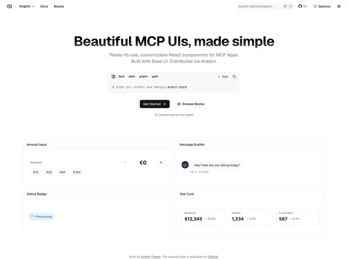
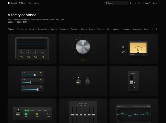
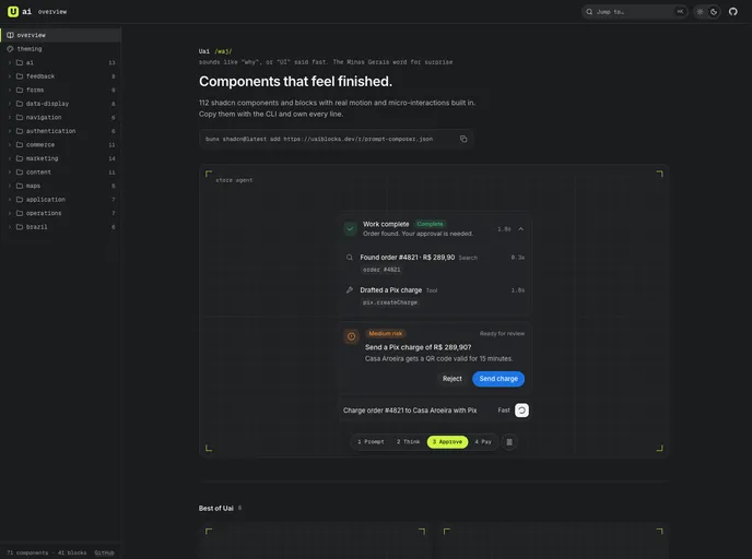
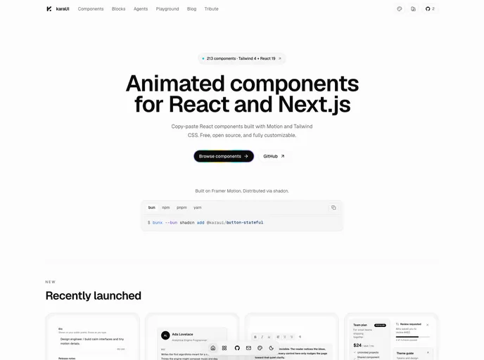
shadcn-compatible components, blocks, and illustrations that adapt to your existing design configuration.
- Free
- Price
- Jul 25, 2026
- Listed
 Open NavUI
Overview
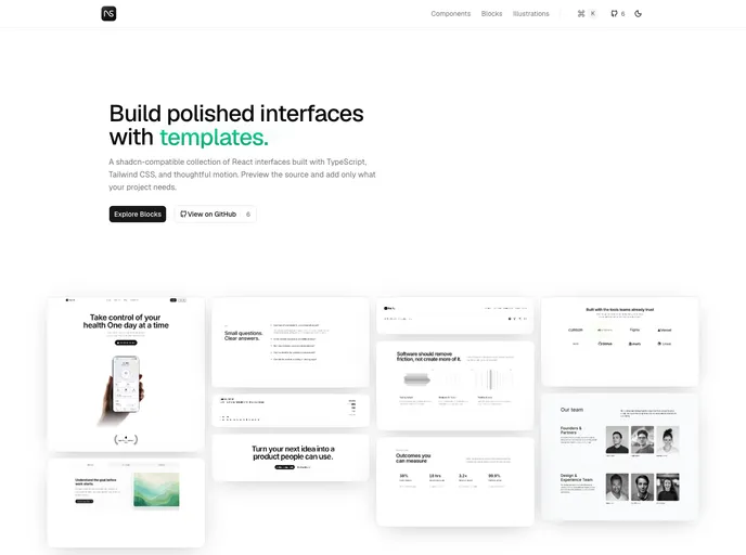
NavUI is a shadcn-compatible design-engineering library by Navdeep Singh, offering React components, production-ready blocks and illustrations built with TypeScript, Tailwind CSS and motion. Components are meant to adapt to an existing shadcn design configuration, and each comes with a live preview, a documented API and copy-paste source.
The registry contains 62 items: 41 blocks across page sections such as heroes, headers, pricing, auth, logo clouds, teams, FAQs and contact forms, plus interactive components and illustrations. Blocks include live previews, source drawers and registry installs.
Features
- Page blocks: Hero (4), header (4), content (5), logo cloud (5), teams (5), contact (4), FAQ (3), forgot password (3), sign up (2), footer (2), plus stats, pricing, blog and CTA sections.
- Animated Numbers: An accessible counter with locale-aware formatting, prefixes, suffixes, decimals and reduced-motion support.
- Contribution Graph: An accessible contribution calendar with data normalization, keyboard navigation and day tooltips.
- Navigation: Proximity Nav, whose guide lines stretch toward the pointer, and Rail Nav, a compact motion rail.
- Interactive pieces: Animated tabs, expandable card, magnetic button, segment spotlight and a keyboard shortcut display that can play key sounds.
- Utilities: A package manager command bar with copy status.
- Illustrations: Feature illustrations and product panels such as approval, receipt, report and payment card panels.
Tech stack
- React, TypeScript, Tailwind CSS, motion, Radix UI, lucide-react, Tabler Icons
Registry
Install via the shadcn CLI registry:
npx shadcn@latest add @navui/component-name