



 paceui
Paceui
Carefully built UI blocks for real apps and dashboards, designed to integrate smoothly from early ideas to production releases.
- Free
- Price
- Jun 24, 2026
- Listed
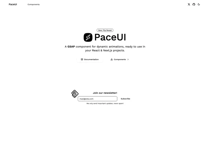 Open Paceui
Overview
PaceUI is a library of animated React blocks, components and templates for Next.js and TanStack Start, built with Motion and shadcn/ui by indie developer Denish. The catalog spans dashboard charts, stat cards, tables, app screens for analytics, finance and health, marketing sections, form controls and motion components, with the site listing 394 blocks and charts.
A free tier covers part of the components. The Pro, Team and Enterprise plans are one-time purchases that include all blocks and charts, a marketing sections builder, premium starters and unlimited use of the PaceUI MCP server. All code is plain TypeScript and Tailwind with no runtime lock-in.
Features
- Dashboard blocks: Charts, widgets, stat cards and tables for data-dense admin screens.
- App screens: Analytics, finance, health, education and project blocks for real product views.
- Marketing sections: Heroes, features, testimonials, top bars, footers and cookie consent banners.
- Motion components: Text effects, spring and fillable buttons, layered stacks, flip reveals, tabs and accordions driven by Motion physics.
- AI interface pieces: Model selector, ability selector, response writer, token counter and AI suggestions.
- Templates and starters: Complete dashboards such as Ultimate Admin Dashboard and Agent Dashboard, and full-stack starters wired with auth, payments and a database.
- MCP server: Lets Cursor, Claude or Windsurf find and insert blocks directly into project files.
Tech stack
- React, Next.js, TanStack Start
- Tailwind CSS, shadcn/ui, Base UI
- Motion, GSAP, TanStack Form
Registry
Install via the shadcn CLI registry:
npx shadcn@latest add @paceui/component-name