 spark-ui
Spark UI
Open-source React components and animated UI building blocks, installable as source with the shadcn CLI.
- Free
- Price
- Sep 17, 2026
- Listed
 Open Spark UI
Overview
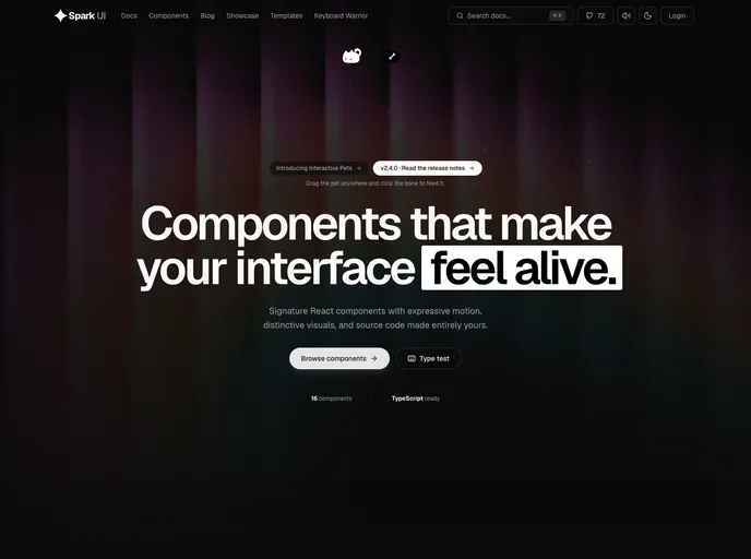
Spark UI is an MIT-licensed collection of signature React components with expressive motion and playful interactions, under the tagline "Components that make interfaces feel alive." It is a shadcn-compatible source registry, so components install as readable TypeScript files rather than a runtime package.
Styling flows through semantic OKLCH CSS variables in Tailwind CSS 4, with light and dark modes, and animations respect prefers-reduced-motion. The site lists 16 components, and its docs are written in MDX with live previews, search and copyable install commands. Recent releases include Interactive Pets, a draggable pet that can be fed by clicking a bone.
Features
- Interactive Pets: A draggable on-page pet with a feeding interaction
- Device-style widgets: Dynamic Island, widget stack, keyboard and Spotify card
- Text and numbers: Shimmer text, a basic number ticker and an animated "hello"
- Visual effects: Animated gradient, ghost ether, image trail and tactile highlight
- Layouts: Masonry and left or right logo carousels
- Utility pieces: QR code generator and a receipt component
- Accessible defaults: Keyboard navigation, visible focus and sensible ARIA
Tech stack
- Next.js (App Router), React, TypeScript
- Tailwind CSS 4 with OKLCH tokens
- Framer Motion, Three.js
- MDX docs with Shiki
Registry
Install via the shadcn CLI registry:
npx shadcn@latest add @spark-ui/component-name