 stylexui
Stylexui
High-performance StyleX & Base UI toolkit for modern dashboards. Modular blocks and production templates, built with zero runtime CSS overhead.
- Free
- Price
- Sep 12, 2026
- Listed
 Open Stylexui
Overview
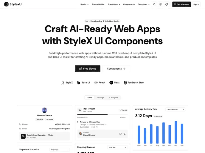
StyleX UI is a component, block and template toolkit built on Meta's StyleX and Base UI instead of Tailwind CSS. StyleX compiles styles at build time, so the components carry no runtime CSS overhead. The site lists 55+ copy-paste components, a theme builder, transitions, UI blocks and dashboard templates, with examples for React, Next.js and TanStack Start.
The free community tier includes all 56 components, 22 blocks and one template. Paid one-time plans (Basic and Pro) add more blocks, up to 66, and up to four templates, plus faster support. The public shadcn registry exposes a base style and the StyleX components.
Features
- StyleX components: Accordion, alert dialog, attachment, avatar, bubble, button group, calendar, carousel, chart, combobox, command, context menu and more.
- Zero runtime CSS: Styles are compiled by StyleX rather than generated in the browser.
- Base UI primitives: Interactive components use
@base-ui/reactfor accessible behavior. - Blocks: Dashboard-style blocks such as cards, settings and AI widgets, with 100+ new blocks announced on the site.
- Templates: Production dashboard templates, with two new landing templates announced.
- Theme builder: A theme builder and a transitions section on the site.
- TypeScript: Components are typed end to end.
Tech stack
- React, Next.js, TanStack Start
- StyleX, Base UI, TypeScript
- Recharts (charts), Embla Carousel, lucide-react
Registry
Install via the shadcn CLI registry:
npx shadcn@latest add @stylexui/component-name