 tessli
Tessli
Sections, pages and components on shadcn/ui primitives, each with notes on when to use it, when not to, the UI rules it follows and the generic default it replaces. Also installs a compact rules file, TESSLI.md.
- Free
- Price
- Oct 16, 2026
- Listed
 Open Tessli
Overview
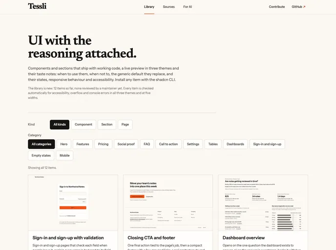
Tessli is a library of UI components, sections and pages built on shadcn/ui primitives, where each item ships with its reasoning attached. Alongside working code and a live preview in three themes, every entry has taste notes: when to use it, when not to, the generic default it replaces, and its states, responsive behavior and accessibility.
The library is new, with 12 items so far, and the site notes that none have been reviewed by a maintainer yet. Every item is checked automatically for accessibility, overflow and console errors in all three themes and at five widths. The registry also installs TESSLI.md, a compact rules file meant for AI coding tools.
Features
- Product hero with real UI: A hero that states what the product does, offers one primary action and shows the product itself.
- Evidence-led features: Each feature is shown with an artifact that proves it, such as a UI fragment or exact limit.
- Pricing tiers: Two or three plans compared on the limits buyers weigh, with an honest billing-period switch.
- Honest social proof and FAQ: A social proof section and an FAQ built on native disclosure widgets with a real contact route.
- App pages: Sign-in and sign-up with per-field validation, a dashboard overview, account settings with a danger zone and mobile list-to-detail.
- States: A data table with loading, empty, no-results and error states, and an empty state that explains what to do next.
- Rules file:
TESSLI.mdgives AI tools the same UI rules the library follows.
Tech stack
- React, shadcn/ui primitives
Registry
Install via the shadcn CLI registry:
npx shadcn@latest add @tessli/component-name