 tween-ui
Tween UI
GSAP & CSS animated React components and blocks. One file each, no shared runtime, reduced-motion handled.
- Free
- Price
- Sep 21, 2026
- Listed
 Open Tween UI
Overview
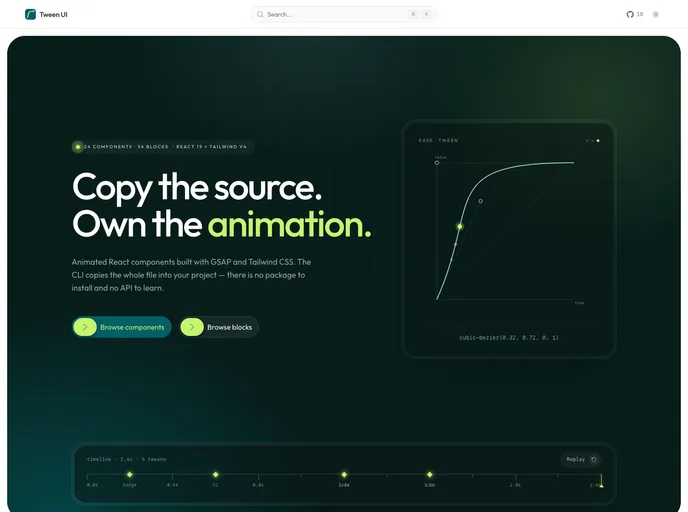
Tween UI is a set of animated React components and blocks built with GSAP, CSS transitions and Tailwind CSS v4 on React 19. The site lists 24 components and 34 blocks, and the shadcn registry also includes a demo example for each. The CLI writes a single .tsx file per component into the project, so there is no package to install, no shared runtime and no API to learn.
GSAP drives the sequenced work through timelines, ScrollTrigger and SplitText, while simpler effects stay plain CSS transitions. Every component checks prefers-reduced-motion and renders its finished state instead of animating. Each live preview on the site is the same file the CLI installs.
Features
- Animated buttons: Icon trail, text roll, shiny, glow, magnetic, dot bloom, arrow tile, focus frame, slide arrow and slant morph buttons.
- Navigation and UI: Sliding tabs, auth modal, FAQ accordion, flip card and avatar reveal.
- Numbers and media: A number counter triggered by ScrollTrigger with Number Flow, plus a voice sample player.
- Logo displays: Logo orbit, logo cycle and logo wave.
- Text and SVG: Morphing text, wordmark reveal and SVG draw.
- Blocks: Pricing plan switch, process card reveal, sticky process steps, rating carousel, strip wipe and image-fan or photo-headline CTAs.
- Reduced motion: Each component renders its end state when reduced motion is requested.
Tech stack
- React 19, Tailwind CSS v4
- GSAP (ScrollTrigger, SplitText), CSS transitions, Number Flow
Registry
Install via the shadcn CLI registry:
npx shadcn@latest add @tween-ui/component-name