 velora
Velora UI
100 animated React components and 31 free section blocks for Tailwind CSS 4 — accessible, reduced-motion safe and MIT licensed.
- Free
- Price
- Sep 29, 2026
- Listed
 Open Velora UI
Overview
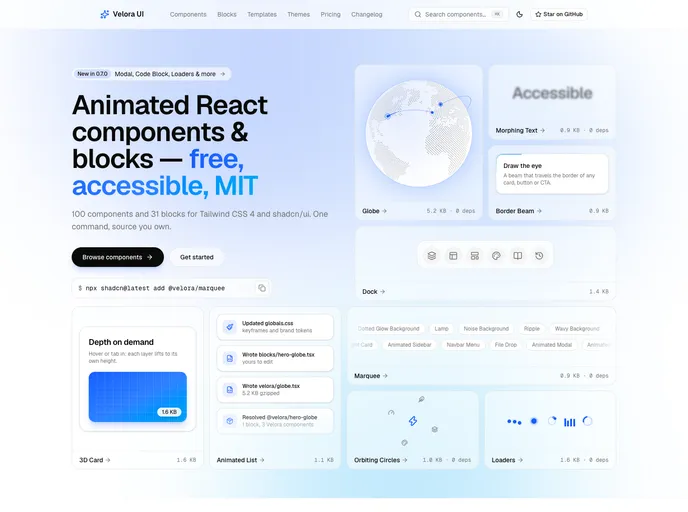
Velora UI is a free, MIT-licensed library of animated React components and landing page blocks from Colorlib, built for Tailwind CSS 4 and shadcn/ui. It ships 100 components across 16 categories and 31 free section blocks, all installed with one shadcn command that brings the code, keyframes, tokens and dependencies.
The library focuses on size and accessibility: 97 of the 100 components are 3 KB or less gzipped, 51 have zero dependencies, and 60 accessibility fixes are documented per component, with reduced-motion handling throughout. It works with either Radix UI or Base UI. A paid Velora Pro tier of niche templates is announced as coming soon, while the library stays free.
Features
- 100 components: Backgrounds (16), text effects (12), buttons (8), cards and layout (21), scroll (9), navigation, cursors, 3D, mockups and more.
- 31 free blocks: Sections such as a globe split hero, bento feature grid, three-tier pricing and testimonial marquee.
- Small footprint: Examples include Marquee and Morphing Text at 0.9 KB and Globe at 5.2 KB with no dependencies.
- Accessibility: Documented fixes per component and reduced-motion safe animation.
- Radix or Base UI: Components work with either primitive library.
- Agent installs: AI agents can install components through the registry.
Tech stack
- Next.js 16, React, TypeScript
- Tailwind CSS 4, shadcn/ui
- Motion
- Radix UI or Base UI
Registry
Install via the shadcn CLI registry:
npx shadcn@latest add @velora/component-name