
Shadcn Templates - Page 2
Browse 380 Shadcn UI Templates, Components, Blocks, Boilerplates and more.(Page 2 of 13)
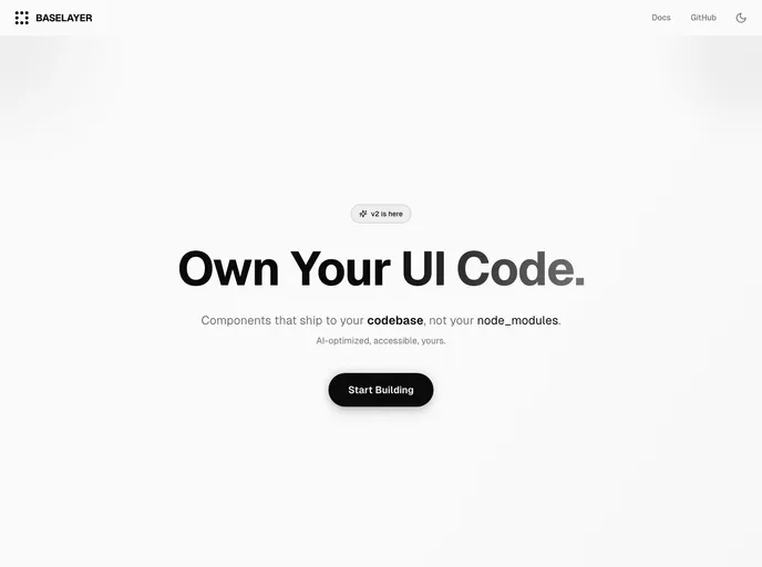
BaseLayer
BaseLayer is a versatile collection of components designed for developers working with shadcn/ui, leveraging the power of React Aria and Tailwind CSS.
Basejump
Open-source SaaS starter with teams, billing, and authentication built on Supabase and Next.js.
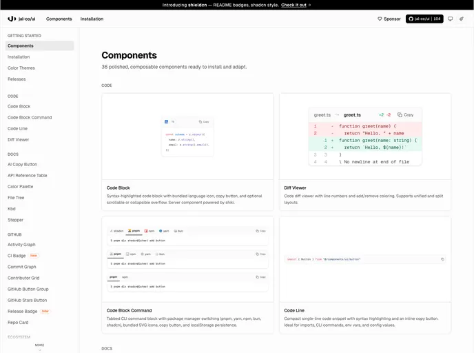
Jal-co UI
Jal-co UI is a component library designed specifically for developers working on shadcn/ui projects, offering a collection of GitHub-integrated and documentation-focused components.
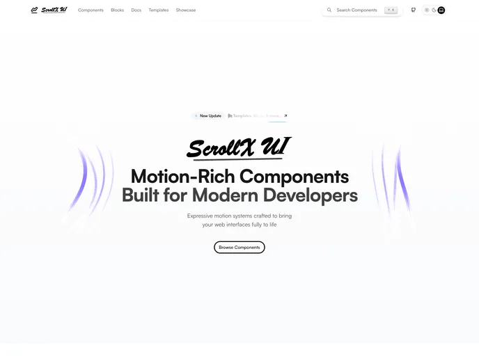
ScrollX UI
ScrollX UI is an open-source component library designed for developers utilizing React and shadcn/ui, providing animated and interactive elements for modern web interfaces.
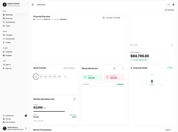
Shadcn Fintech
Premium fintech dashboard with 10 pages, drag-and-drop layout, 3D credit cards, live investment ticker, spending heatmap, and dark mode. Built with Next.js 16, shadcn/ui, and Tailwind CSS v4.
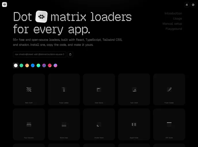
DotMatrix
DotMatrix is a collection of production-ready dot-matrix loading components designed specifically for React applications, catering to developers seeking to enhance user experiences with engaging animations.
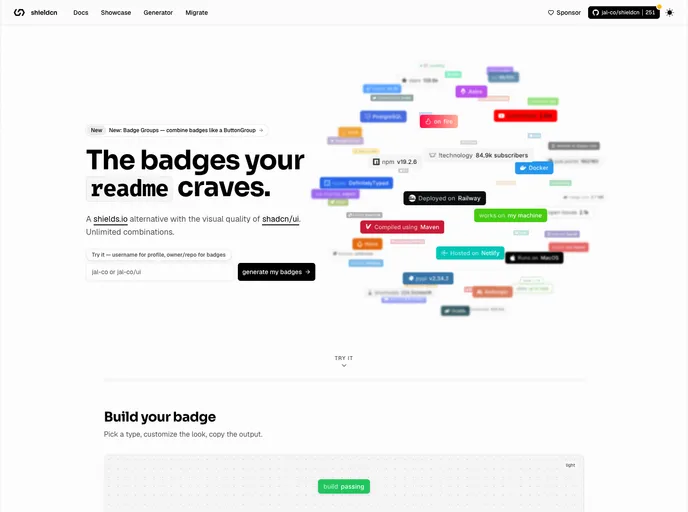
Shield CN
Shield CN is a service that provides beautiful README badges, serving as a compelling alternative to shields.io, specifically designed for developers using shadcn/ui.
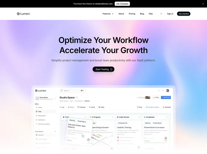
Lumen - Nextjs Template
A luminescent, modern landing page template containing all the core pages and sections for a marketing website. Built with Next.js 15, shadcn/ui, and Tailwind 4.
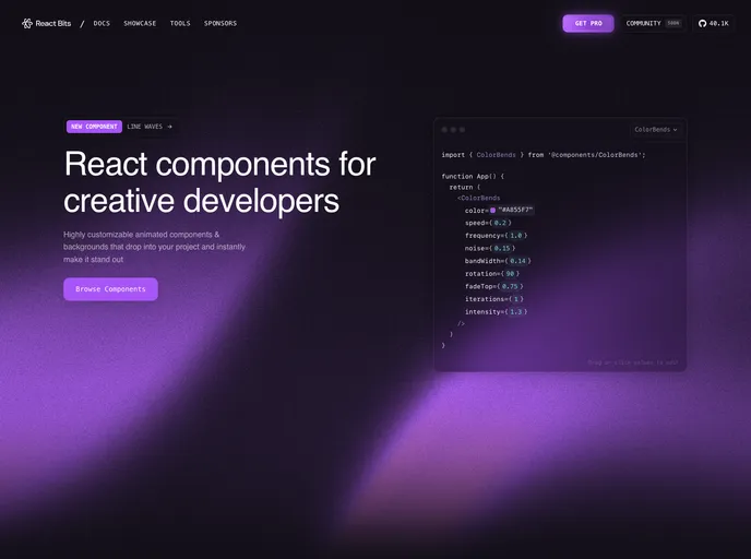
React Bits
React Bits is a comprehensive collection of animated, interactive, and fully customizable React components designed for developers looking to create memorable websites.
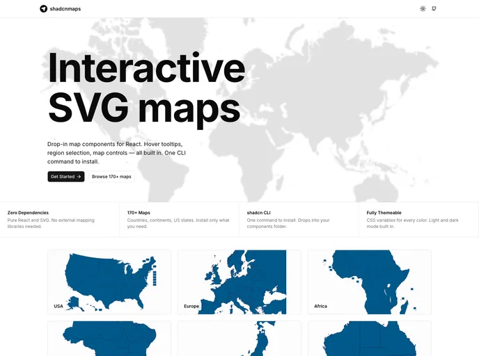
shadcnmaps
shadcnmaps is a collection of interactive map components designed specifically for shadcn/ui projects, utilizing pure SVG technology.
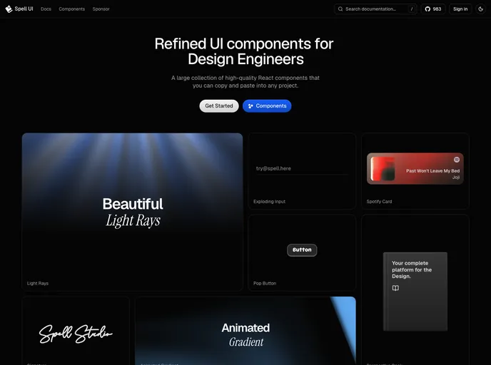
Spell UI
Spell UI is a collection of beautiful, sophisticated UI components tailored for modern React and Tailwind CSS applications, specifically designed for developers and design engineers.
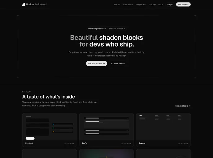
Blockus
Blockus is a collection of production-ready React blocks specifically designed for developers utilizing shadcn/ui and Tailwind.
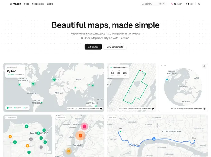
Mapcn
Mapcn is a collection of beautiful map components designed for developers who require dynamic mapping solutions in their applications.
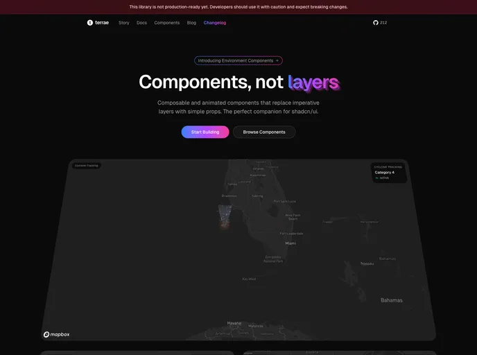
Terrae
Shadcn map component library
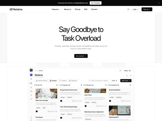
Relative - Nextjs Template
A landing page template crafted with Next.js, shadcn/ui, and Tailwind. Perfect for quickly launching a marketing site with essential sections.
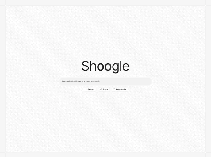
Shoogle
Shoogle is a popular shadcn registry search engine with all the top registries.
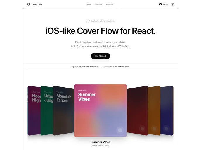
Coverflow
iOS-like Cover Flow for React. Fluid, physical motion with zero layout shifts. Built for the modern web with Motion and Tailwind.
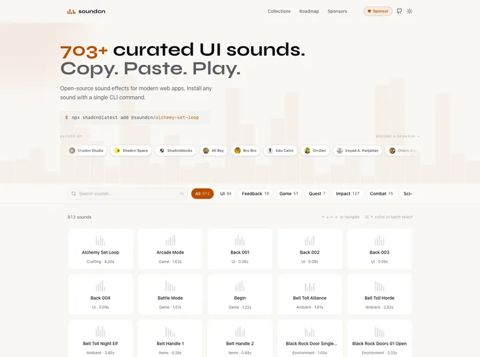
Soundcn
700+ curated UI sound effects for modern web apps. Browse, preview, and install sounds with a single command. Free and open source
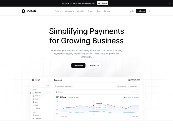
Metafi - Nextjs Template
A modern template suitable for creating sophisticated marketing sites. Built with Next.js 15, shadcn/ui, and Tailwind 4. Available in both Next.js and Astro editions.
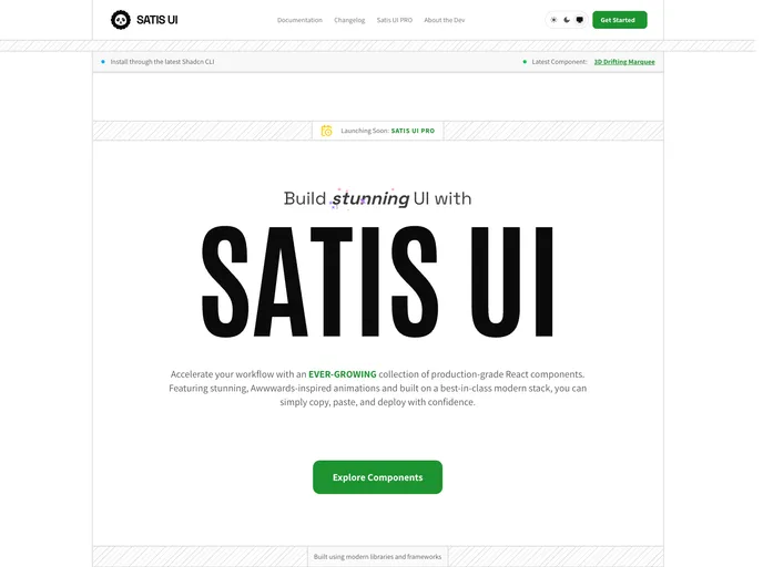
Satisui
Satisui is a comprehensive UI kit designed for developers utilizing shadcn/ui, offering a collection of beautifully engineered components aimed at streamlining the development process.
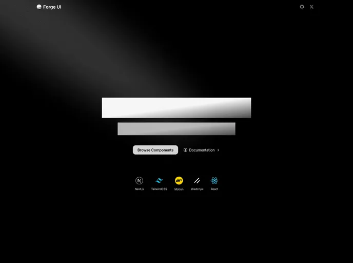
Forgeui
A library of React components for smooth, fast front-end development.
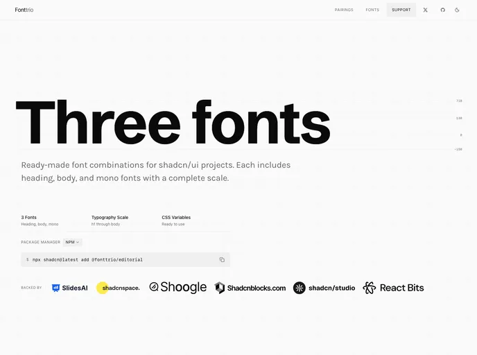
Fonttrio
Curated font pairing registry for shadcn. Three fonts. One command. Install perfectly configured typography (heading + body + mono) with shadcn add
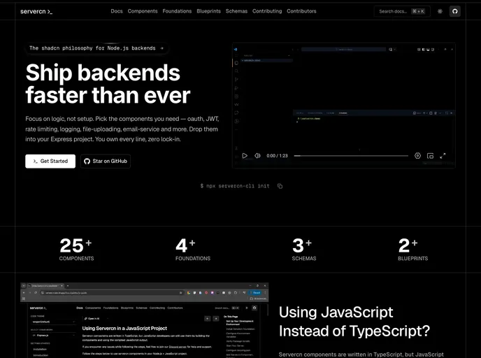
Servercn
Servercn , the backend component registry for Node.js inspired by shadcn/ui. The shadcn philosophy for Node.js backend.
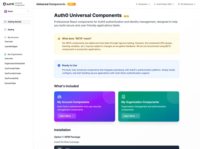
Auth0 Universal Components
Official Auth0 shadcn registry of pre-built React components for MFA, SSO, organization management, and identity workflows — install via @auth0 namespace or the ui.auth0.com registry.
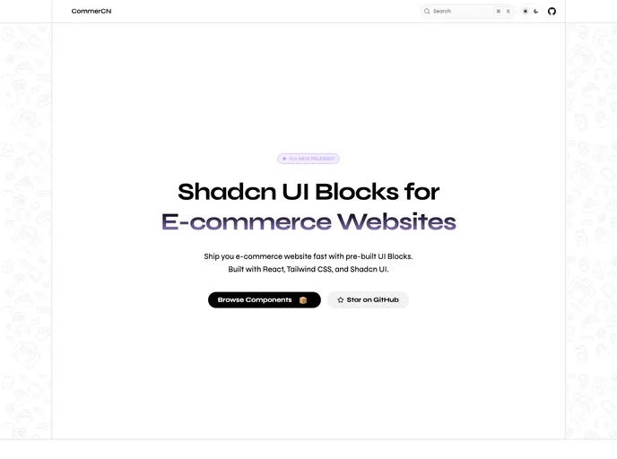
Commercn
Commercn is a collection of Shadcn UI blocks designed specifically for ecommerce websites, catering to developers looking to expedite their project builds.
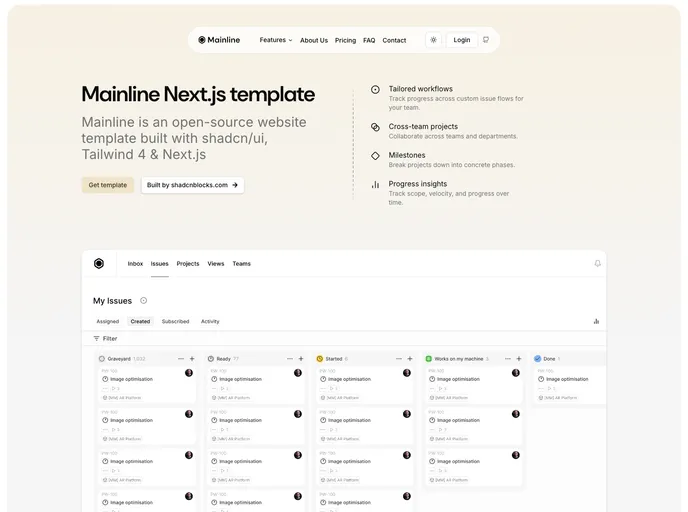
Mainline - Nextjs Template
A minimal, yet unique, landing page template built with Nextjs 15, shadcn/ui and Tailwind 4
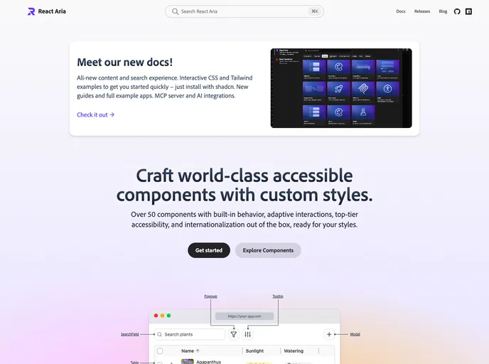
React Aria
Craft world-class accessible React components with custom styles — 50+ primitives with adaptive interactions, i18n, and shadcn-installable examples on the new docs.
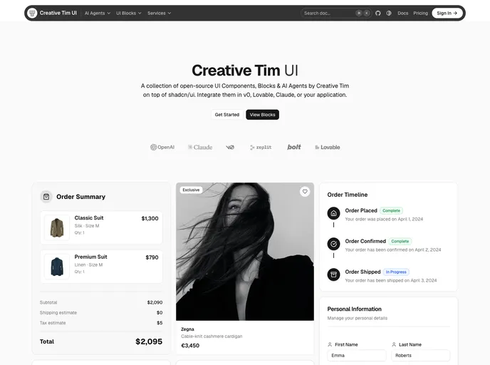
Creative Tim UI
Creative Tim UI is a collection of open-source UI components, blocks, and AI agents designed specifically for shadcn/ui projects.
AnimBits
50+ production-ready animation components for React, powered by Framer Motion. Copy-paste buttons, cards, text effects, loaders, icons, and page transitions into any shadcn/ui project with a single CLI command.
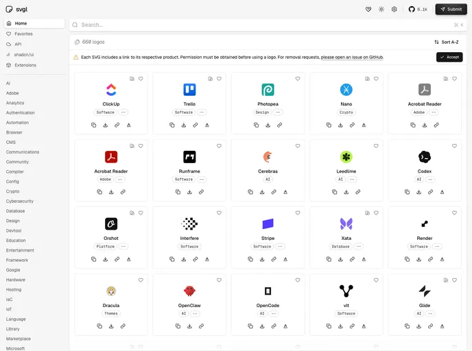
SVGL
SVGL is a library designed for developers seeking a collection of high-quality SVG logos that can be easily integrated into their projects.