


Shadcn Templates - Page 9
Browse 611 Shadcn UI Templates, Components, Blocks, Boilerplates and more.(Page 9 of 21)
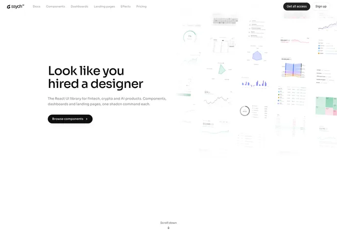

Ssych
Dark, data-dense React components for high-stakes decision surfaces: trading books, screeners, clinical dashboards. Hand-drawn SVG charts, no chart runtime.
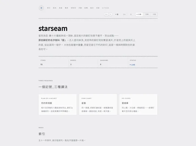
starseam
A registry modelled on the star-riveted helmet: plates on a lacquer ground, rivets only on real seams, console/report as two materials, ink-only code highlighting, and first-class CJK typography.
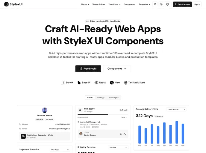

Stylexui
High-performance StyleX & Base UI toolkit for modern dashboards. Modular blocks and production templates, built with zero runtime CSS overhead.
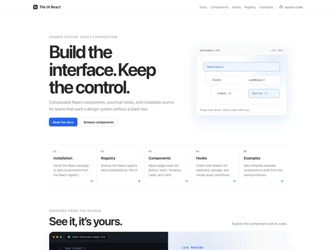

Tile UI
A lightweight React component library built around a shared SCSS design system and distributed as editable source through the shadcn CLI.
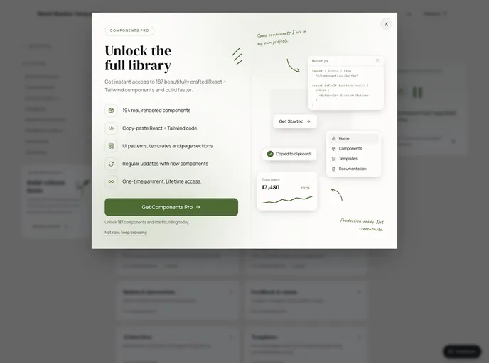

UI Shrushank
Free React and Tailwind components with Framer Motion interaction states and Tailwind CSS styling: buttons, badge, text field, toggle switch and breadcrumbs.
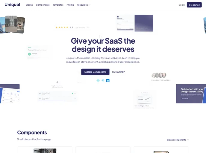

Uniquel
Minimalist components for React / Next.js: animated backgrounds, galleries, badges, and conversion blocks. Built with Tailwind CSS and Motion, installable with the shadcn CLI.
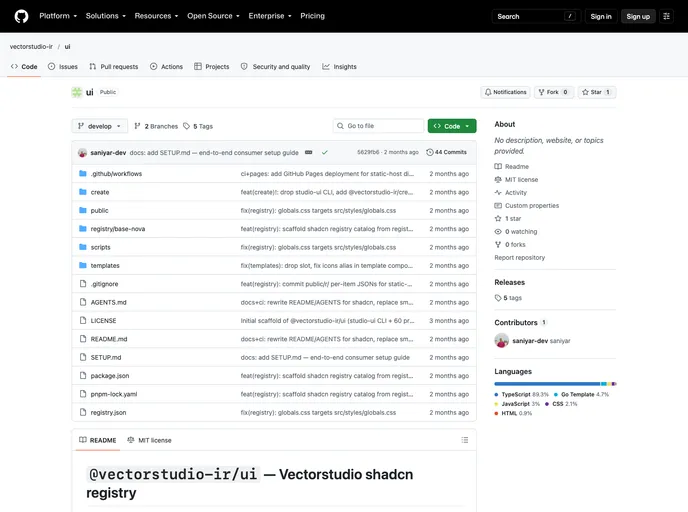

Vectorstudio Ir
Vectorstudio UI design system: 60 shadcn-compatible primitives on @base-ui/react, RTL/Persian first, 578-icon pixel-icon library, Tailwind v4 + orange brand palette.
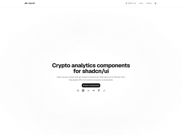

Vora UI
Open source crypto market analytics components for shadcn/ui - candlestick trading charts, BTC rainbow chart, Fear & Greed and Altseason gauges, live from free public APIs.
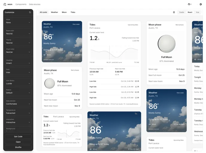

wxcn
Theme-aware React weather, tide, and moon forecast components built with shadcn/ui.

designali
Where thoughtful design meets production-ready code. I design and build digital experiences that look great, feel intuitive, and work beautifully.
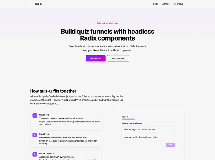

quiz-ui
Headless, Radix-based components for building quiz funnels — shadcn-style distribution, style entirely via className.
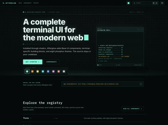

Afterglow
A complete terminal UI system for shadcn with Base UI components, terminal-specific building blocks, and eight phosphor color themes.
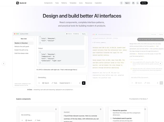

Scrimui
Free, open-source React components and patterns for AI interfaces, including prompts, streaming messages, reasoning, tool calls, citations, agents, memory, voice, and safety.
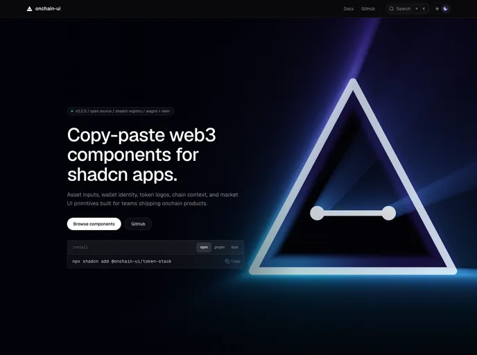
onchain-ui
Web3 components for shadcn apps. Wallet identity, token logos, balances, and market UI primitives for EVM products.
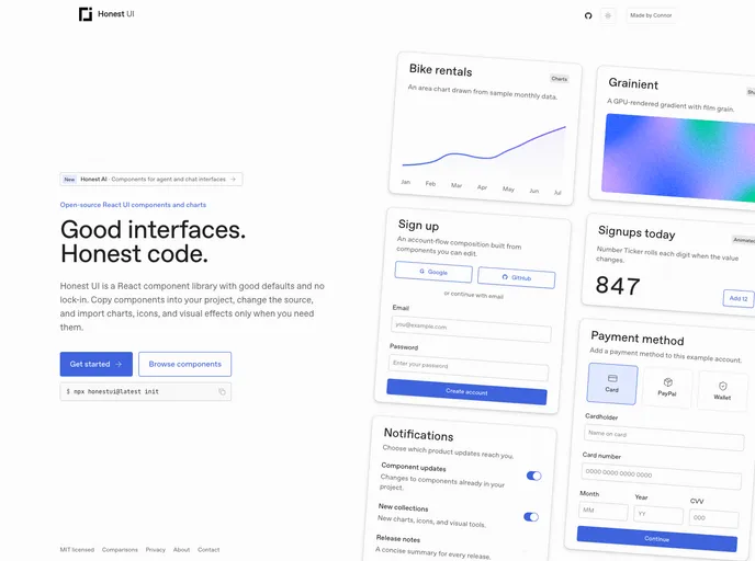

Honestui
React UI components, animated interactions, shaders, and charts distributed as editable source.
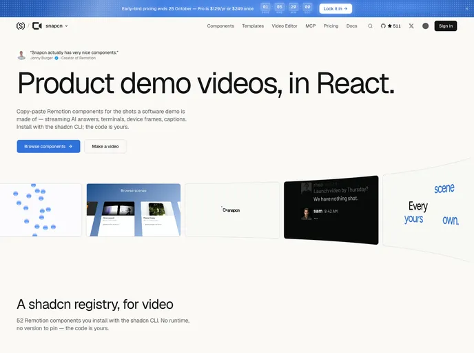

snapcn
Remotion video components for React: animation and motion graphics for product demo videos. Text reveals, karaoke captions, device mockups, logo stings and full scenes, owned as source.
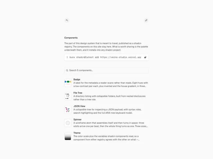

Vernostudio
The full OKLCH scale plus every variable shadcn components read, so anything you install lands on the same tokens instead of its own colors.
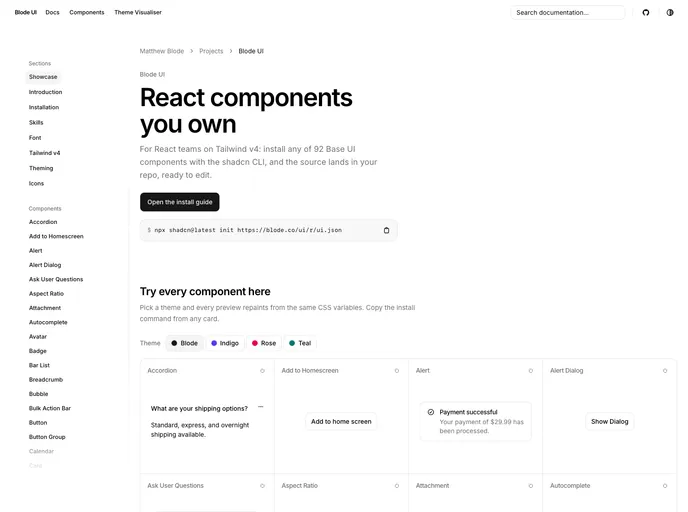

Blode
An open-source registry of accessible React components built on Base UI and Tailwind CSS v4. Install with one command, then own the source.
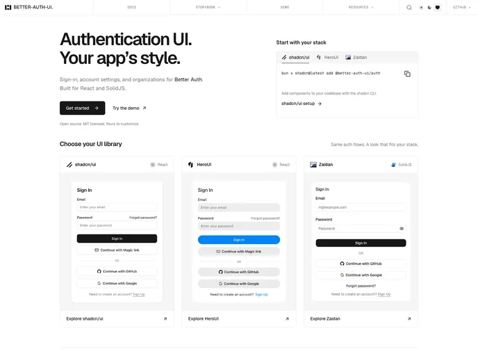

Better Auth UI
Drop-in authentication components for Better Auth applications.
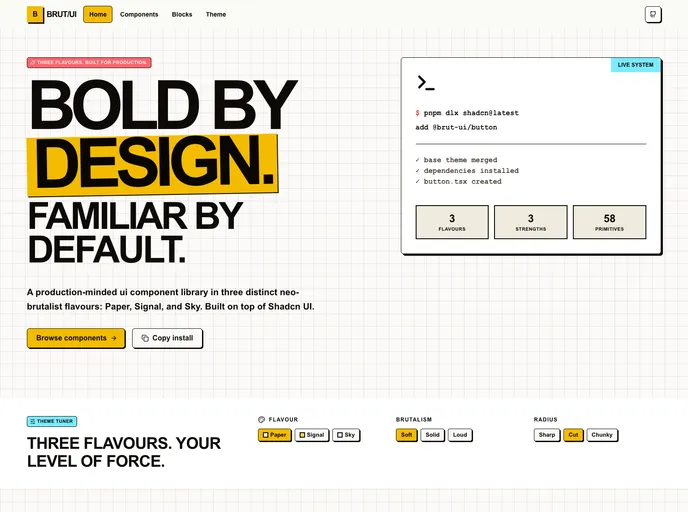

BRUT/UI
Production-minded neo-brutalist shadcn components with three configurable flavours, strengths, and radius modes.
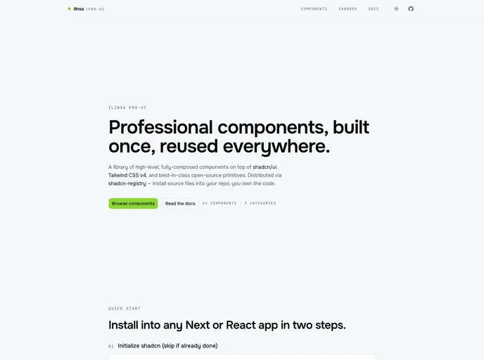

ilinxa pro-ui
High-level composed components for shadcn/ui — kanban, gantt, calendar, media editors, story viewers, flow canvas, forms, and more, each with optional demo fixtures.
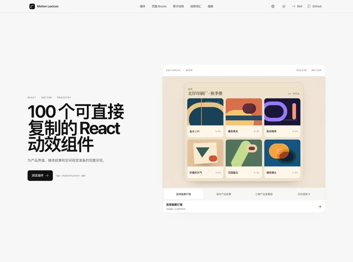

Motion Lexicon
Copy-ready React page blocks and motion components with bilingual previews, reduced-motion paths, and shadcn Registry delivery.
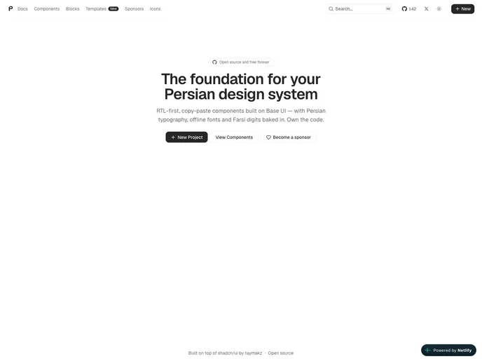

PersianLabs/ui
RTL-first, copy-paste React components and UI blocks for Persian interfaces, built on Base UI and Tailwind CSS. Includes unique Persian-focused patterns with full LTR support.
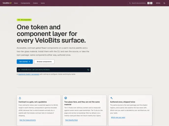

VeloBits UI
An open source collection of accessible, contrast-gated React components on a warm neutral palette and a two-tier glass material — the VeloBits design system, authored once and shipped both as an npm package and as this registry.
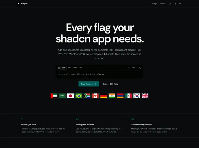

Flagcn
Accessible, source-owned flag components for shadcn/ui with 306 flags in SVG, PNG, WebP, and JPEG plus 4:3, 1:1, and original ratios.
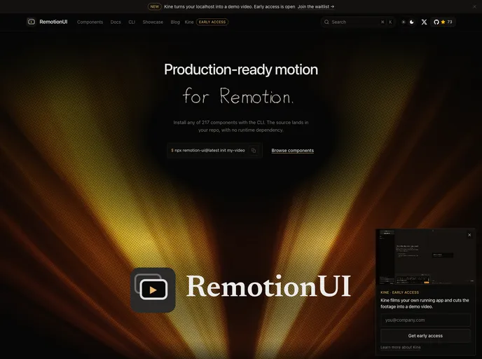

RemotionUI
Copy-paste motion components for Remotion video projects - 200 captions, charts, transitions, backgrounds, and full compositions.
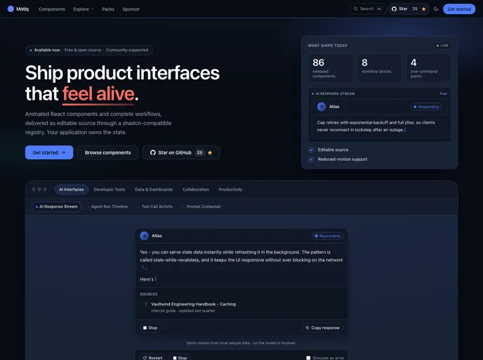

Motiq
Production-ready animated React and Next.js components — accessible, reduced-motion-safe and RSC-safe — installable as editable source with the shadcn CLI. Free and open source.


Initium
Conversion-focused marketing blocks and landing page sections for shadcn/ui, with a visual style editor, agent skills, and the first block of every category free to install.
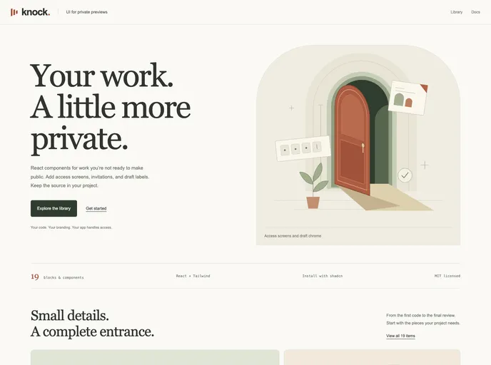

Knock Codes
Copy-paste, session-gated access blocks for React — PIN/Knock Code unlock screens, protected routes/layouts/modals, a headless useKnockCodes hook, and full-page templates.
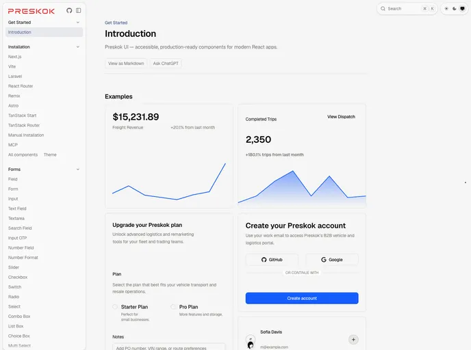

Preskok
Accessible, production-ready React components built with React Aria Components and Tailwind CSS.