


Shadcn Templates - Page 7
Browse 611 Shadcn UI Templates, Components, Blocks, Boilerplates and more.(Page 7 of 21)
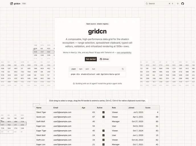

gridcn
An editable, composable data grid for the shadcn/ui ecosystem: range selection, spreadsheet clipboard, fill handle, pinning, undo/redo, and streaming updates. Real DOM cells, shadcn styling.


Verdict - Professional Services Template
A law firm and legal services template for attorneys and professional service businesses. Available in Next.js and Astro editions.
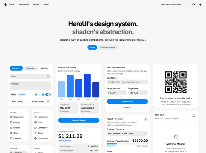

herocn
HeroUI's design system, shadcn's abstraction.
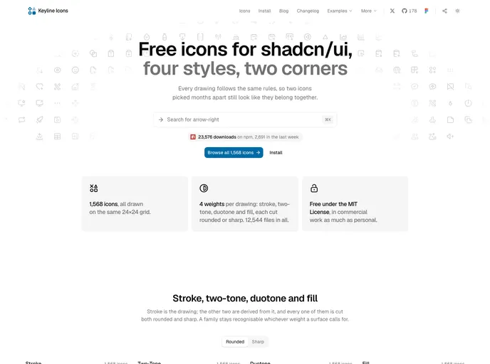

Keyline
1,000 icons on one 24×24 grid as React components, in stroke, two-tone, duotone and fill, each with rounded or sharp corners. Free under MIT.
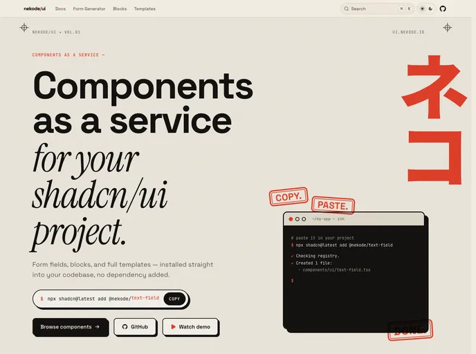

nekode/ui
Composed ready to use shadcn components, just plug and play.
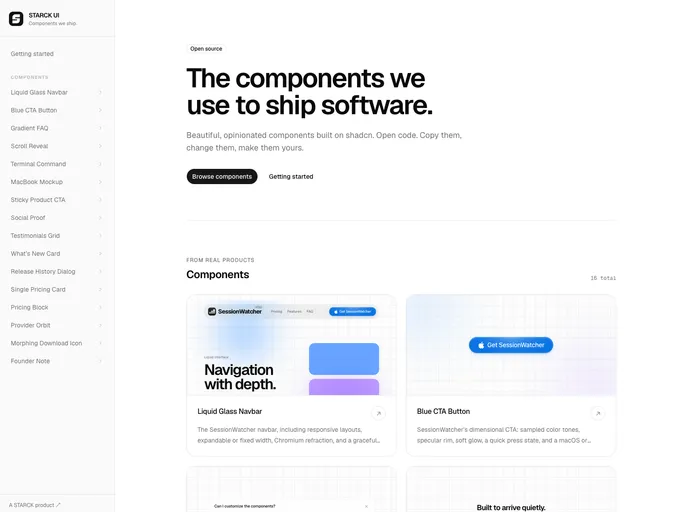

Starck
Product-proven React components from STARCK, built on shadcn with polished motion, responsive behavior, and accessible defaults.
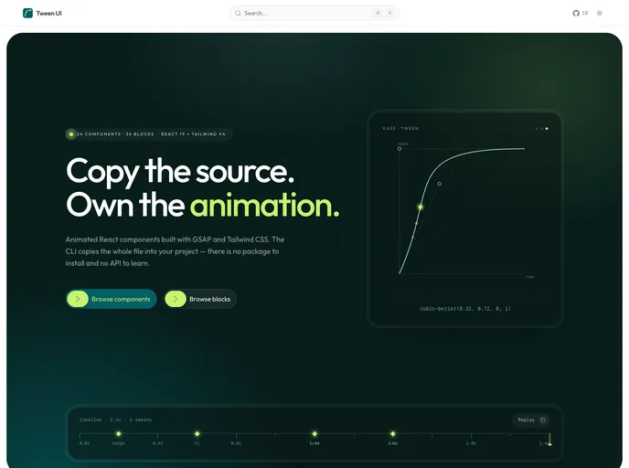

Tween UI
GSAP & CSS animated React components and blocks. One file each, no shared runtime, reduced-motion handled.
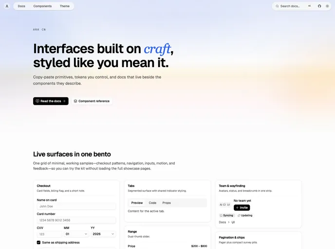

ARK CN
Accessible shadcn/ui components built with React, TypeScript, and Tailwind CSS. Copy-paste ready, and customizable. Built by ARK UI.
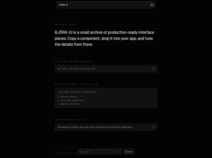

Bjork UI
Production-ready animated interface components, primitives, and WebGL shader studies for React and Tailwind CSS.
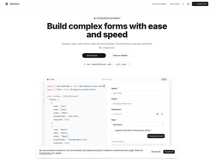

BuzzForm
Type-safe, schema-based forms for shadcn/ui apps. Auto-generate UI with validation and state out-of-the-box with minimal boilerplate.
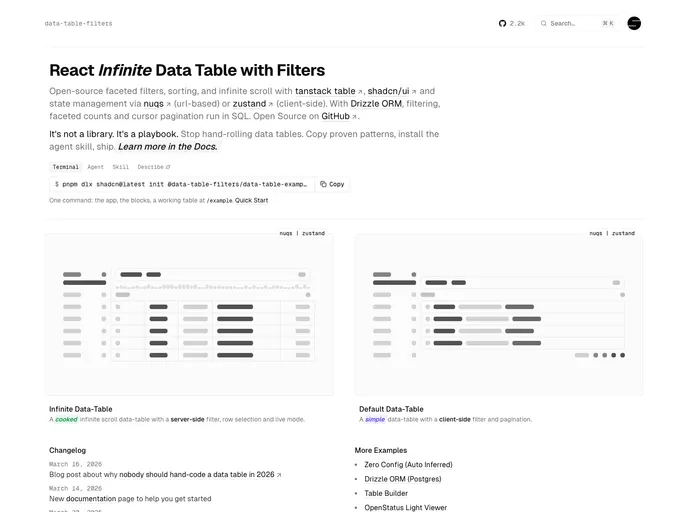

Data Table Filters
Data tables for React and shadcn/ui: faceted filters, sorting, infinite scroll, row detail sheet, and server-side filtering with Drizzle. Built on TanStack Table. Powered by openstatus.

Hatch - Nextjs Template
A minimal freelancer template built on shadcn/ui and Tailwind. Available in both Next.js and Astro editions, perfect for a clean portfolio and freelance services site.
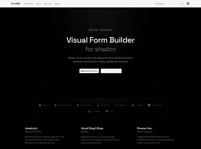

FormSCN
Production-ready shadcn/ui forms visually with drag-and-drop.
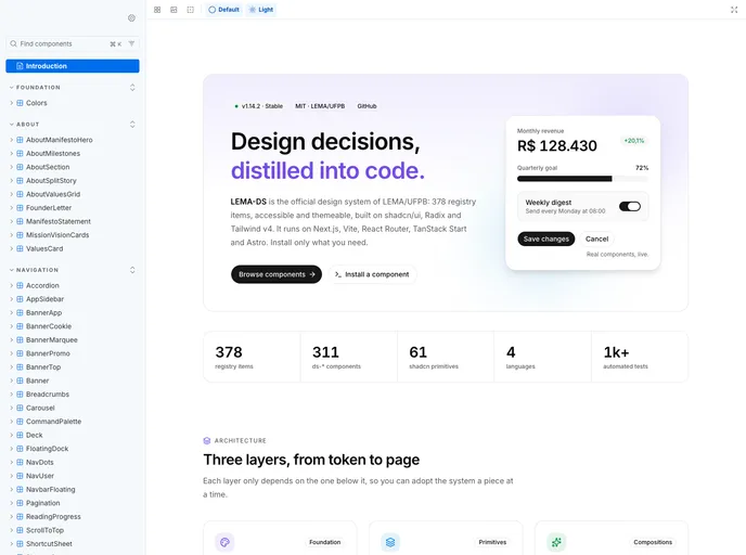

Lema Ds
Enterprise-grade design system and component library for LEMA-UFPB
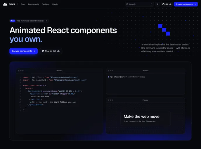

mewo
Animated React components and page sections built on Tailwind CSS v4, powered by Motion and GSAP. Every item respects prefers-reduced-motion and installs only the dependency it needs.
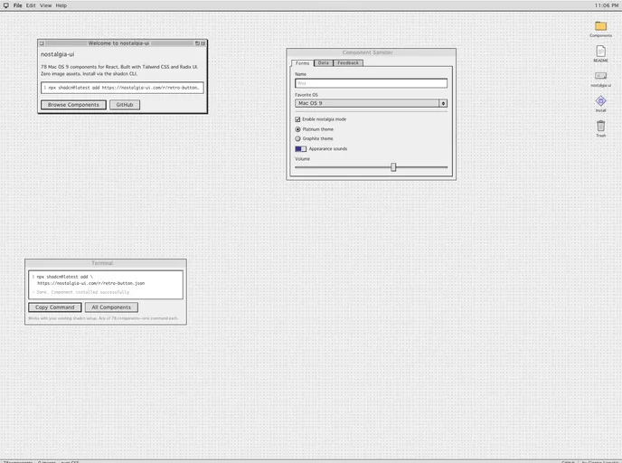

nostalgia-ui
Mac OS 9 styled components for React. 60 retro UI primitives with platinum bevels, system fonts, and pixel-perfect details. Pure CSS, zero images.
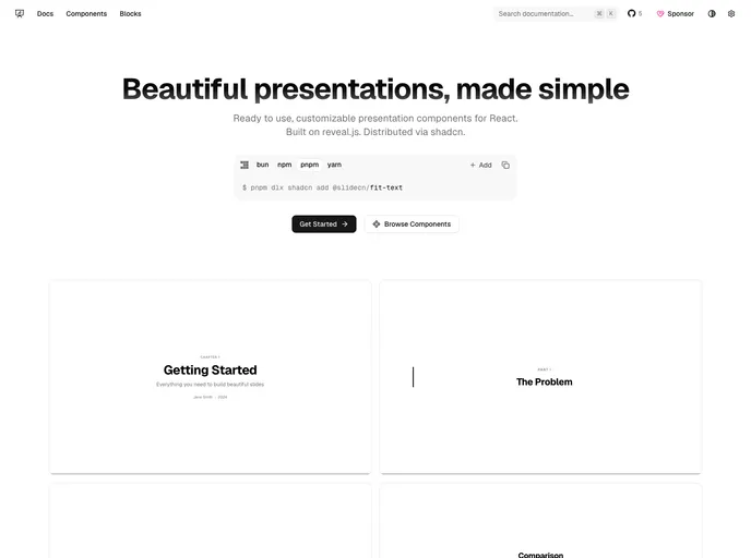

slidecn
Beautiful presentations, made simple. Ready to use, customizable presentation components for React.
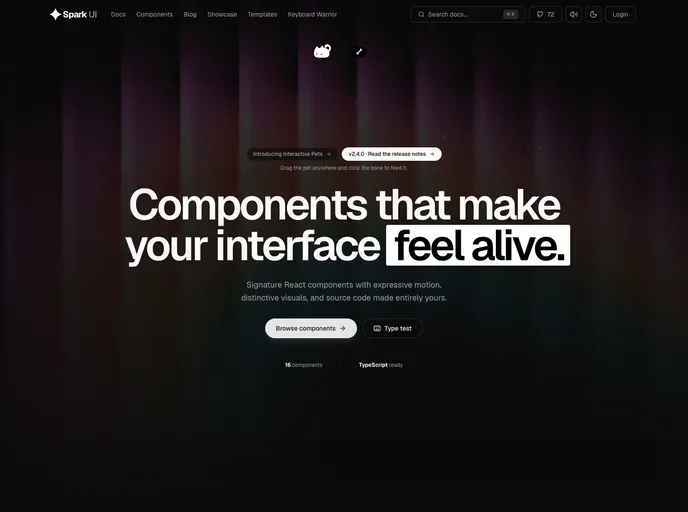

Spark UI
Open-source React components and animated UI building blocks, installable as source with the shadcn CLI.

Hive - Nextjs Template
An agency portfolio template built on shadcn/ui and Tailwind. Available in both Next.js and Astro editions, perfect for creating a modern portfolio website.
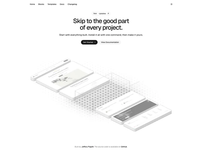

uiception
Launch with everything built. Just make it yours.
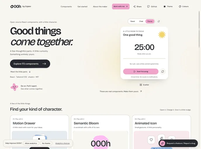

000h Cojeev
Expressive React components with organic shapes, purposeful motion, and source you can make your own.
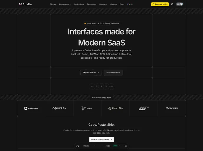

D2 Studio
Ultra modern monospace component library for React and Tailwind CSS v4 — AI cards, bento grids, dashboards, hero sections and animated pixel spinners.
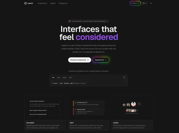

easeUI
Open-source React components with natural motion, installable as source.
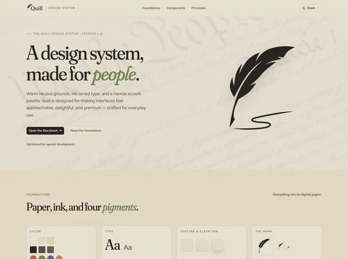

Quill
An editorial design system for digital products — warm neutral grounds, ink-toned type, five themes and four accents, 51 blocks, WCAG 2.1 AA, and agent-ready docs (llms.txt, usage guides, Claude Code rules).
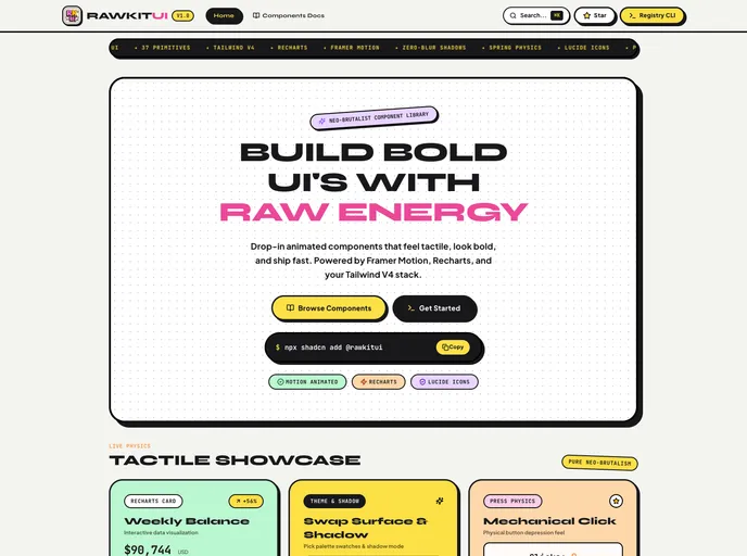

RawkitUI
Pop-Brutalist UI primitives for React: 30 components with hard shadows, high-contrast borders, motion spring physics, and Lucide icons. MIT.

Kinto - Nextjs Template
An elegant single product/app template built on shadcn/ui and Tailwind. Available in both Next.js and Astro editions.
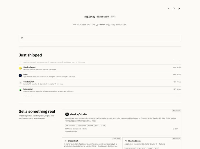
Registrydirectory
The explorer for the shadcn registry ecosystem.
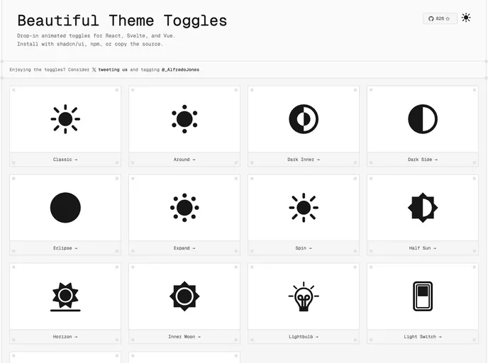

Toggles
Animated dark/light mode toggles
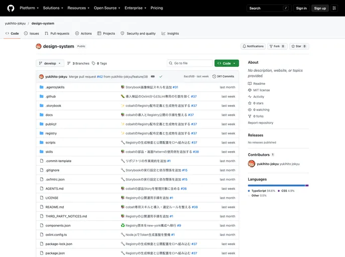

Yukihi
An accessible React design system with scoped themes, reusable application patterns, and character icons, built for Tailwind CSS v4.

Echo - Nextjs Template
A personal portfolio template built on shadcn/ui and Tailwind. Available in both Next.js and Astro editions, perfect for creating a stunning personal portfolio website.