


Shadcn Templates - Page 6
Browse 611 Shadcn UI Templates, Components, Blocks, Boilerplates and more.(Page 6 of 21)
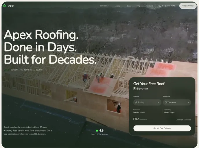

Apex - Small Business Template
A roofing and home services template with before/after image sliders, an inline booking calendar and MDX-driven services and blog. Available in Next.js and Astro editions.
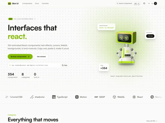

Glint UI
354 animated React components you copy, paste and own: text effects, cursors, WebGL backgrounds, micro-interactions, UI primitives and mascots. Built with Tailwind CSS v4 and shadcn tokens.
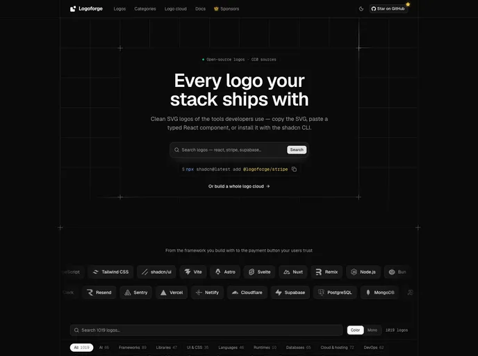

Logoforge
900+ brand logos for developers as typed React components with automatic dark mode and mono variants. Includes logo cloud sections and African brands. Free and open source.
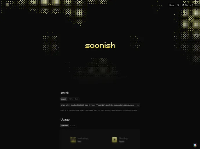
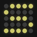
soonish
91 loading animations for React, each on a 5×5 grid of dots, animated with plain CSS. Server Component-ready.
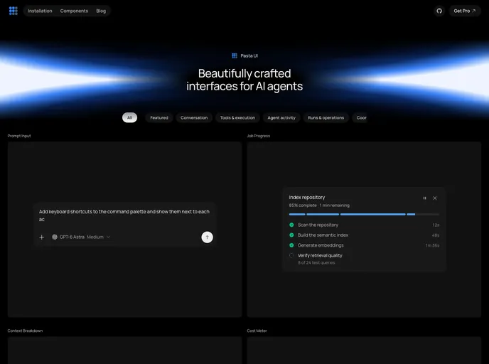
Pasta UI
Open-source React components for AI agent interfaces: conversations, tool calls, approvals, background runs, and rich outputs.
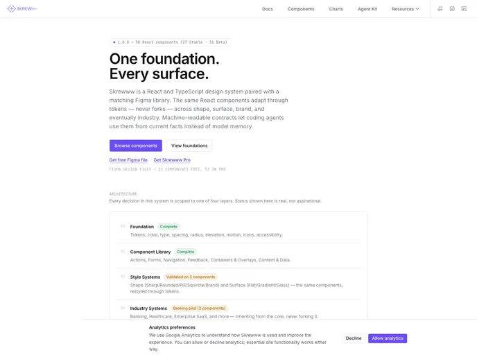

Skrewww Design System
Open-source React and TypeScript design system with a token-driven foundation, live documentation, and machine-readable component contracts for coding agents.
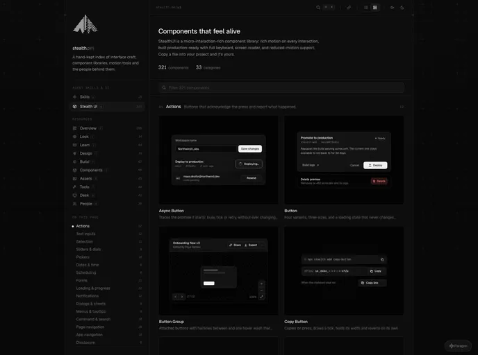

Stealth UI
Components that feel alive. A micro-interaction-rich React library: rich motion on every interaction, production-ready with full keyboard, screen reader and reduced-motion support.
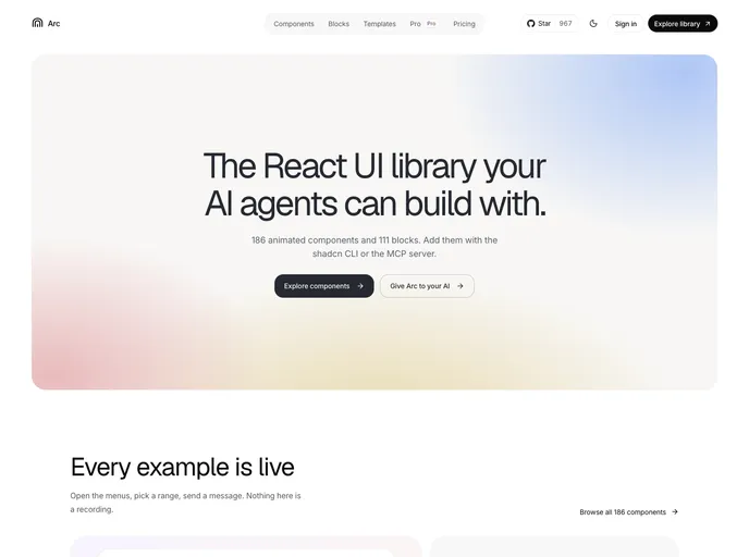

Arc
React components and blocks with motion built in. Source you own, with Markdown docs and llms.txt so AI tools install them correctly.
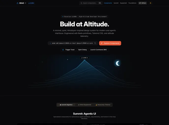

Aayurt
Minimal, precise Himalayan-inspired React components on Radix primitives and Tailwind CSS. Buttons, overlays, tables, forms and agentic patterns you can own.
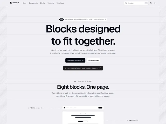

Balick UI
Blocks for shadcn/ui designed to fit together: compose a page, then install it with one command.
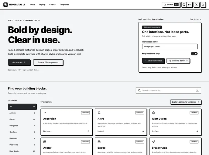

neobrutal-ui
Neobrutalist React UI with staged press feedback, shared themes, and editable Next.js page templates, built with Base UI.
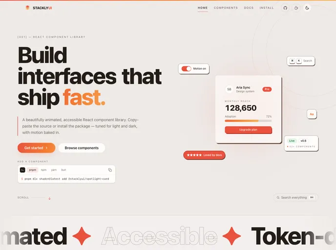

StacklyUI
Animated React components — built with Tailwind CSS and Motion, installable via the shadcn CLI. Copy-paste source you own and can customize.
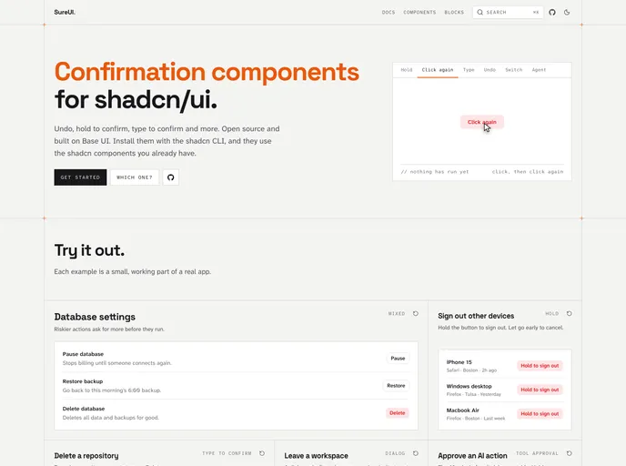

SureUI
Open source confirmation components for shadcn/ui: undo, hold to confirm, type to confirm and more. Built on Base UI.
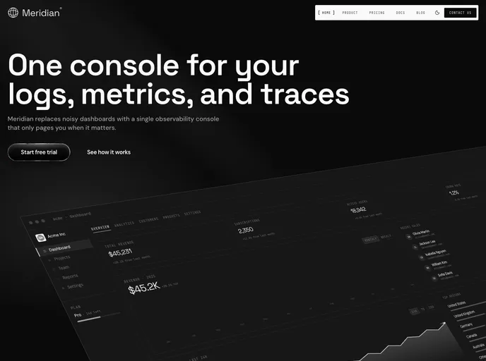
Meridian - SaaS Marketing Template
A developer tools SaaS template with a signature intro animation and Fumadocs-powered MDX docs. Available in Next.js and Astro editions.
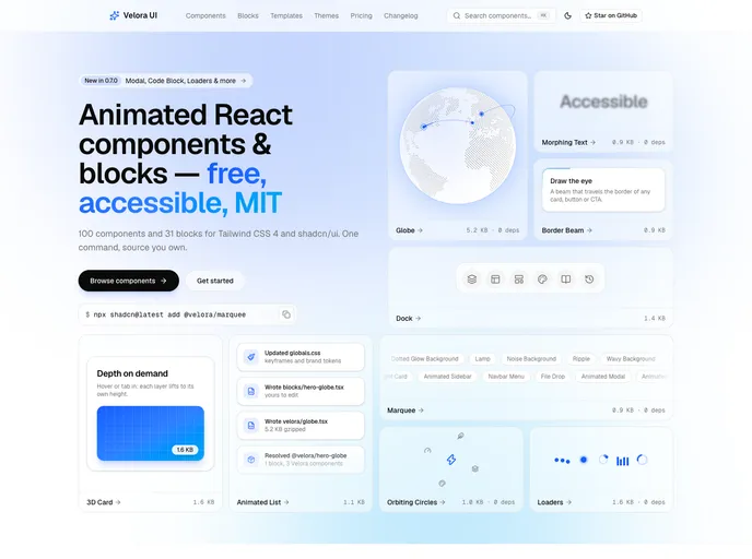

Velora UI
100 animated React components and 31 free section blocks for Tailwind CSS 4 — accessible, reduced-motion safe and MIT licensed.
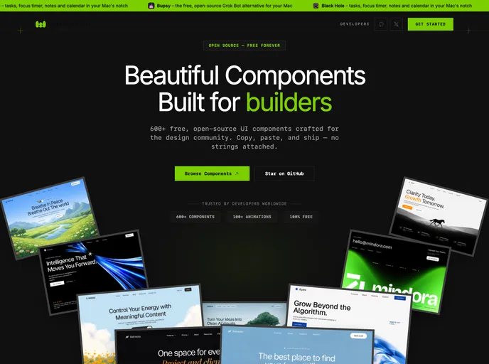

Watermelon
Free, open-source React components, animated interactions, blocks, dashboards, and templates for shadcn/ui projects. Install with the shadcn CLI and own the source.
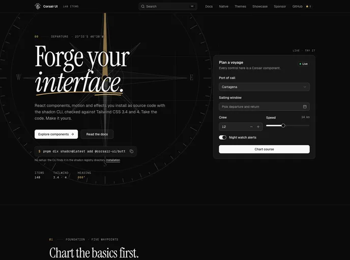

Corsair UI
Copy-and-own React components for Tailwind CSS 3 and 4: forms, overlays, site chrome, motion, animated text and backgrounds.

Shadcnblocks Page Builder
Drag-and-drop shadcn/ui page builder. Compose landing pages from 2000+ Shadcn Blocks, save layouts, and export production-ready pages for React and Next.js.
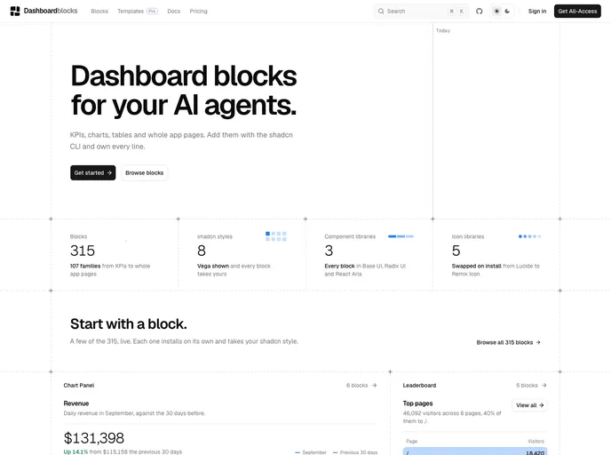

Dashboardblocks
Dashboard blocks for shadcn/ui: KPIs, charts, tables, funnels, heatmaps and full dashboards. Works with Base UI, Radix UI and React Aria, and every style and icon library.
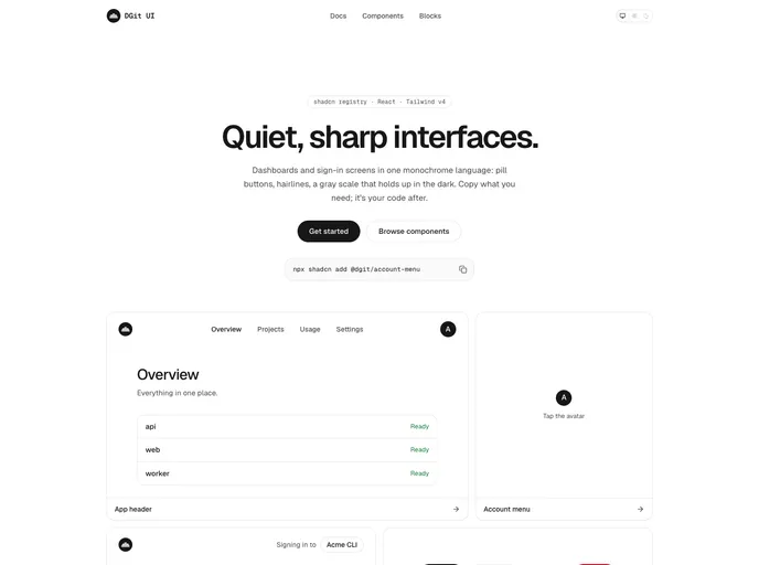

Dgit
Quiet, sharp React components for dashboards and sign-in screens: a neutral light and dark theme, pill buttons, menus, an account menu, an app header, a sidebar layout, and a sign-in page.
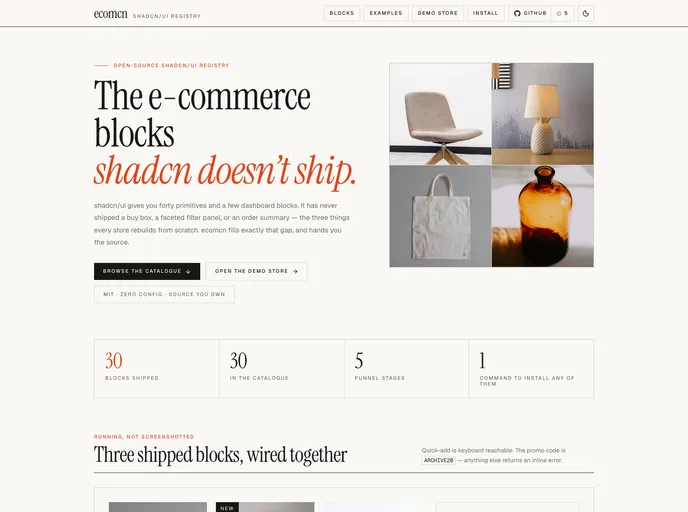

ecomcn
E-commerce blocks for shadcn/ui, organised by the purchase funnel — product cards and grids, URL-driven filters, sort, load more, quick view, empty states and the order summary.
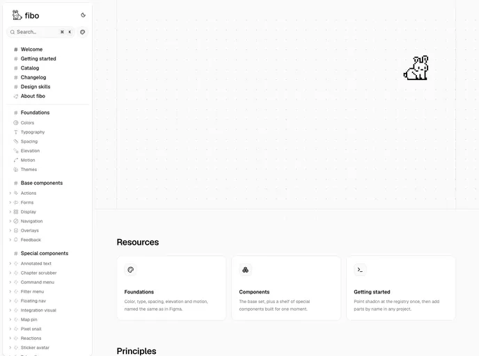
Fibo
An achromatic design system on Base UI: the standard parts plus playful niche components, with semantic tokens that match Figma variables one to one.
Opaline
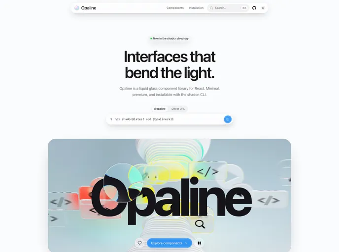
Liquid glass components for React — real backdrop refraction, Apple-inspired, minimal and premium. Docks, sheets, command palette, knobs and more.

Reactframe
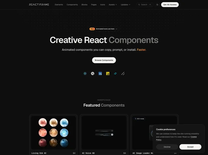
Animated React components, blocks and elements built with Tailwind CSS and Motion. 150+ free, open-source items install with the shadcn CLI; premium components are sold separately.

Shadcnblocks Figma Kit
Premium shadcn/ui Figma kit with 500+ pro blocks, full component library, light/dark themes, Tweakcn support, and design-to-code links for every block.
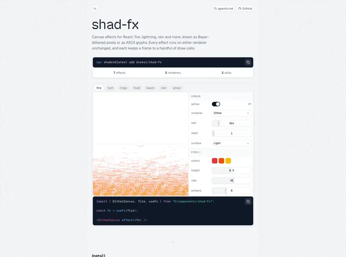

Sekei
Canvas effects for React, copied into your project as source. Starts with ordered dither: fire, lightning, sonar rings, a light beam, a sloshing fluid, rain and snow.
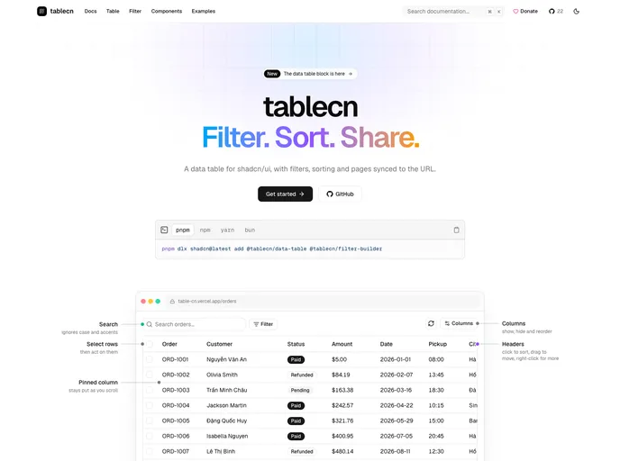

Tablecn
Data table and filter builder blocks with search, sorting, pagination and URL-synced filters. Built for Radix UI, Base UI and React Aria.
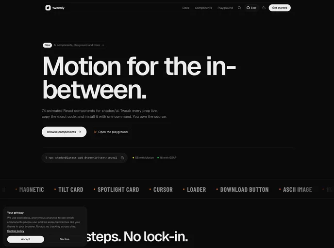
Tweenly
Animated React components built on Motion and GSAP. Tweak every prop live, copy the code, and own it.
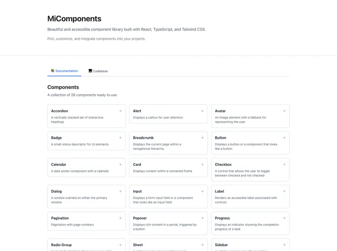

Avertra UI
A collection of React components built with Tailwind CSS, designed to help you create beautiful and responsive user interfaces with ease.
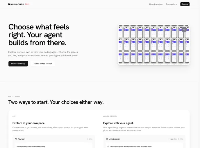

Catalogs
Discover components, blocks, and more from independent teams. Browse previews and bring the source into your project.