


Shadcn Free Block Library79 listings
Free and open-source block library for shadcn/ui. See all block library, including premium options.
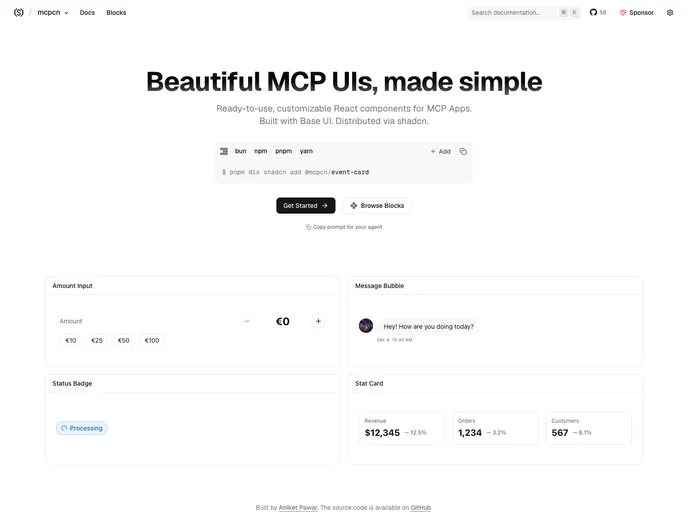

mcpcn
Free, open-source React components for ChatGPT, Claude and MCP apps: forms, payments, product lists, posts, maps and events, built on Base UI.
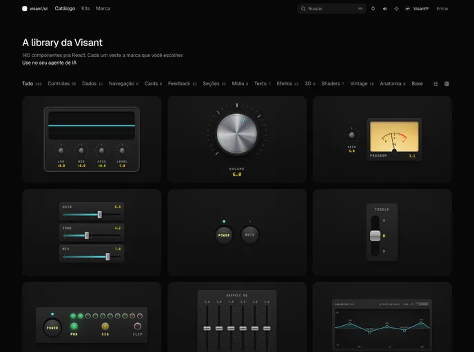
Visant UI
Brand-aware React components, blocks and app kits from Visant Labs: tokens, motion and analog-sound feedback that dress in your brand.
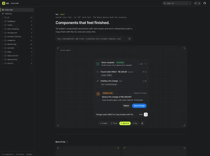

Uai
Compound React components and page blocks with motion and micro-interactions built in, including AI agent UI (prompt composer, thinking, approvals) and Brazilian commerce (Pix, CEP, installments).
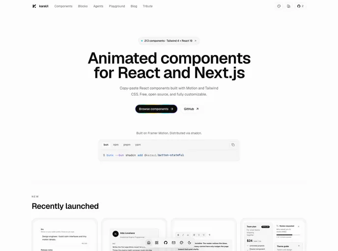

Kara UI
Animated React components, AI agent interfaces and app blocks built with Motion and Tailwind CSS, with ten switchable design styles.
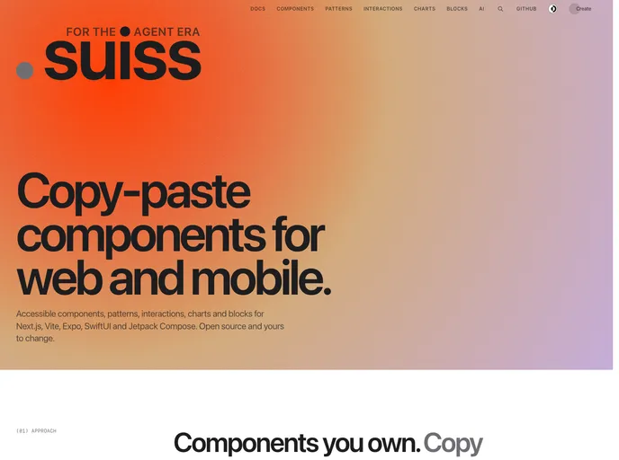

Suiss UI
Copy-paste components, patterns, interactions, charts and blocks for React with Next.js and Vite, React Native with Expo, SwiftUI and Jetpack Compose.
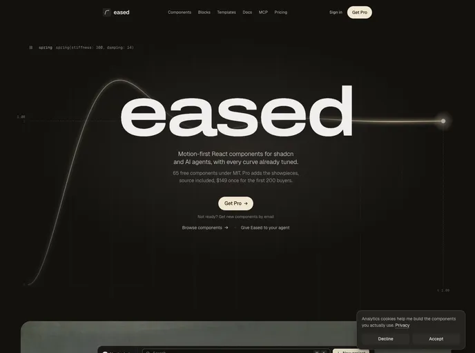

Eased
Motion-first React components and blocks for shadcn, with tuned springs, light and dark themes, and an MCP server for AI agents.
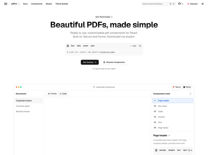

pdfcn
Free, open-source PDF components and blocks for React, built on Takumi and Forme and installed with the shadcn CLI. Invoices, reports, tables, charts and more.
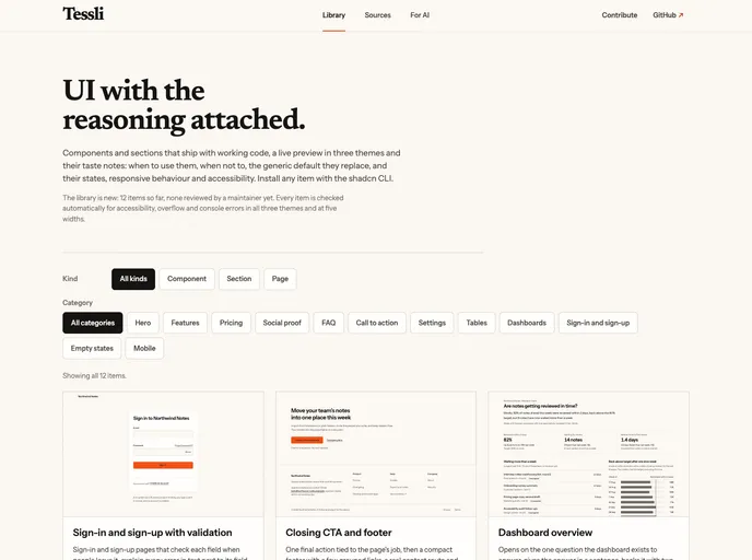

Tessli
Sections, pages and components on shadcn/ui primitives, each with notes on when to use it, when not to, the UI rules it follows and the generic default it replaces. Also installs a compact rules file, TESSLI.md.
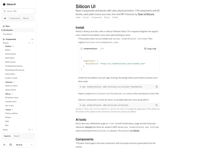

Silicon UI
Free, open source React components and blocks with calm, physical motion. Live previews with editable props, Markdown docs and llms.txt for AI tools.


Cult UI Pro
Cult UI Pro — polished shadcn marketing blocks, components, full-stack patterns, and Next.js SaaS templates. Open-source components on GitHub; lifetime license for blocks, templates, and updates.
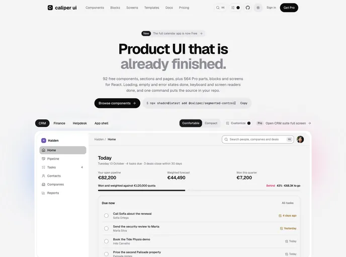

Caliper UI
React components, blocks and complete product screens drawn to one specification. Accessible by default, with every state designed. Free parts are MIT and install as source you own.
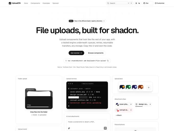

Uploadcn
Production-ready file uploads: dropzones, queues, resumable S3 and R2 uploads, and 58 blocks for every style.
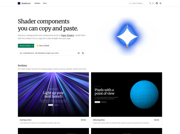

shaderscn
Copy-paste shader sections and components for shadcn/ui, built on Paper Shaders.
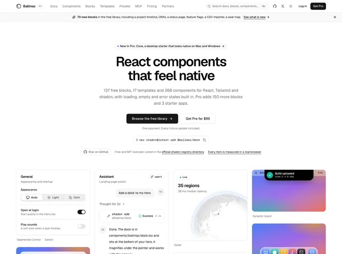
Ballmac
Accessible React and Tailwind v4 components, blocks and templates with native-app motion, built-in keyboard, RTL and translation support, and an MCP server for AI agents.
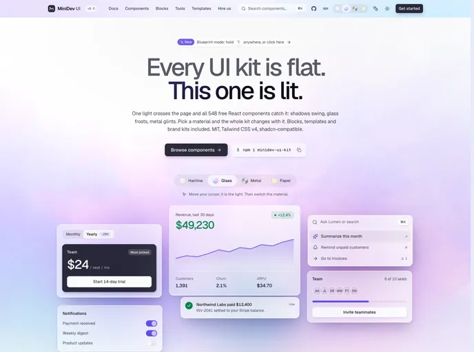

Minidev
500+ free components, blocks and motion pieces for product UI: data tables, billing, settings, command palettes and AI chat. Built on Base UI, Tailwind CSS v4 and motion.
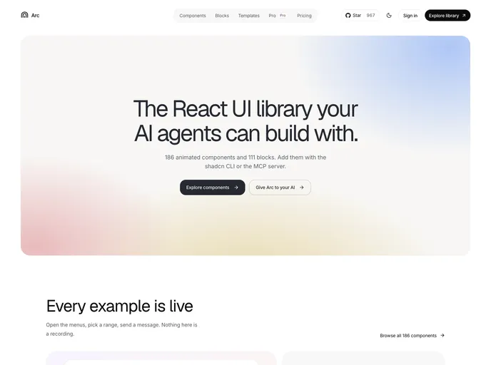

Arc
React components and blocks with motion built in. Source you own, with Markdown docs and llms.txt so AI tools install them correctly.
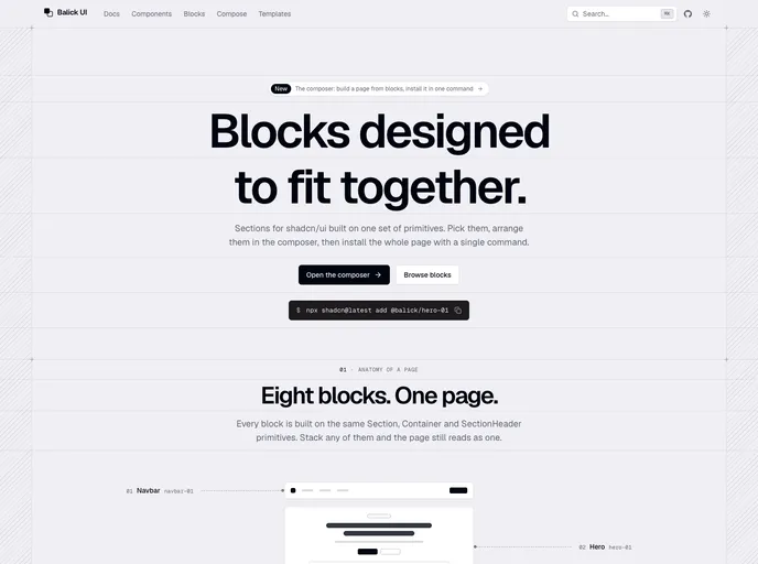

Balick UI
Blocks for shadcn/ui designed to fit together: compose a page, then install it with one command.
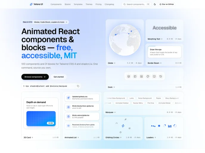

Velora UI
100 animated React components and 31 free section blocks for Tailwind CSS 4 — accessible, reduced-motion safe and MIT licensed.
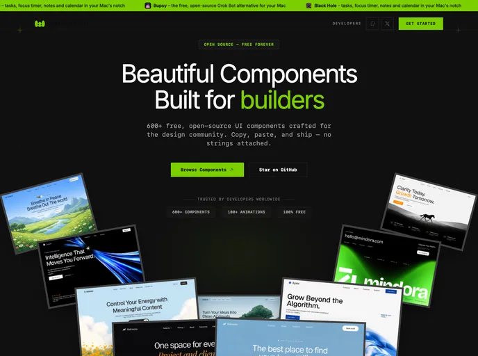

Watermelon
Free, open-source React components, animated interactions, blocks, dashboards, and templates for shadcn/ui projects. Install with the shadcn CLI and own the source.
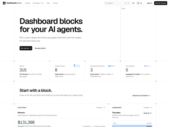

Dashboardblocks
Dashboard blocks for shadcn/ui: KPIs, charts, tables, funnels, heatmaps and full dashboards. Works with Base UI, Radix UI and React Aria, and every style and icon library.
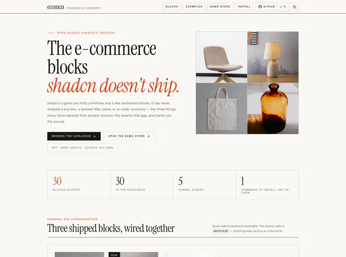

ecomcn
E-commerce blocks for shadcn/ui, organised by the purchase funnel — product cards and grids, URL-driven filters, sort, load more, quick view, empty states and the order summary.
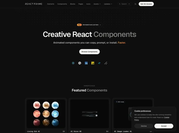

Reactframe
Animated React components, blocks and elements built with Tailwind CSS and Motion. 150+ free, open-source items install with the shadcn CLI; premium components are sold separately.
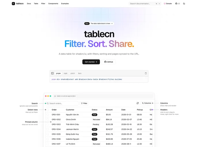

Tablecn
Data table and filter builder blocks with search, sorting, pagination and URL-synced filters. Built for Radix UI, Base UI and React Aria.
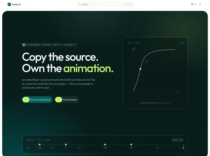

Tween UI
GSAP & CSS animated React components and blocks. One file each, no shared runtime, reduced-motion handled.
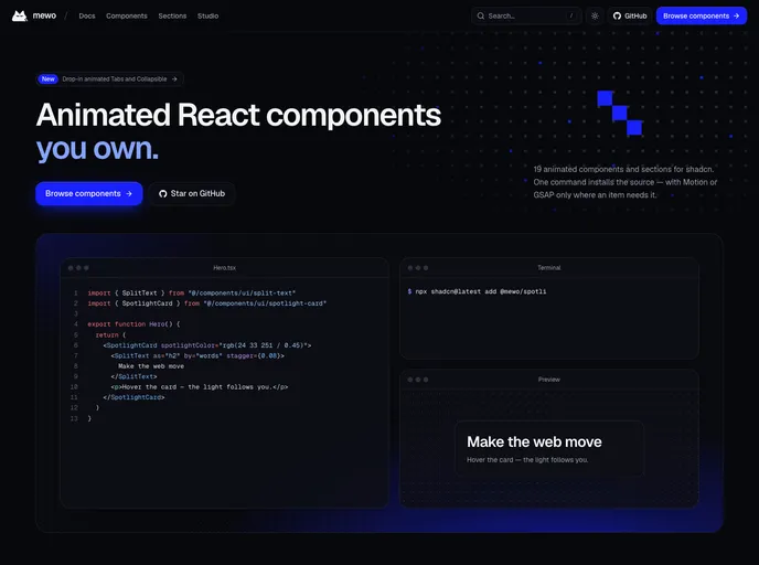
mewo
Animated React components and page sections built on Tailwind CSS v4, powered by Motion and GSAP. Every item respects prefers-reduced-motion and installs only the dependency it needs.
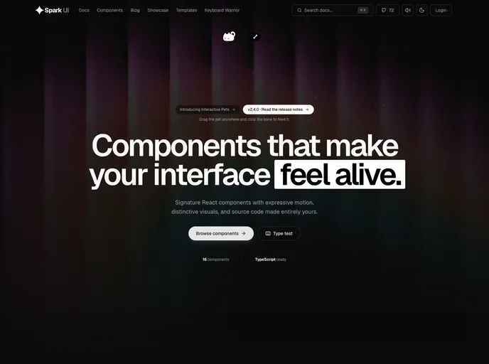

Spark UI
Open-source React components and animated UI building blocks, installable as source with the shadcn CLI.
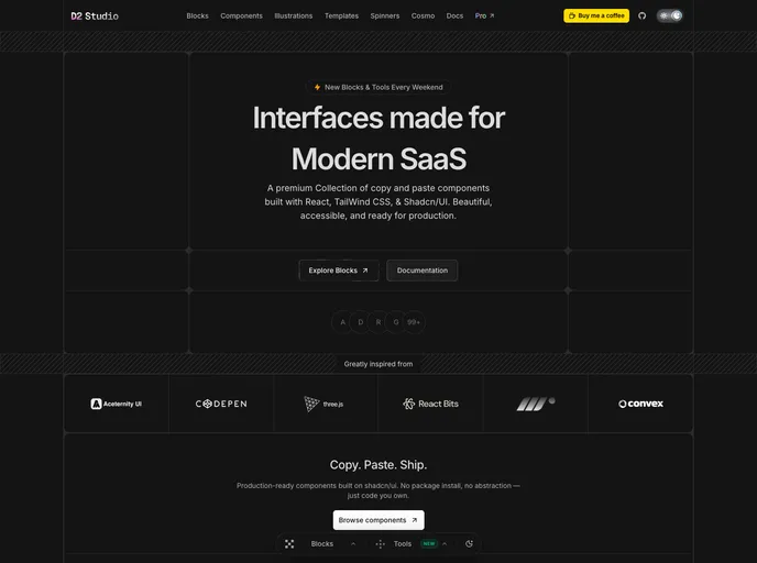
D2 Studio
Ultra modern monospace component library for React and Tailwind CSS v4 — AI cards, bento grids, dashboards, hero sections and animated pixel spinners.
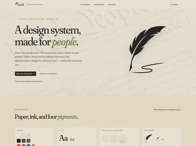

Quill
An editorial design system for digital products — warm neutral grounds, ink-toned type, five themes and four accents, 51 blocks, WCAG 2.1 AA, and agent-ready docs (llms.txt, usage guides, Claude Code rules).
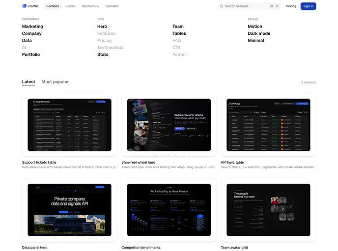
craftUI Pro
Animated, interaction-first components for React: 70+ loaders, interactive SVG icons, plus blocks, sections and UI primitives. Built with Tailwind CSS v4 and Motion, with every animation hand-tuned rather than generated.
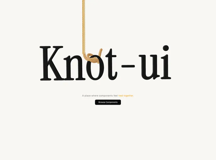

knot-ui
A registry of animated, cinematic React components and UI blocks for shadcn — buttons, cards, folders, navbars and more, built with Tailwind CSS v4 and Motion.
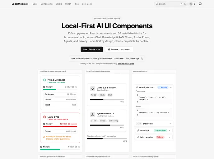

LocalMode UI
Local-first, offline AI UI primitives + blocks - run ML models (chat, RAG, vision, audio) entirely in the browser. No servers, no API keys.
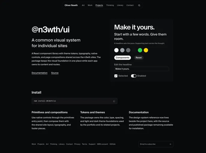

N3wth
Flat, minimal, iOS-inspired design system. 49 components, hooks, and blocks installable with the shadcn CLI.
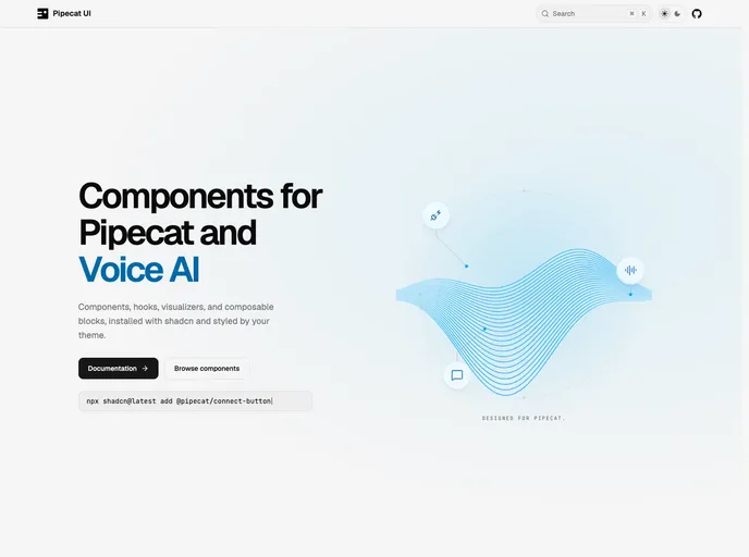

Pipecat UI
Components, hooks, visualizers, and composable blocks for Pipecat and voice AI.
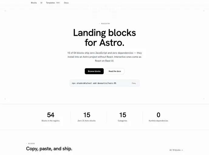

Saastro Blocks
Landing page blocks for Astro. Zero-JS .astro blocks with no dependencies — installable in an Astro project without React — plus interactive React blocks on Base UI.
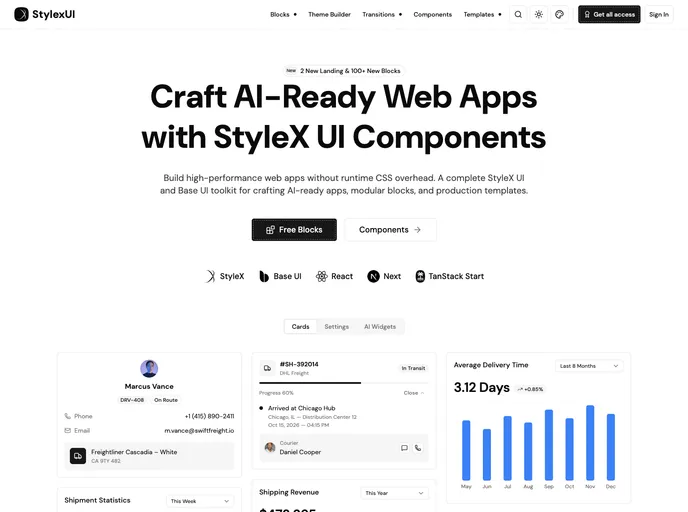

Stylexui
High-performance StyleX & Base UI toolkit for modern dashboards. Modular blocks and production templates, built with zero runtime CSS overhead.
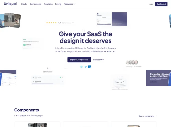

Uniquel
Minimalist components for React / Next.js: animated backgrounds, galleries, badges, and conversion blocks. Built with Tailwind CSS and Motion, installable with the shadcn CLI.
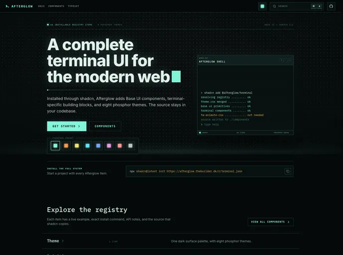

Afterglow
A complete terminal UI system for shadcn with Base UI components, terminal-specific building blocks, and eight phosphor color themes.
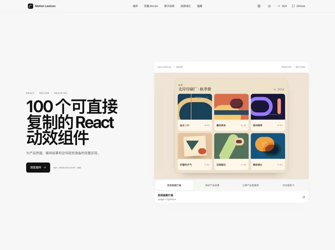

Motion Lexicon
Copy-ready React page blocks and motion components with bilingual previews, reduced-motion paths, and shadcn Registry delivery.
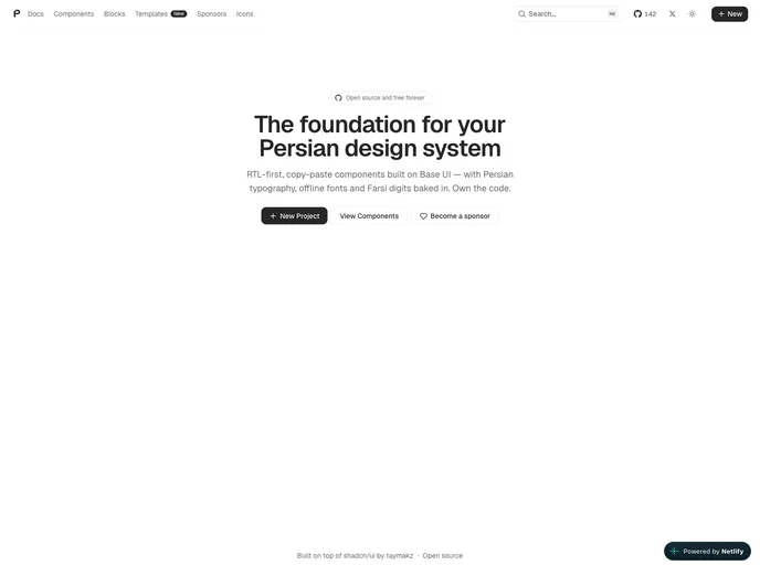

PersianLabs/ui
RTL-first, copy-paste React components and UI blocks for Persian interfaces, built on Base UI and Tailwind CSS. Includes unique Persian-focused patterns with full LTR support.


Initium
Conversion-focused marketing blocks and landing page sections for shadcn/ui, with a visual style editor, agent skills, and the first block of every category free to install.
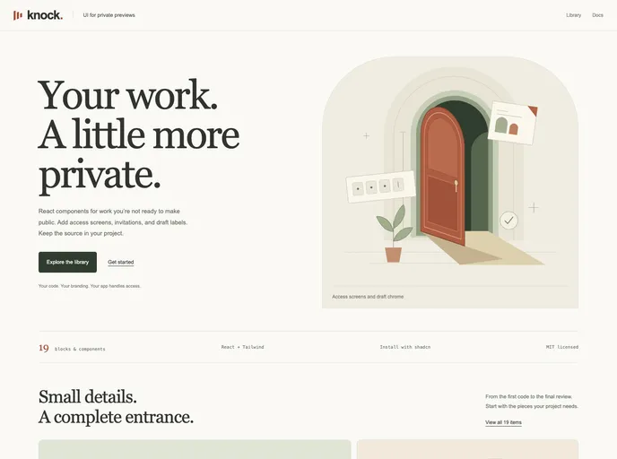

Knock Codes
Copy-paste, session-gated access blocks for React — PIN/Knock Code unlock screens, protected routes/layouts/modals, a headless useKnockCodes hook, and full-page templates.
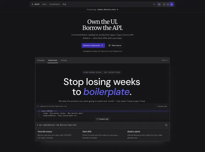

AtroUI
Dark-first React / Next.js components and marketing blocks. Install with the shadcn CLI and own the source.
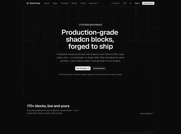

Blockforge
170+ production-grade shadcn/ui blocks, forged to ship. Full source in TypeScript + Tailwind CSS, plus a page builder and starter pages. Copy, paste, ship.
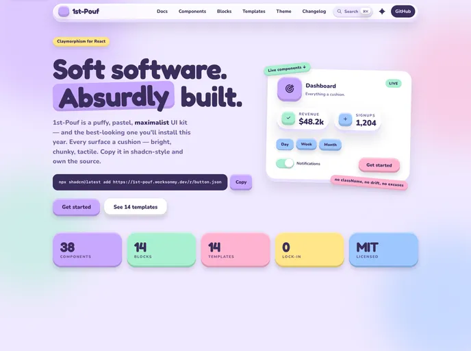

1st-Pouf
Puffy, pastel claymorphism components and app blocks for React, built with Tailwind CSS v4 and Radix UI.
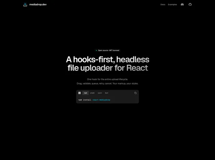

Mediadrop
Drag-and-drop file upload blocks for React built on react-mediadrop — dropzone, avatar uploader, multi-file upload form, and direct-to-S3 upload.
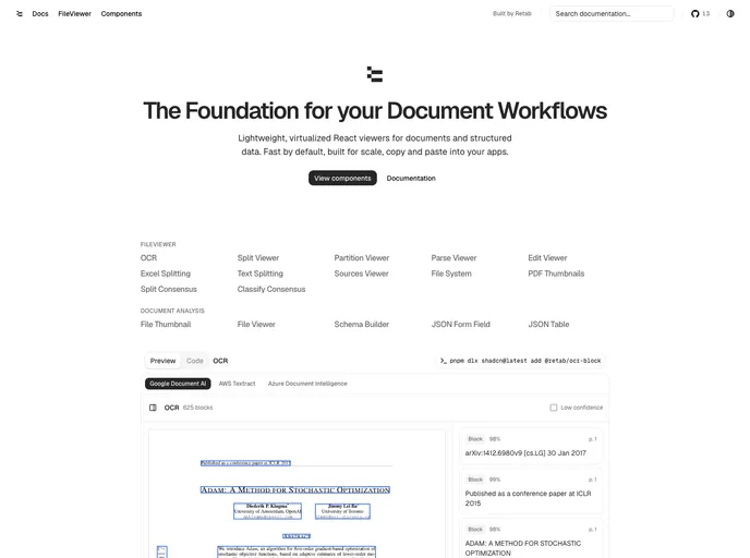

Retab
Document-processing UI components for Retab — file, OCR, and data viewers, schema builders, dropzones, and extraction blocks, built on shadcn/ui.
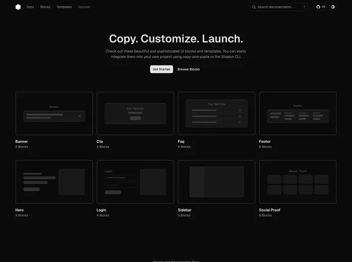

Hex UI
A shadcn/ui registry of high-quality React blocks and templates.
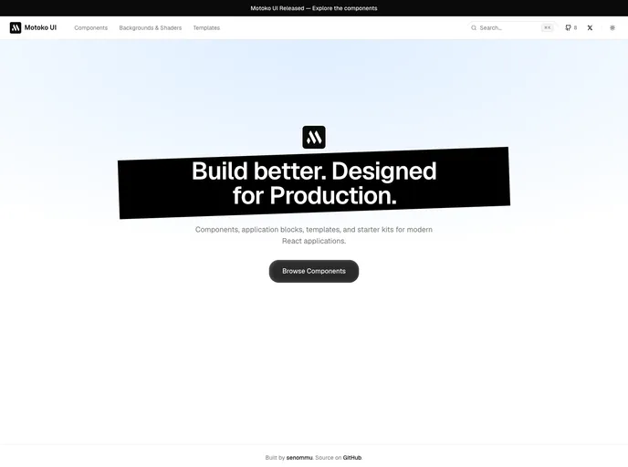

Motokoui
Components, application blocks, templates, and starter kits for modern React applications.
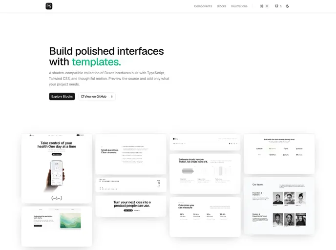

NavUI
shadcn-compatible components, blocks, and illustrations that adapt to your existing design configuration.
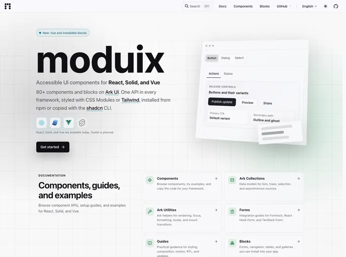

Moduix React
Ark-first React components, blocks, and themes with native CSS, available as a package or a shadcn-compatible copy-owned registry.
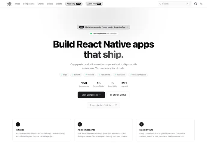

AniUI
Beautiful, accessible React Native components (Uniwind or NativeWind) — copy, paste, own the code. 93 components plus pre-built screen blocks, installable with the shadcn CLI.
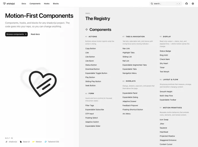

ericts/ui Registry
Motion-focused shadcn-compatible components, hooks, and blocks for polished React interfaces.
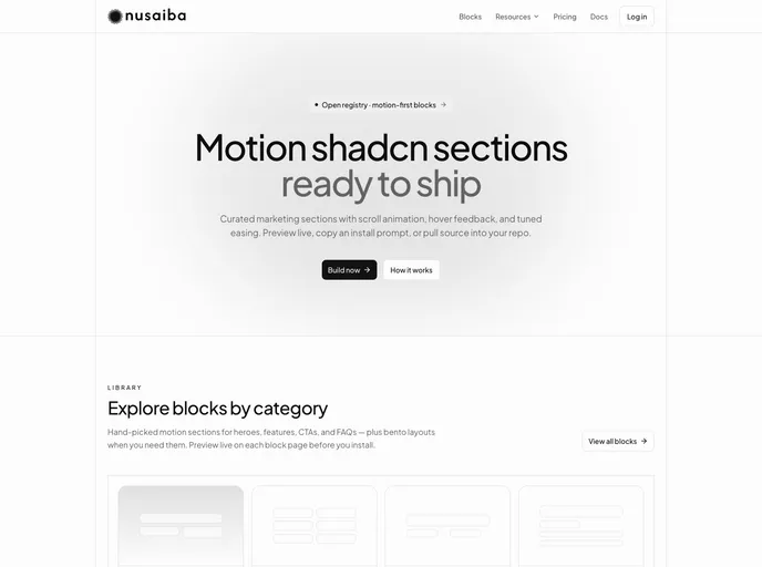

Nusaiba
Motion-first shadcn marketing blocks for landing pages — heroes, pricing, FAQs, footers, and more. Built on base-nova with intentional animation and CLI install.
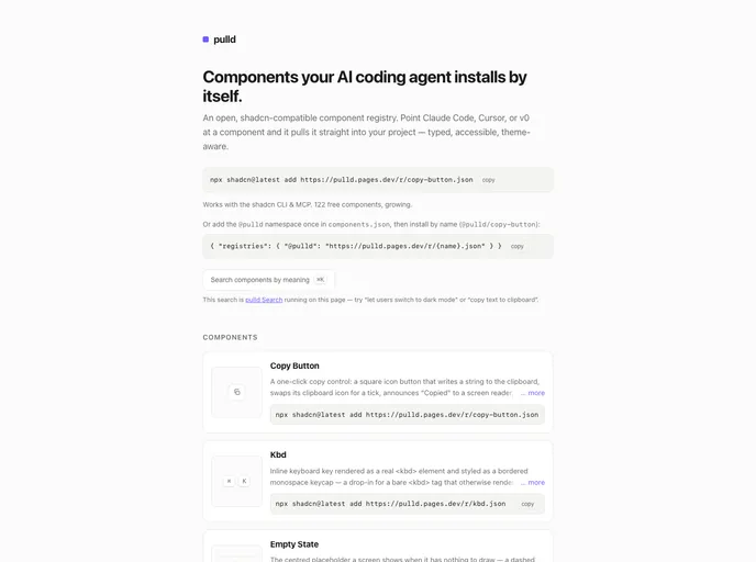

pulld
Typed, accessible, theme-aware React/Tailwind components installable by the shadcn CLI or your AI coding agent. Free atoms plus composed Pro blocks.
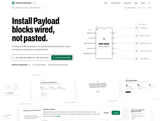

Payload Components
MIT registry of typed Payload CMS blocks for Payload v3 + Next.js. Each block installs as reviewable source; the companion CLI also wires collection config, RenderBlocks, types, and the admin import map.


Paceui
Carefully built UI blocks for real apps and dashboards, designed to integrate smoothly from early ideas to production releases.
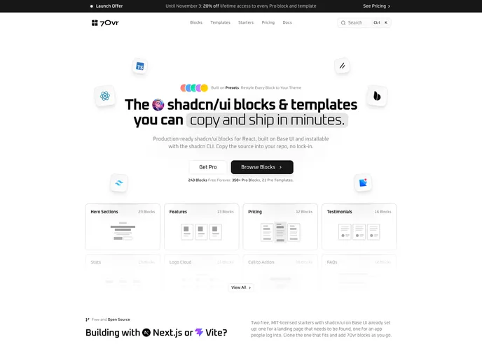

7ovr
A collection of shadcn/ui blocks and page templates for building modern, fast, and beautiful websites. Built on Base UI. Works with CLI and presets.
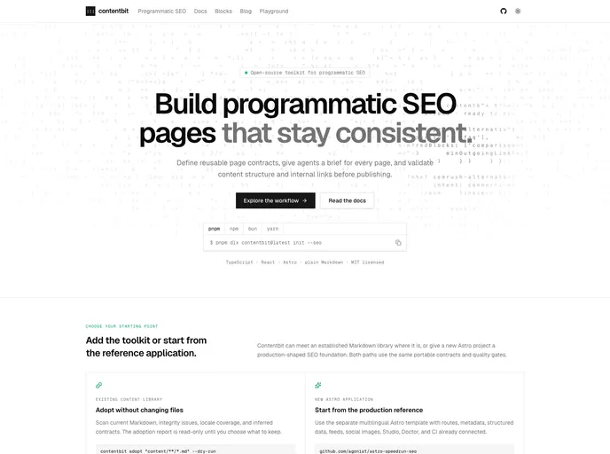

Contentbit
React components that render Content Blocks: plain Markdown with schema-validated directive blocks. Built for content written by humans, CMSes, and LLMs.
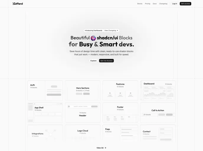

Efferd
Ready-to-use shadcn/ui blocks and components — modern, responsive sections installable via the @efferd registry.
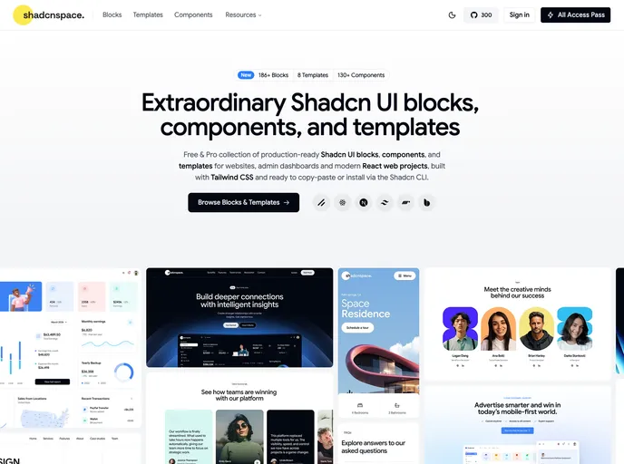

Shadcnspace
Open-source shadcn/ui blocks, components, and layouts built with React, Tailwind, and Base UI.
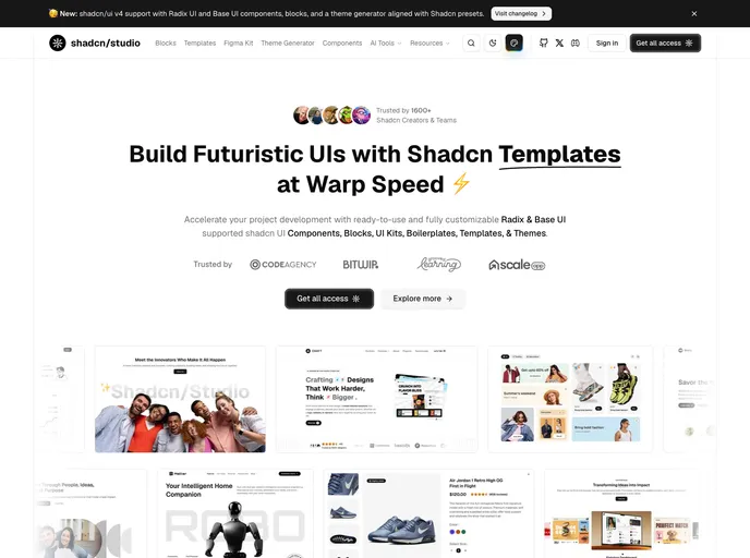

Shadcn Studio
Shadcn Studio is an open-source collection of shadcn/ui components, blocks, and templates designed for developers who are creating modern web applications using React and Next.js.
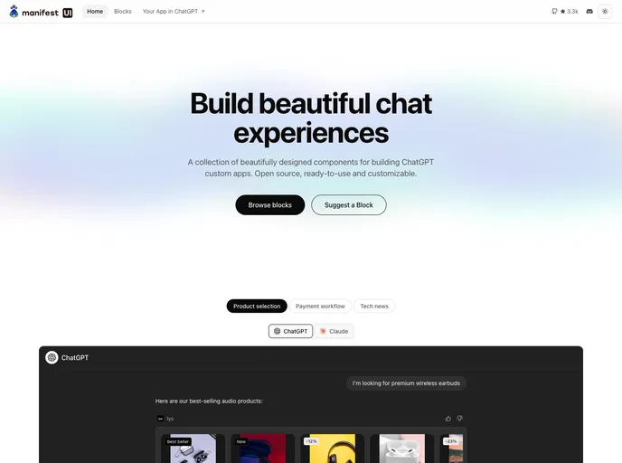

Manifest UI
A component library for building ChatGPT Apps and MCP Apps.


AI Elements by Vercel
AI Elements is a component library and custom registry built on top of shadcn/ui and Vercels AI SDK to help you build AI-native applications faster. It provides pre-built components like conversations, messages and more.
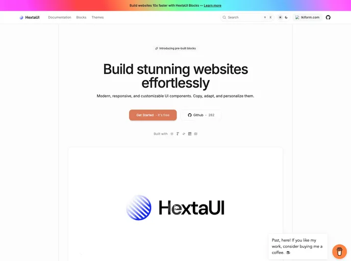

HextaUI
modern, responsive, and customizable ui components.
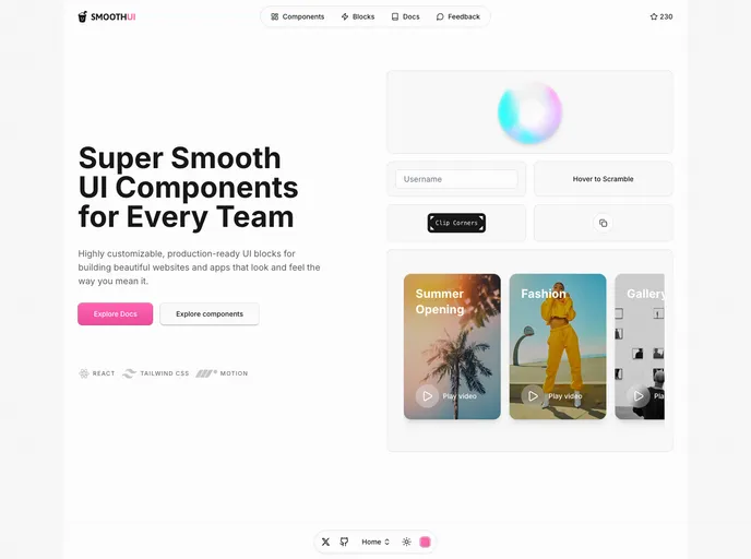

Smooth UI
SmoothUI is a collection of beautifully designed components with smooth animations built with React, Tailwind CSS, and Motion


Blocks.so
An open-source library of UI blocks. Built with React, Tailwind and shadcn/ui


Tailark
Shadcn marketing blocks


8bitcn UI
A set of retro-designed, accessible components and a code distribution platform. Open Source. Open Code.


Launch UI
Landing page kit built with React, Shadcn/ui and Tailwind that you can copy/paste into your project.


Spectrum UI
Spectrum UI is a collection of re-usable components built using Aceternity UI Magic UI and ShadCN UI that you can copy and paste into your apps.


Kibo UI
A custom registry of composable, accessible and open source shadcn/ui components.


Prompt Kit
Core building blocks for AI apps. High-quality, accessible, and customizable components for AI interfaces.


Kokonut UI
Collection of components built for Next.js and React with Tailwind CSS and shadcn/ui


UI Layouts
100+ Free beautifull interactive react/nextjs component based on tailwindcss, framer-motion, gsap etc


Simple AI
Components and blocks to easily build AI apps. A collection of ready-to-use UI components designed specifically for AI-powered applications.


Eldora UI
Eldora UI is a collection of re-usable components that you can copy and paste into your web apps. It primarily features components, blocks, and templates.


Motion Primitives
UI kit to make beautiful, animated interfaces, faster. Customizable. Open Source.
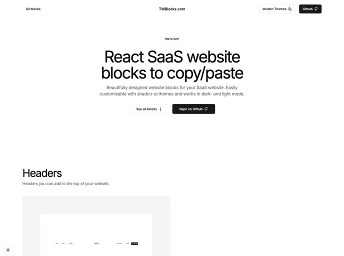

TWBlocks
Website blocks to copy/paste - based on shadcn & Radix using Tailwind and NextJS


Magic UI
UI library for design engineers — animated components and effects to copy and paste, plus 50+ premium sections and templates with Framer Motion.