


Shadcn Free Component Library302 listings
Free and open-source component library for shadcn/ui. See all component library, including premium options.


Shadcn UI
shadcn/ui is a collection of beautifully designed, accessible, and customizable UI components for React, built on top of Radix UI and styled with Tailwind CSS. Shadcn revolutionized UI libraries with a copy-paste model, giving developers full control without dependencies. Its component registry l...


Kibo UI
A custom registry of composable, accessible and open source shadcn/ui components.


Magic UI
UI library for design engineers — animated components and effects to copy and paste, plus 50+ premium sections and templates with Framer Motion.


React Bits
React Bits is a comprehensive collection of animated, interactive, and fully customizable React components designed for developers looking to create memorable websites.
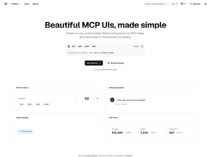

mcpcn
Free, open-source React components for ChatGPT, Claude and MCP apps: forms, payments, product lists, posts, maps and events, built on Base UI.
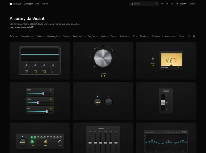
Visant UI
Brand-aware React components, blocks and app kits from Visant Labs: tokens, motion and analog-sound feedback that dress in your brand.
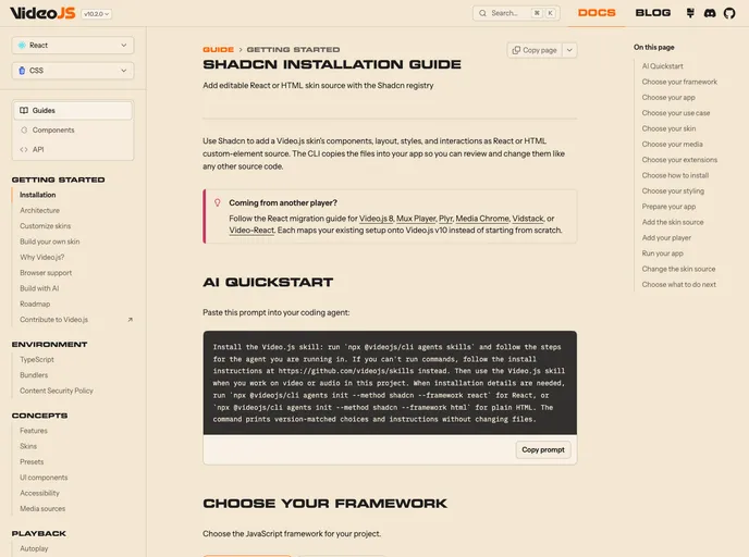

Videojs
Video, audio, and live player skins from Video.js, the open source web video player. Add a full skin or individual controls as editable React and Tailwind CSS source.
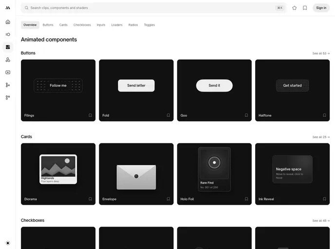

Movin
288 animated UI components: buttons, toggles, checkboxes, inputs, loaders, radios and cards. Zero dependencies for most, Framer Motion for a few, with a plain HTML/CSS version of each. MIT-0.


Cult UI
Free, open-source collection of 150+ animated components for shadcn/ui, built with Tailwind CSS and Motion. MIT licensed and installable with the shadcn CLI.
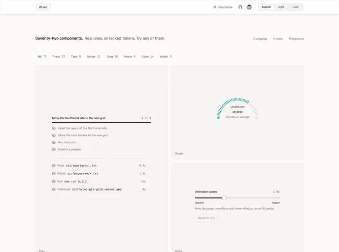

Litt
Technical precision, lit from above. Controls, overlays, data and agent components on warm stone neutrals, with glass only on what floats. Every token is prefixed litt-, so your app's theme stays untouched.
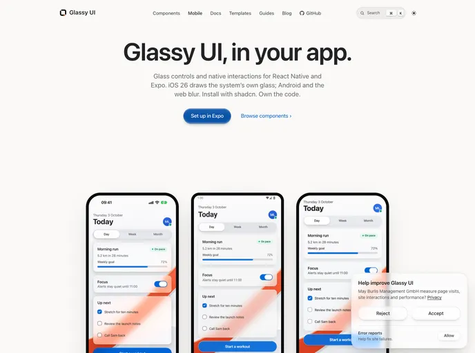

Glassyui Native
Glassy UI for Expo: 29 React Native components, drawing the system's own glass on iOS 26 and blur elsewhere.


Cult UI Pro
Cult UI Pro — polished shadcn marketing blocks, components, full-stack patterns, and Next.js SaaS templates. Open-source components on GitHub; lifetime license for blocks, templates, and updates.
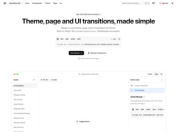

Transition Kit
Free, open-source theme, page and UI transitions for React built on view transitions: 19 theme-switch styles, 18 page transitions and 17 animated UI components.
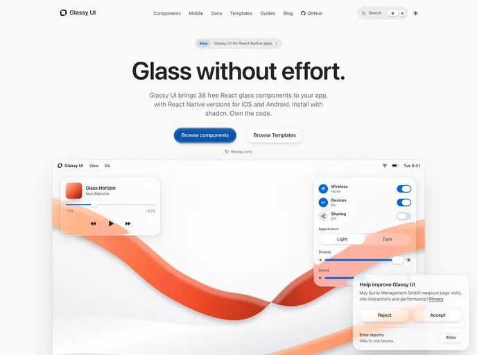

Glassy UI
Glassy UI for React and Next.js: 37 glass components, a CSS glass theme, and drop-in component sets.
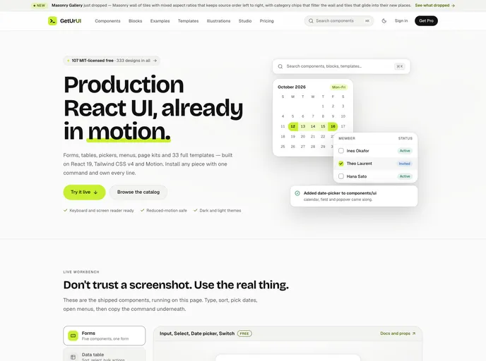

Geturui
Animated React components, blocks, charts and AI-chat UI built with Tailwind CSS v4 and Motion. Free MIT library with an MCP server so coding agents can install them.
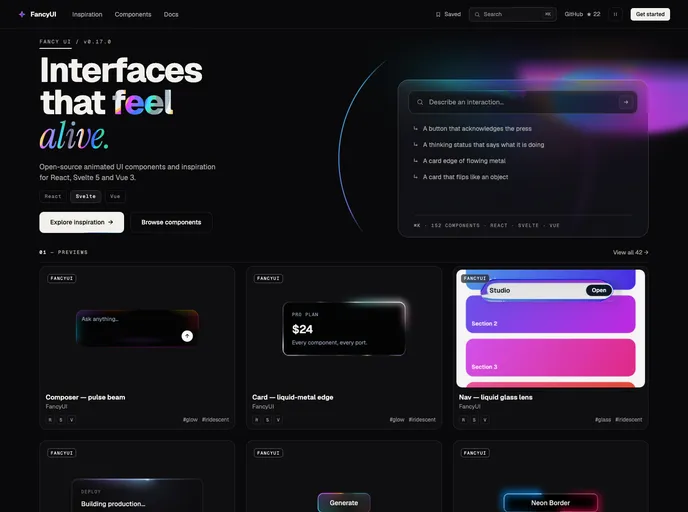

FancyUI
145 animated React components with motion, glow and sound effects, built with Tailwind CSS v4.
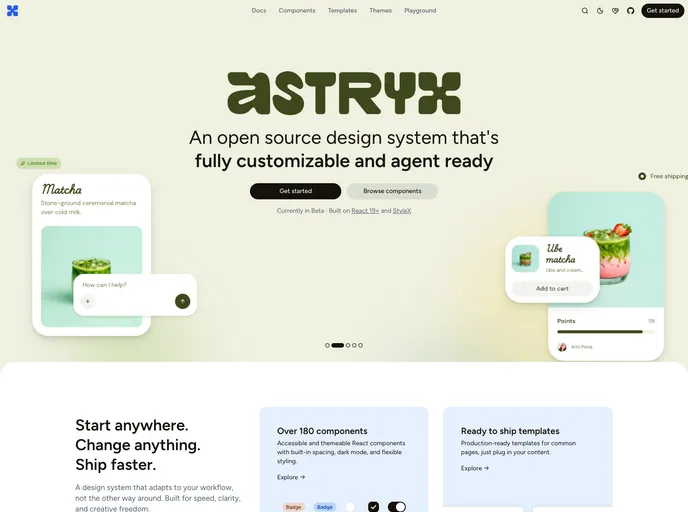

Astryx Design System
Meta's open source design system: accessible React components, hooks, examples, and page templates. Components install as re-exports of the Astryx package; examples and pages copy editable source.
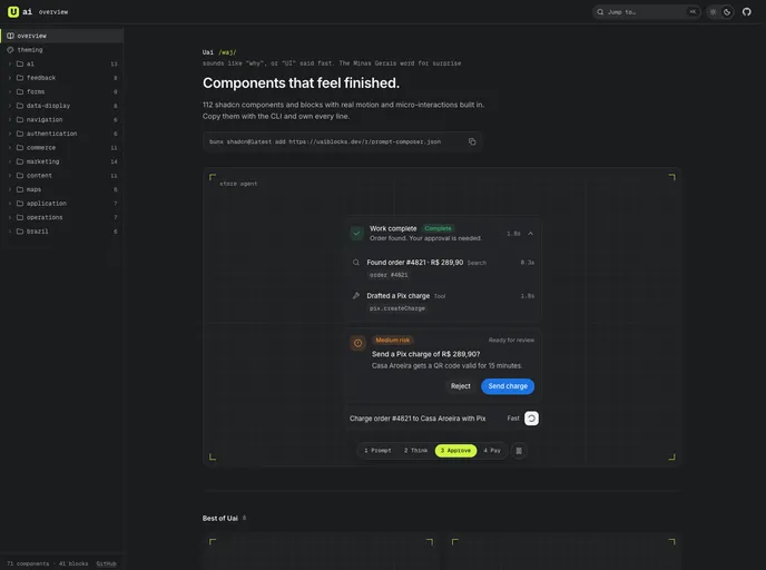

Uai
Compound React components and page blocks with motion and micro-interactions built in, including AI agent UI (prompt composer, thinking, approvals) and Brazilian commerce (Pix, CEP, installments).
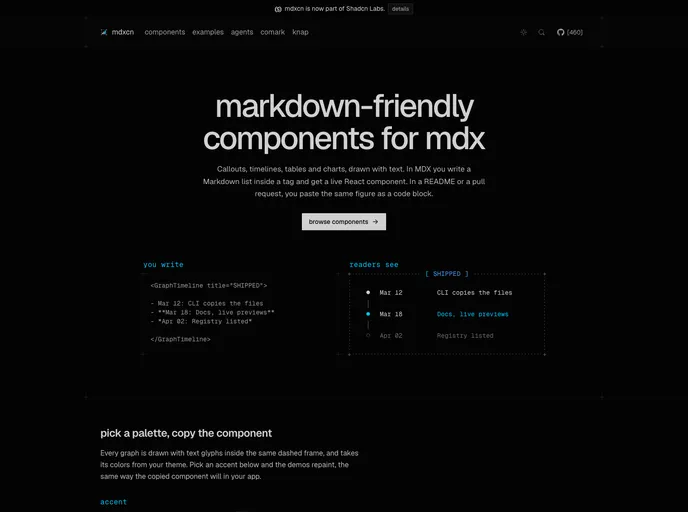

mdxcn
Free, open-source Markdown-friendly components for React: callouts, steps, terminals, changelogs and 30+ text-drawn charts and diagrams for MDX docs.
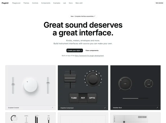

PluginUI
Design modern interfaces for instruments and effects, on the web or in native DAWs. Customizable controls and themes powered by the Maru Audio platform.
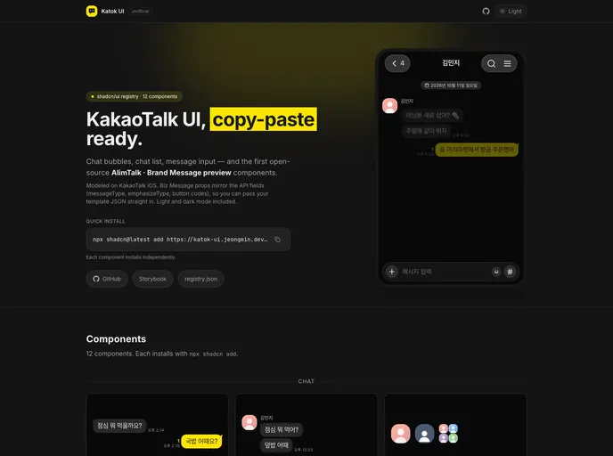

Katok UI
Unofficial KakaoTalk (카카오톡) chat UI for React: chat bubbles, chat list, message input, and Kakao AlimTalk (알림톡) / Brand Message previews with API-shaped props. Tailwind CSS v4, light and dark.
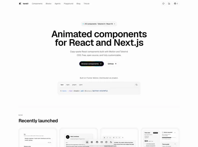

Kara UI
Animated React components, AI agent interfaces and app blocks built with Motion and Tailwind CSS, with ten switchable design styles.
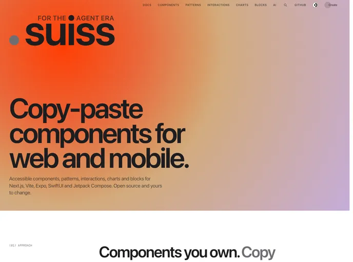

Suiss UI
Copy-paste components, patterns, interactions, charts and blocks for React with Next.js and Vite, React Native with Expo, SwiftUI and Jetpack Compose.
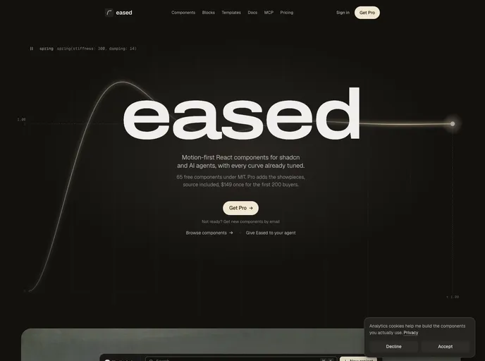

Eased
Motion-first React components and blocks for shadcn, with tuned springs, light and dark themes, and an MCP server for AI agents.
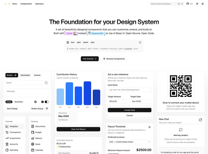

shadcn-cssinjs
An unofficial StyleX port of shadcn/ui: accessible copy-paste components built on Base UI and styled with CSS-in-JS instead of Tailwind.
Dualkit
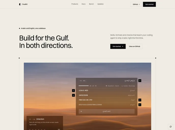
Bilingual Arabic and English components for Gulf products: RTL-aware buttons, sheets, tabs and toasts, Gulf money, Hijri dates and Arabic digit input.

Crucible
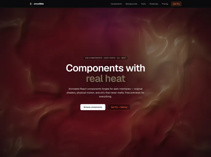
Animated React components with real heat: 100+ free, MIT-licensed WebGL and canvas backgrounds, text effects, cards, data viz, and AI chat UI. TypeScript, Tailwind v4, reduced-motion safe.

Chewypixel
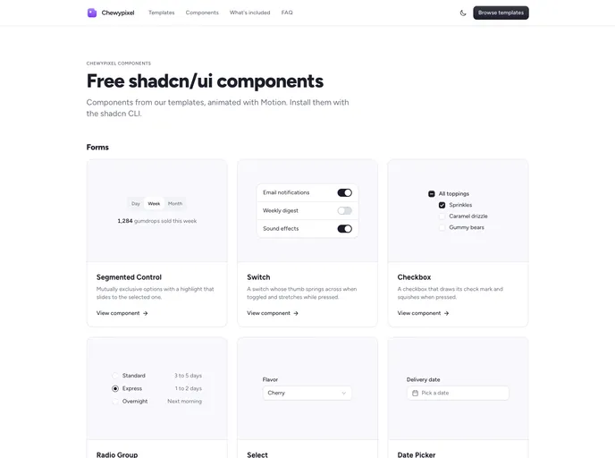
Animated components from the Chewypixel templates, built with Motion.
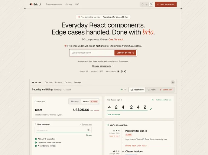

Brio
Everyday React components with the edge cases handled: FAQ, pricing toggle, code input and more. One file each.
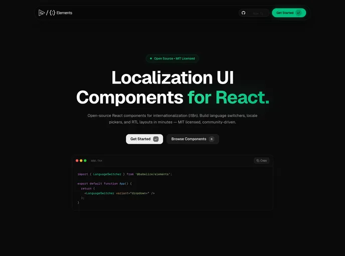
Babelize Elements
Open-source localization components for shadcn/ui: language switchers, locale-aware number and relative-time formatters, phone input, localized navbar, and a translation widget.
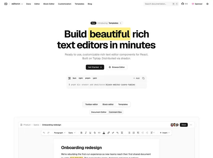

editorcn
Free, open-source rich text editor components for React, built on Tiptap and themed by your shadcn/ui tokens, with slash commands, a block editor and 20+ toolbar controls.
Bevel
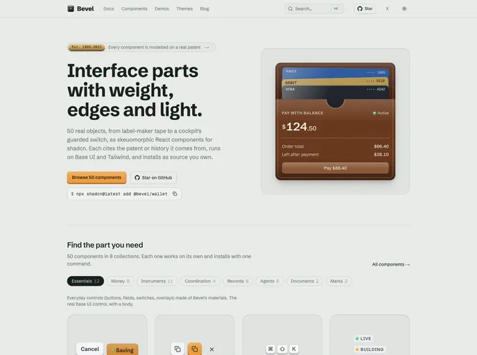
Tactile, skeuomorphic React components for real product work: guarded switches, annunciators, motorized faders, split-flap boards. Base UI and Tailwind CSS v4.
Bricked UI
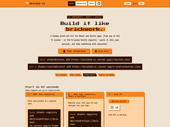
A chunky pixel-art kit for React and Svelte apps. Pick any of the 91 pieces.


Creance
React components for supervising AI agents: approvals, tool calls, run timelines, diff review and handoffs. 109 components, light and dark.
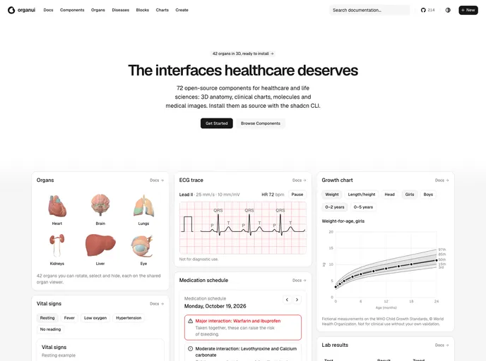

OrganUI
Healthcare and life sciences components: 3D organ viewers, anatomy trees, vital signs, lab results, ECG traces, medication schedules and molecule viewers.
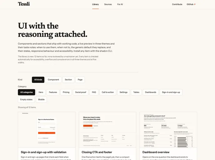

Tessli
Sections, pages and components on shadcn/ui primitives, each with notes on when to use it, when not to, the UI rules it follows and the generic default it replaces. Also installs a compact rules file, TESSLI.md.
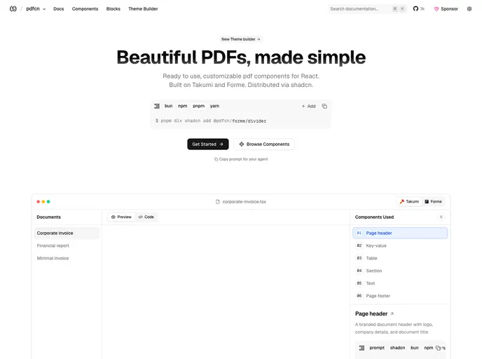

pdfcn
Free, open-source PDF components and blocks for React, built on Takumi and Forme and installed with the shadcn CLI. Invoices, reports, tables, charts and more.
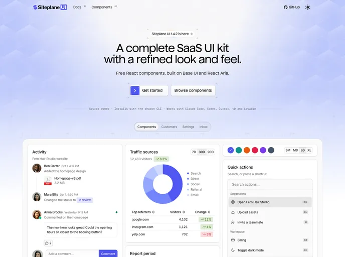

Siteplane UI
Finished React components with every state and micro-interaction built in, plus a skill for your coding agent. Free with full source.
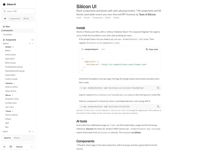

Silicon UI
Free, open source React components and blocks with calm, physical motion. Live previews with editable props, Markdown docs and llms.txt for AI tools.
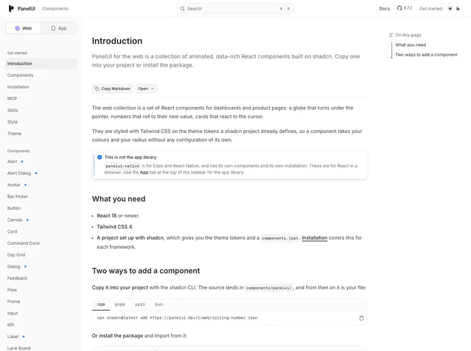

Panelui
Tailwind CSS components for React: KPI tiles, a lane board, flow diagrams, an interactive globe and more, from the PanelUI design system.
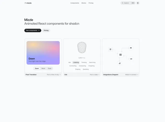

Mizzle
Animated React components installed as source. Text Reveal, Number Roll, Link, Field and Input are free; the rest comes with a one-time license.
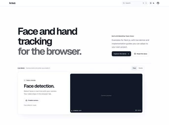

Krave Docs
A professional collection of reusable, real-time computer vision components powered by MediaPipe
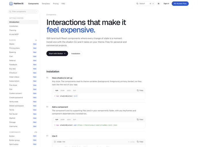

Hairline
Interaction-first React components where every change of state morphs: one file each, no animation library, hairline borders.
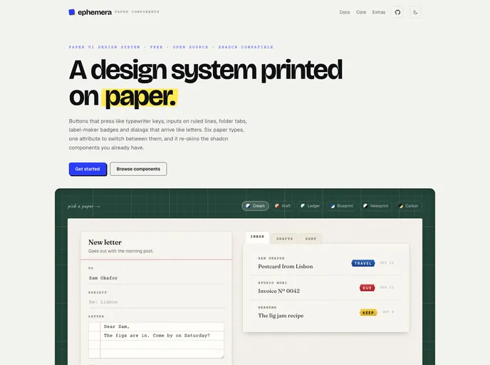

Ephemera
A paper UI design system: shadcn/ui-compatible components styled as stationery, with six paper themes, fonts and theme CSS that install in one step.
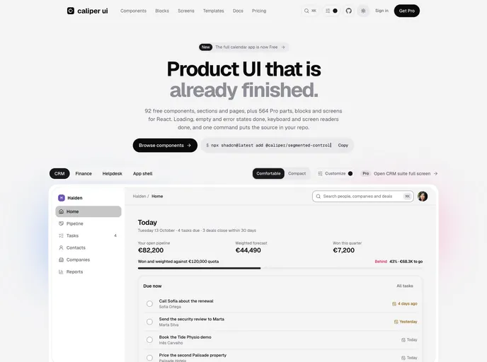

Caliper UI
React components, blocks and complete product screens drawn to one specification. Accessible by default, with every state designed. Free parts are MIT and install as source you own.
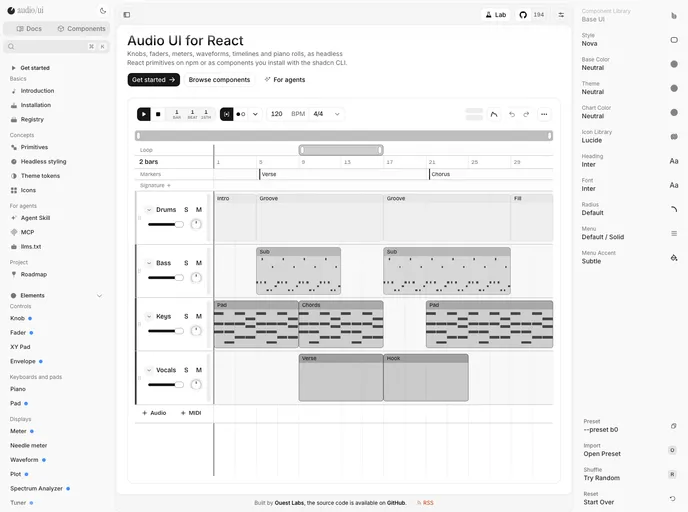

audio/ui
Accessible audio controls for React: knobs, faders, XY pads, meters, waveforms, timelines, sequencers and piano rolls, on headless primitives from @audio-ui/react.
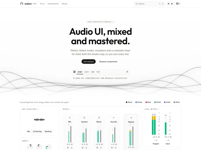

audiocn Solid
Audio components for Solid, distributed as source through shadcn.
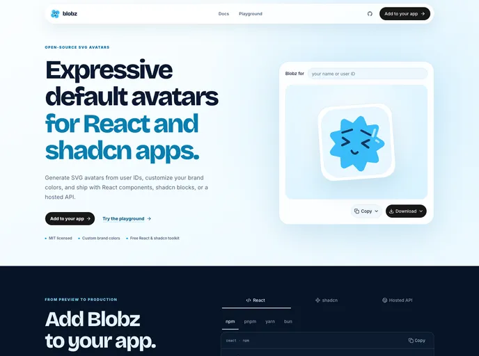

Blobz
Playful, deterministic blob avatars for React.


LiquiKit
Liquid glass components for React with physically based refraction that works in Chrome, Safari and Firefox. Built on Base UI.
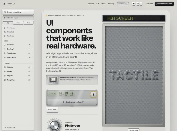

Tactile
Interface pieces that behave like hardware: an odometer that carries, a liquid-damped compass, a pull-cord lamp, engraved plates and a machined footer. Vanilla JS and CSS with React, Vue and Svelte wrappers. MIT.
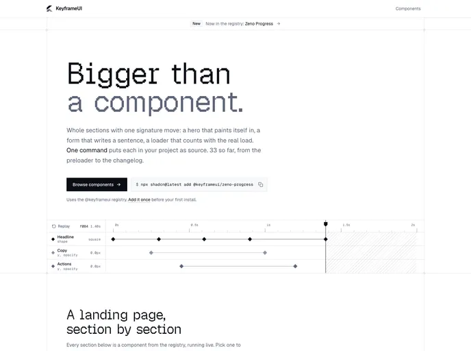

Keyframeui
Animated React components built with Tailwind CSS, Motion and GSAP, installable with the shadcn CLI.
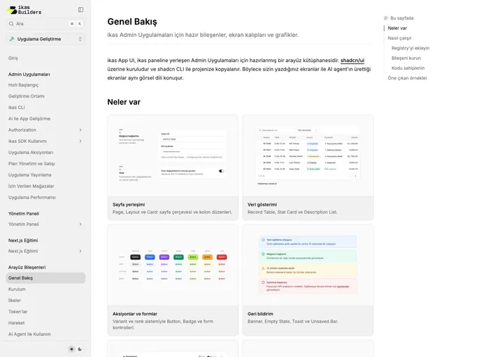

Ikas
UI components and screen patterns for building apps on ikas.
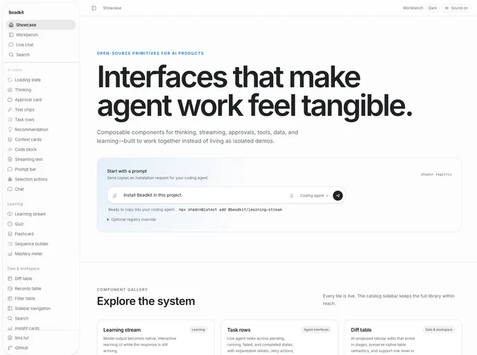

Beadkit
Learning primitives for AI-native interfaces: inline quizzes, flashcards, sequences, and mastery meters with streaming support and xAPI telemetry.
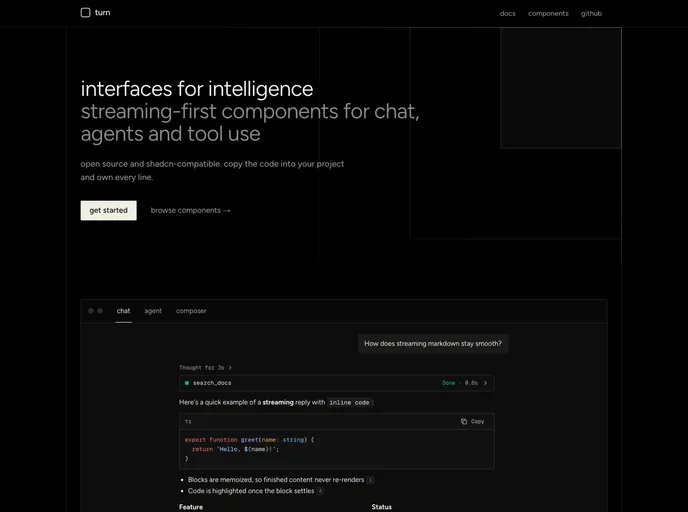

turn
Minimal, accessible components for AI apps: chat, agents and tool use. Streaming-first, built on Base UI and Tailwind.
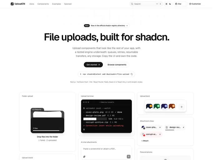

Uploadcn
Production-ready file uploads: dropzones, queues, resumable S3 and R2 uploads, and 58 blocks for every style.
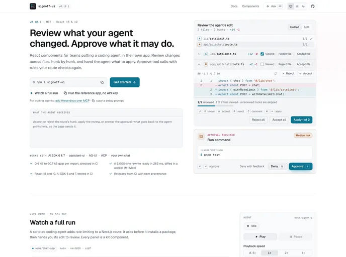

Agent UI Kit
Accessible React components for agent runs: tool call timeline, human-in-the-loop approvals, per-hunk diff review and run telemetry, typed against AI SDK message parts.
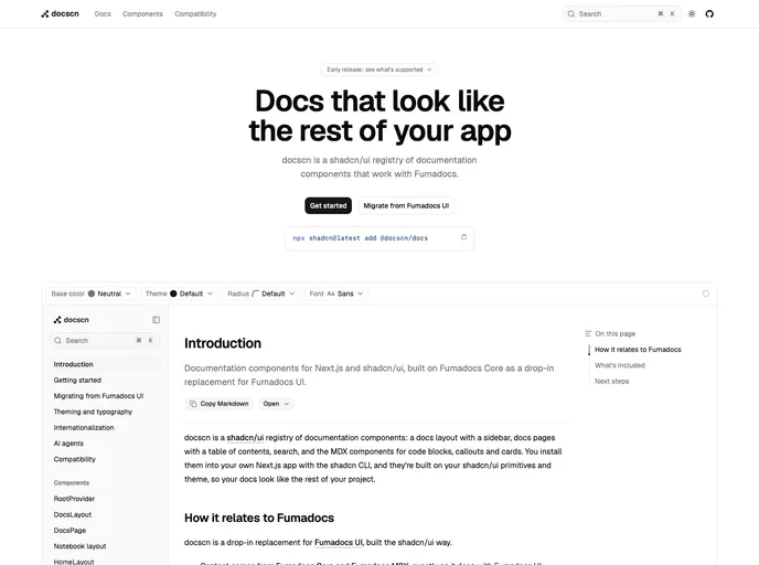

Docscn
Documentation components built on Fumadocs Core: docs layouts, sidebars, tables of contents, search and MDX components. A drop-in replacement for Fumadocs UI.
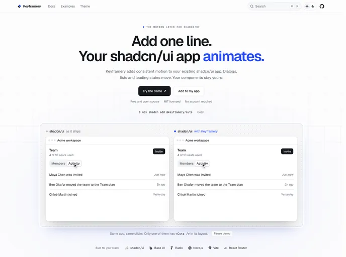
Keyframery
An open-source motion layer for shadcn/ui. One \x3CCuts /> line animates your dialogs, sheets, tabs and toasts; four helpers animate lists, numbers, skeletons and cards.
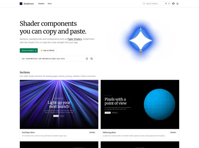

shaderscn
Copy-paste shader sections and components for shadcn/ui, built on Paper Shaders.
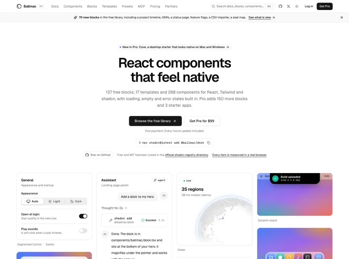
Ballmac
Accessible React and Tailwind v4 components, blocks and templates with native-app motion, built-in keyboard, RTL and translation support, and an MCP server for AI agents.
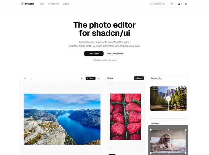

photocn
The photo editor for shadcn/ui. Typed React components on a WebGL engine: adjustments, curves, filters, crop and transform, export. Add the whole editor with one command, or compose your own.
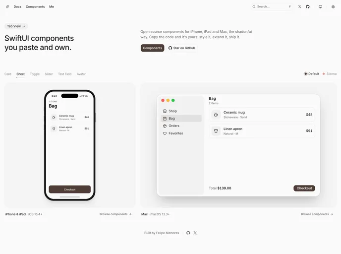

Swiftui Flx
SwiftUI components for iPhone, iPad and Mac, the shadcn/ui way. Native controls, design tokens, themes and dark mode. Install with the shadcn CLI and own the Swift code.
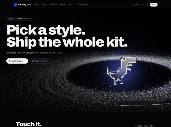

Viberdy
Animated React and Tailwind components in 14 design styles, from glassmorphism and aurora to kinetic type and dither, each with an AI prompt. 161 are free with source at github.com/viberdy-dev/ui; Pro items need an API key.
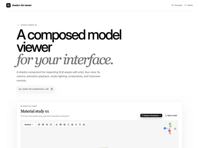

shadcn-3d-viewer
A composable 3D model viewer for shadcn/ui with inspection, animation, multiple cameras, screenshots, and fullscreen support.
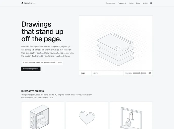

Isometric
Isometric line figures and UI primitives for React. SVG drawings that answer the pointer, and buttons, cards and tabs that stand on their own depth.
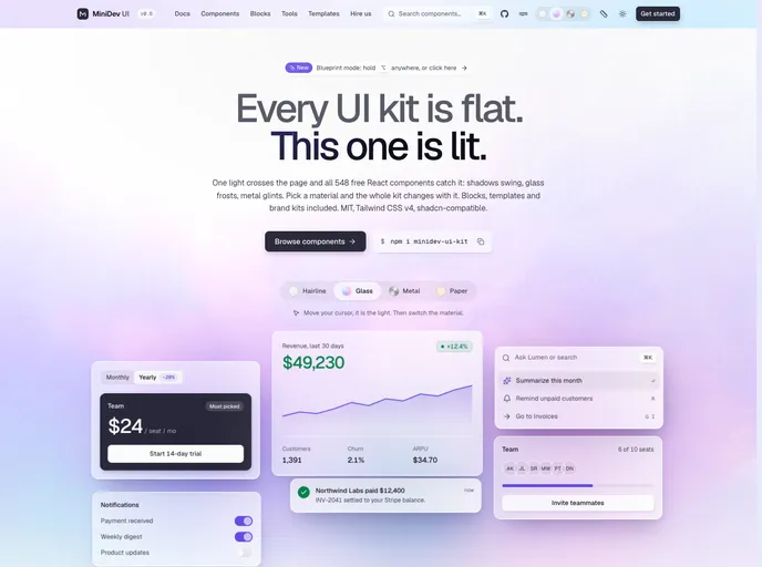

Minidev
500+ free components, blocks and motion pieces for product UI: data tables, billing, settings, command palettes and AI chat. Built on Base UI, Tailwind CSS v4 and motion.
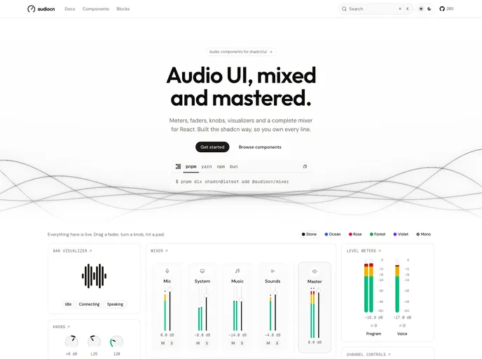

Audiocn
Audio components for React, built the shadcn way. Level meters, visualizers, faders, knobs, channel strips, a complete mixer, players and sound pads.
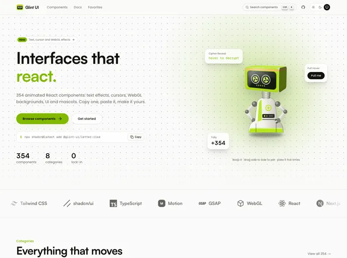

Glint UI
354 animated React components you copy, paste and own: text effects, cursors, WebGL backgrounds, micro-interactions, UI primitives and mascots. Built with Tailwind CSS v4 and shadcn tokens.
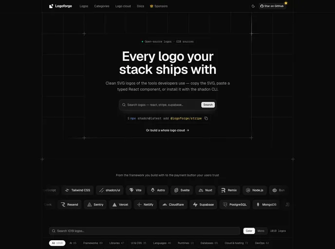

Logoforge
900+ brand logos for developers as typed React components with automatic dark mode and mono variants. Includes logo cloud sections and African brands. Free and open source.
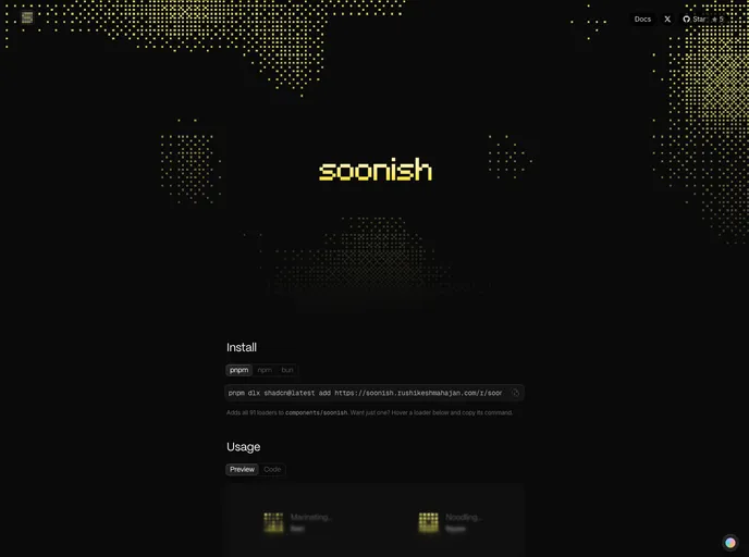
soonish
91 loading animations for React, each on a 5×5 grid of dots, animated with plain CSS. Server Component-ready.
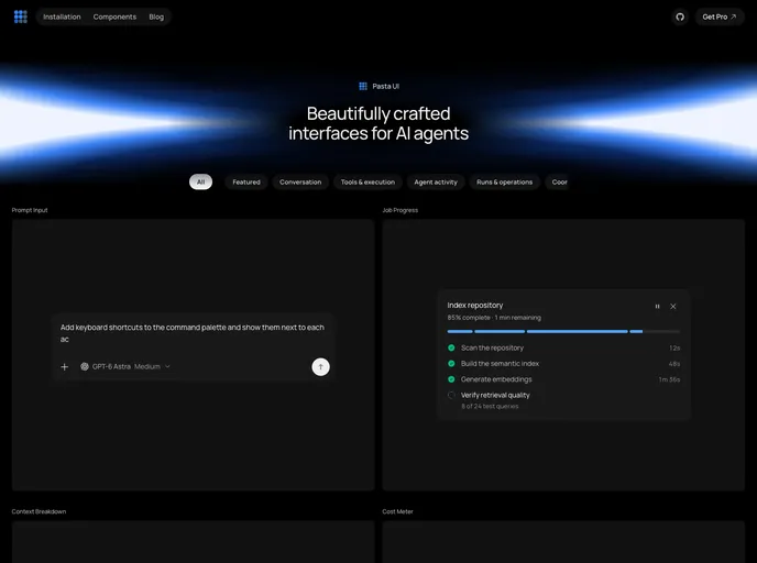
Pasta UI
Open-source React components for AI agent interfaces: conversations, tool calls, approvals, background runs, and rich outputs.
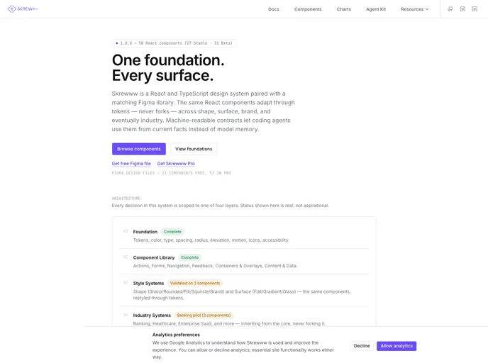

Skrewww Design System
Open-source React and TypeScript design system with a token-driven foundation, live documentation, and machine-readable component contracts for coding agents.
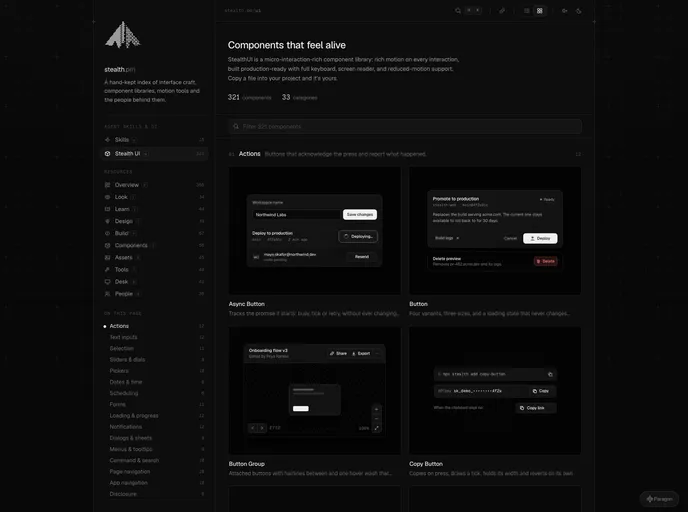

Stealth UI
Components that feel alive. A micro-interaction-rich React library: rich motion on every interaction, production-ready with full keyboard, screen reader and reduced-motion support.
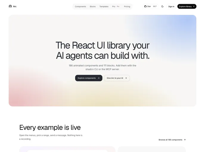

Arc
React components and blocks with motion built in. Source you own, with Markdown docs and llms.txt so AI tools install them correctly.
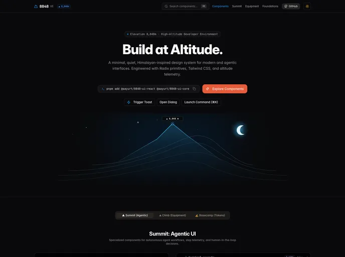

Aayurt
Minimal, precise Himalayan-inspired React components on Radix primitives and Tailwind CSS. Buttons, overlays, tables, forms and agentic patterns you can own.
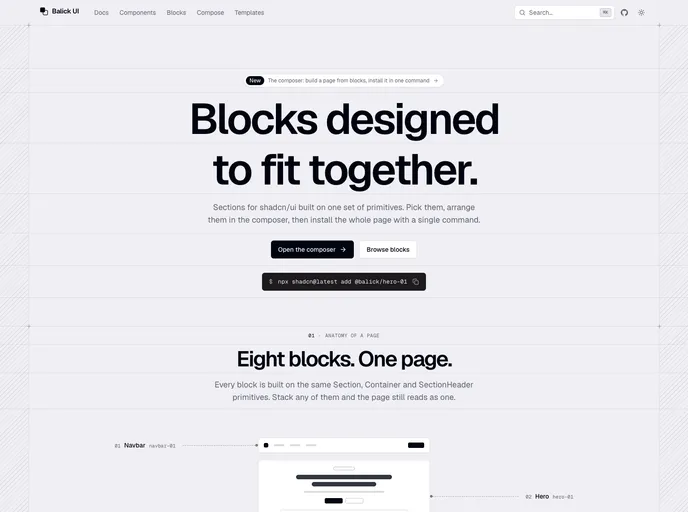

Balick UI
Blocks for shadcn/ui designed to fit together: compose a page, then install it with one command.
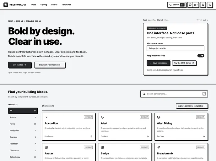

neobrutal-ui
Neobrutalist React UI with staged press feedback, shared themes, and editable Next.js page templates, built with Base UI.
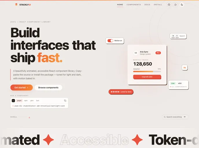

StacklyUI
Animated React components — built with Tailwind CSS and Motion, installable via the shadcn CLI. Copy-paste source you own and can customize.
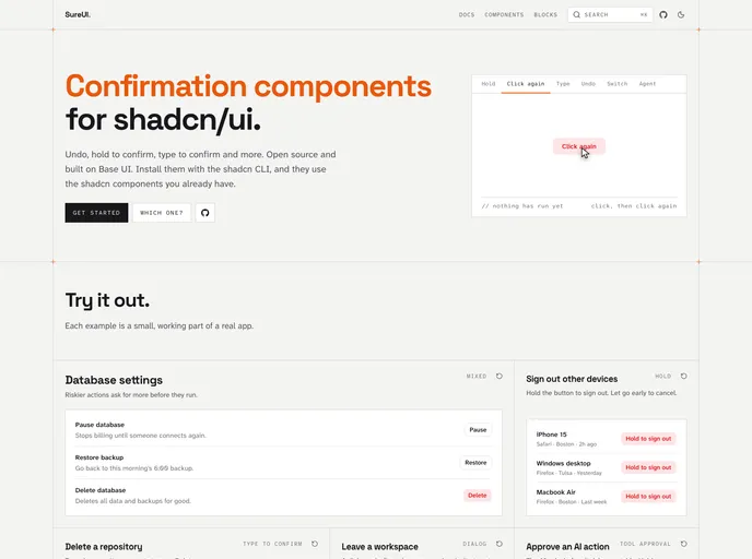

SureUI
Open source confirmation components for shadcn/ui: undo, hold to confirm, type to confirm and more. Built on Base UI.
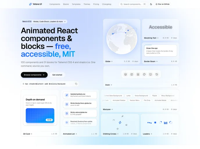

Velora UI
100 animated React components and 31 free section blocks for Tailwind CSS 4 — accessible, reduced-motion safe and MIT licensed.
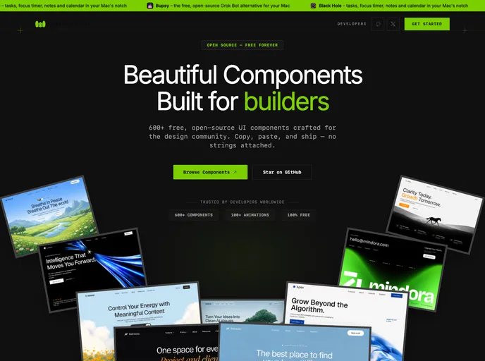

Watermelon
Free, open-source React components, animated interactions, blocks, dashboards, and templates for shadcn/ui projects. Install with the shadcn CLI and own the source.
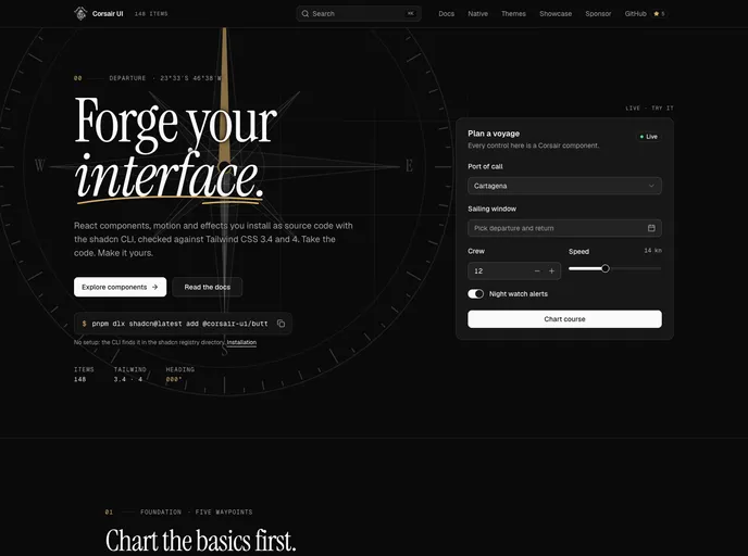

Corsair UI
Copy-and-own React components for Tailwind CSS 3 and 4: forms, overlays, site chrome, motion, animated text and backgrounds.
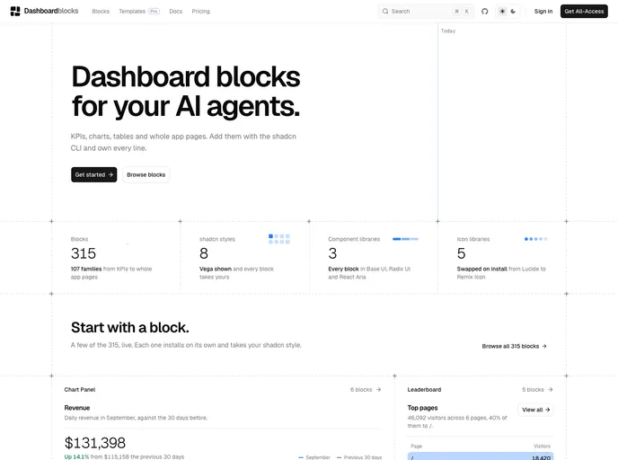

Dashboardblocks
Dashboard blocks for shadcn/ui: KPIs, charts, tables, funnels, heatmaps and full dashboards. Works with Base UI, Radix UI and React Aria, and every style and icon library.

Dgit
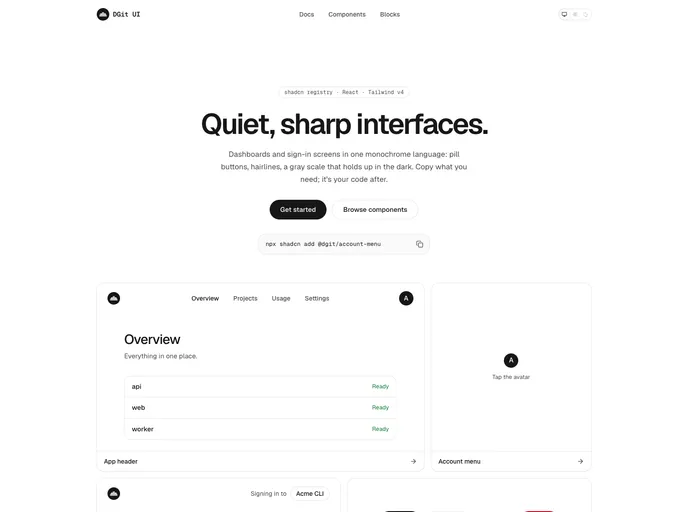
Quiet, sharp React components for dashboards and sign-in screens: a neutral light and dark theme, pill buttons, menus, an account menu, an app header, a sidebar layout, and a sign-in page.

ecomcn
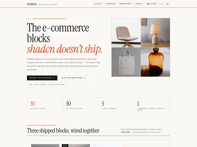
E-commerce blocks for shadcn/ui, organised by the purchase funnel — product cards and grids, URL-driven filters, sort, load more, quick view, empty states and the order summary.
Fibo
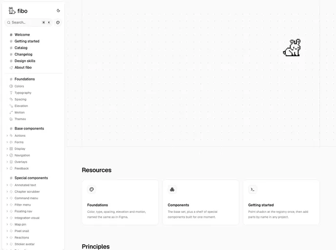
An achromatic design system on Base UI: the standard parts plus playful niche components, with semantic tokens that match Figma variables one to one.
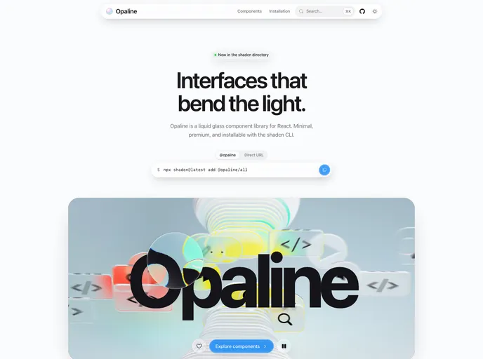
Opaline
Liquid glass components for React — real backdrop refraction, Apple-inspired, minimal and premium. Docks, sheets, command palette, knobs and more.
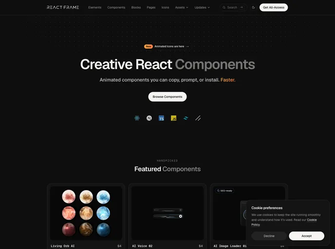

Reactframe
Animated React components, blocks and elements built with Tailwind CSS and Motion. 150+ free, open-source items install with the shadcn CLI; premium components are sold separately.
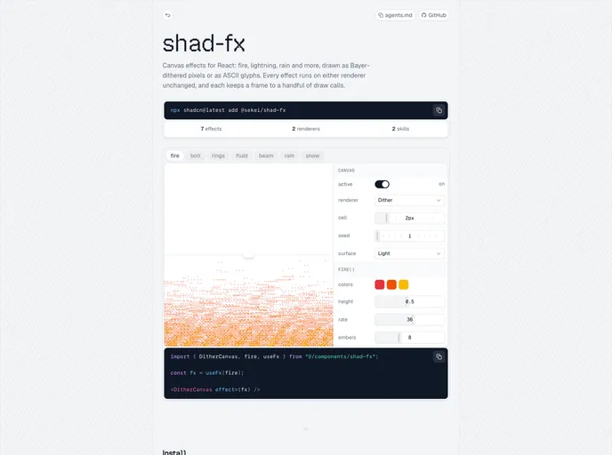

Sekei
Canvas effects for React, copied into your project as source. Starts with ordered dither: fire, lightning, sonar rings, a light beam, a sloshing fluid, rain and snow.
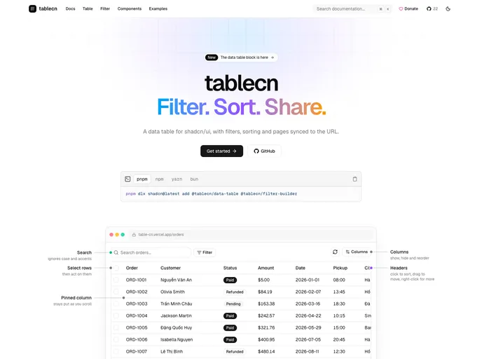

Tablecn
Data table and filter builder blocks with search, sorting, pagination and URL-synced filters. Built for Radix UI, Base UI and React Aria.
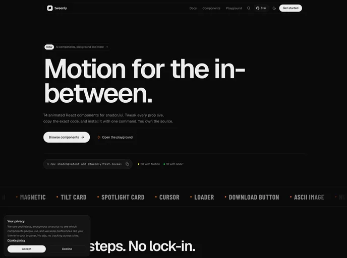

Tweenly
Animated React components built on Motion and GSAP. Tweak every prop live, copy the code, and own it.
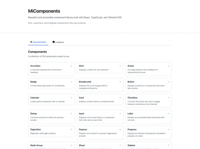

Avertra UI
A collection of React components built with Tailwind CSS, designed to help you create beautiful and responsive user interfaces with ease.
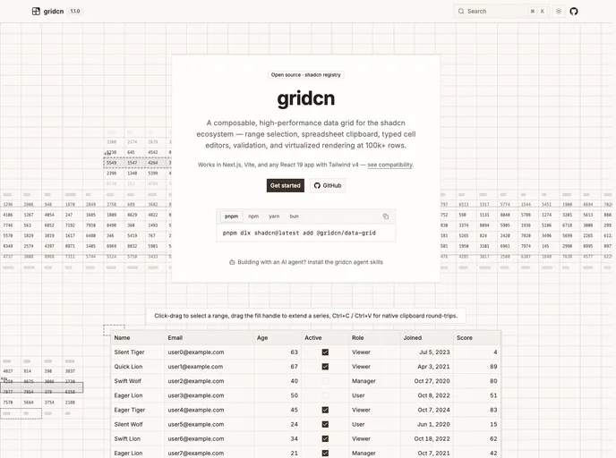

gridcn
An editable, composable data grid for the shadcn/ui ecosystem: range selection, spreadsheet clipboard, fill handle, pinning, undo/redo, and streaming updates. Real DOM cells, shadcn styling.
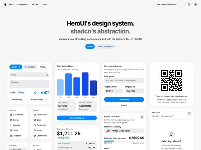

herocn
HeroUI's design system, shadcn's abstraction.
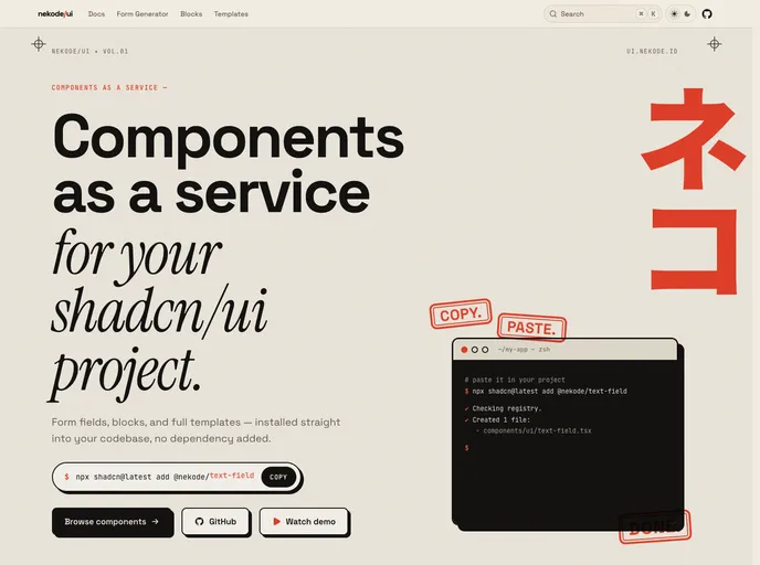

nekode/ui
Composed ready to use shadcn components, just plug and play.
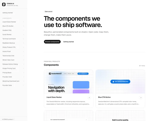

Starck
Product-proven React components from STARCK, built on shadcn with polished motion, responsive behavior, and accessible defaults.
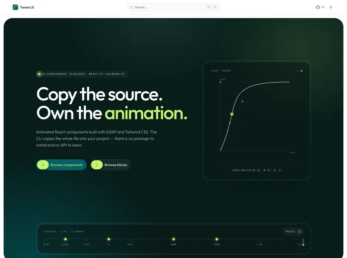

Tween UI
GSAP & CSS animated React components and blocks. One file each, no shared runtime, reduced-motion handled.
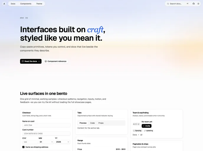

ARK CN
Accessible shadcn/ui components built with React, TypeScript, and Tailwind CSS. Copy-paste ready, and customizable. Built by ARK UI.
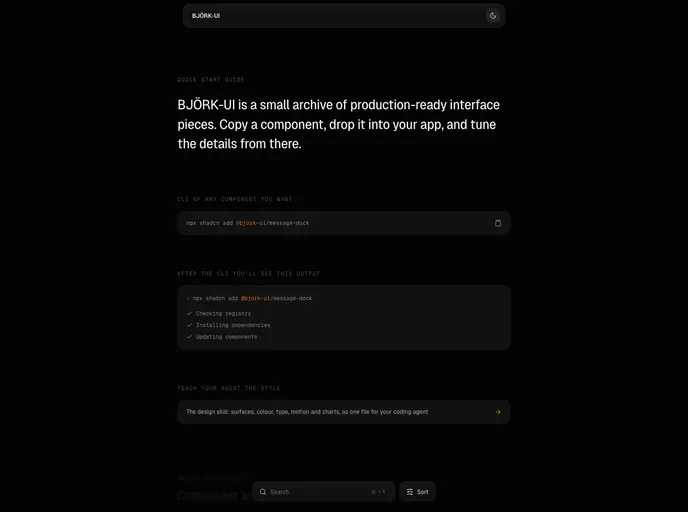

Bjork UI
Production-ready animated interface components, primitives, and WebGL shader studies for React and Tailwind CSS.
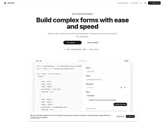

BuzzForm
Type-safe, schema-based forms for shadcn/ui apps. Auto-generate UI with validation and state out-of-the-box with minimal boilerplate.
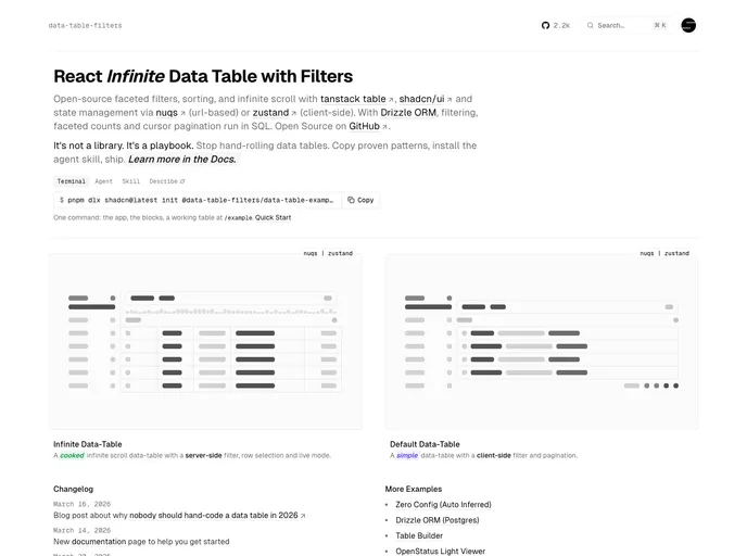

Data Table Filters
Data tables for React and shadcn/ui: faceted filters, sorting, infinite scroll, row detail sheet, and server-side filtering with Drizzle. Built on TanStack Table. Powered by openstatus.
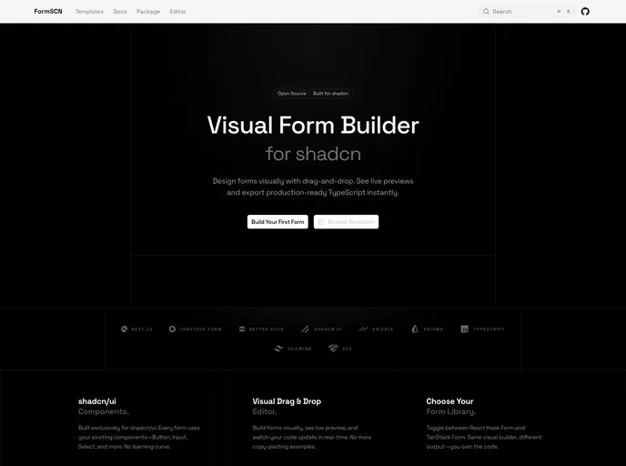

FormSCN
Production-ready shadcn/ui forms visually with drag-and-drop.
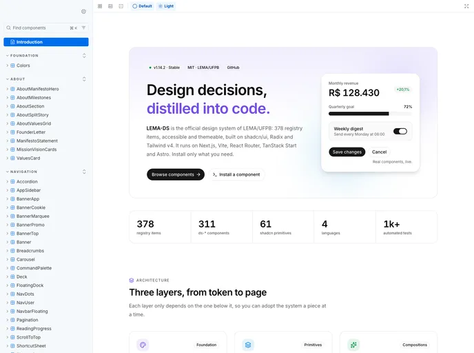

Lema Ds
Enterprise-grade design system and component library for LEMA-UFPB
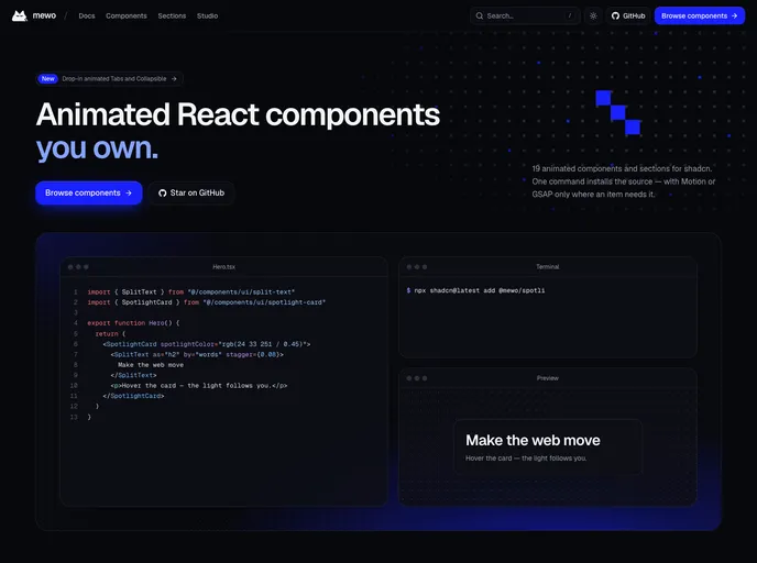
mewo
Animated React components and page sections built on Tailwind CSS v4, powered by Motion and GSAP. Every item respects prefers-reduced-motion and installs only the dependency it needs.
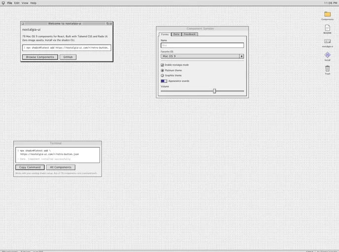

nostalgia-ui
Mac OS 9 styled components for React. 60 retro UI primitives with platinum bevels, system fonts, and pixel-perfect details. Pure CSS, zero images.
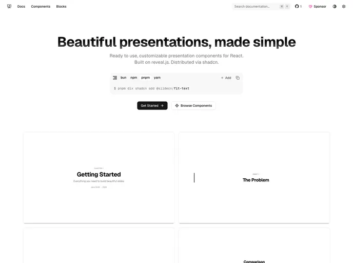

slidecn
Beautiful presentations, made simple. Ready to use, customizable presentation components for React.
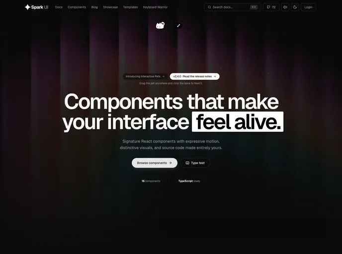

Spark UI
Open-source React components and animated UI building blocks, installable as source with the shadcn CLI.
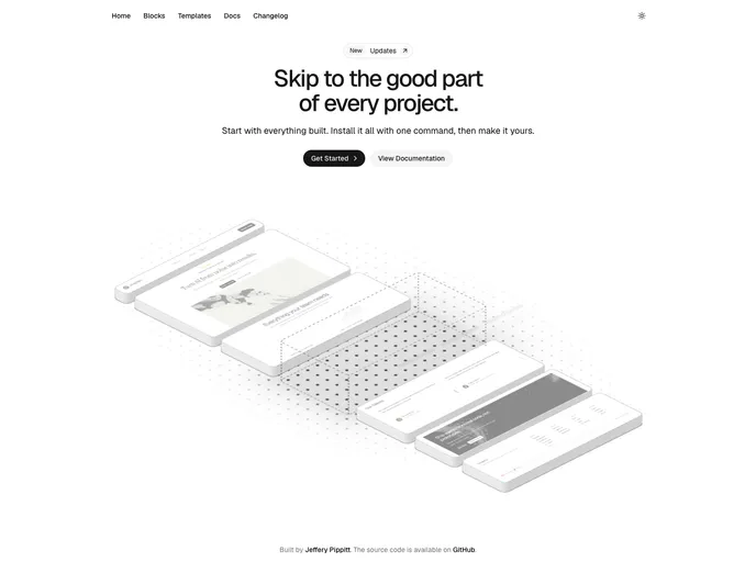

uiception
Launch with everything built. Just make it yours.
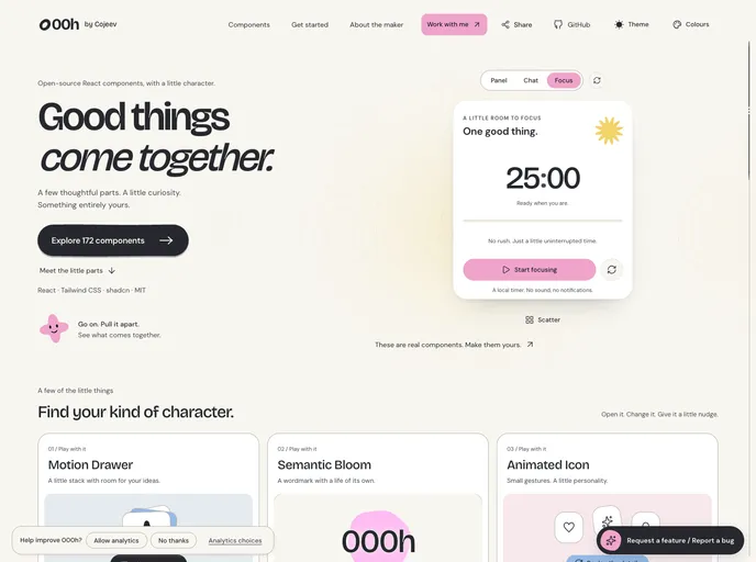

000h Cojeev
Expressive React components with organic shapes, purposeful motion, and source you can make your own.
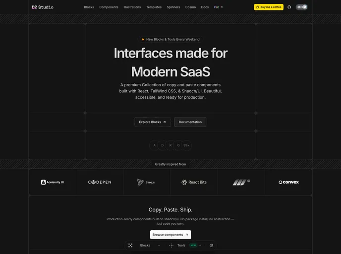
D2 Studio
Ultra modern monospace component library for React and Tailwind CSS v4 — AI cards, bento grids, dashboards, hero sections and animated pixel spinners.
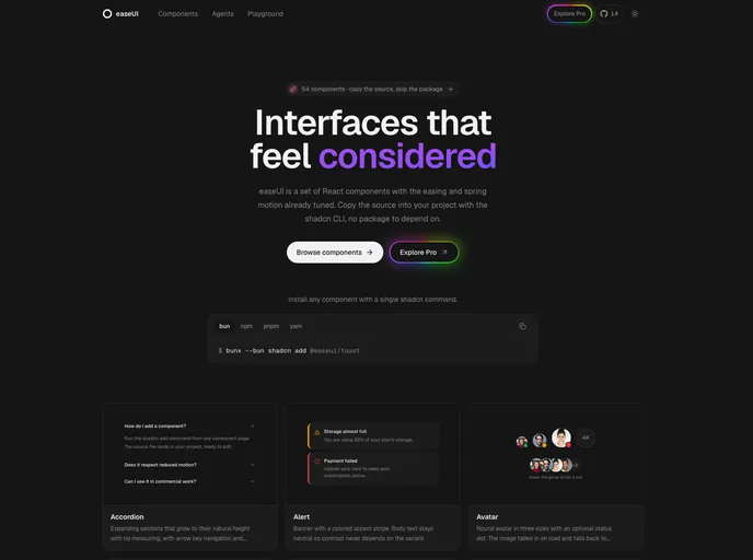
easeUI
Open-source React components with natural motion, installable as source.
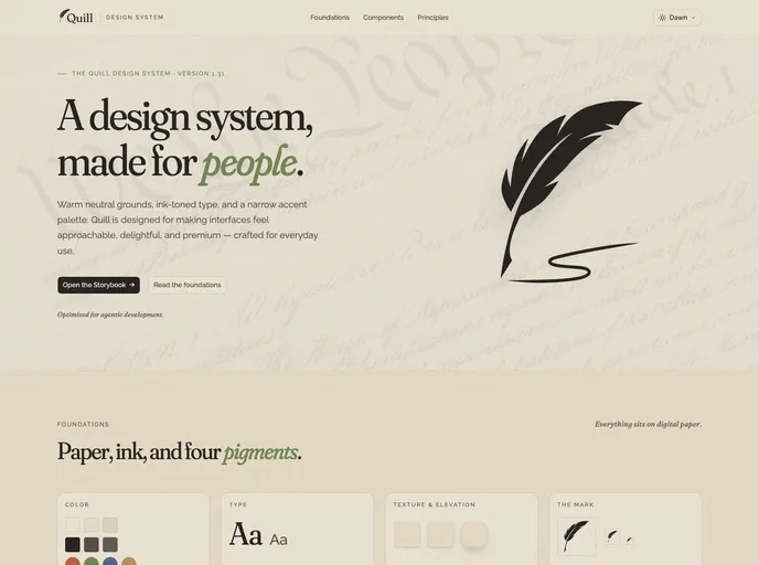

Quill
An editorial design system for digital products — warm neutral grounds, ink-toned type, five themes and four accents, 51 blocks, WCAG 2.1 AA, and agent-ready docs (llms.txt, usage guides, Claude Code rules).
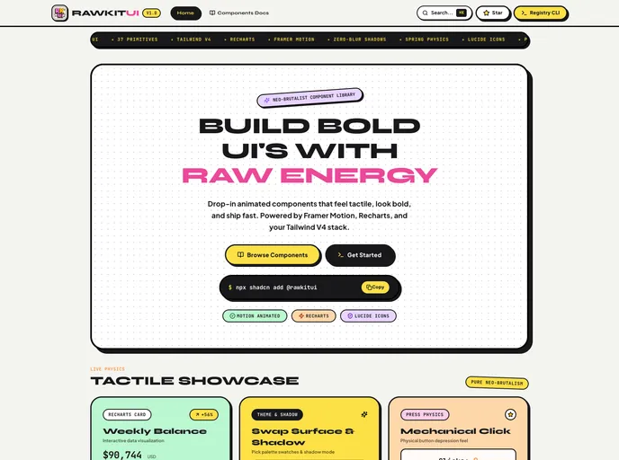

RawkitUI
Pop-Brutalist UI primitives for React: 30 components with hard shadows, high-contrast borders, motion spring physics, and Lucide icons. MIT.
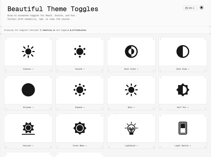

Toggles
Animated dark/light mode toggles
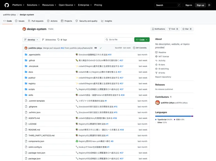

Yukihi
An accessible React design system with scoped themes, reusable application patterns, and character icons, built for Tailwind CSS v4.
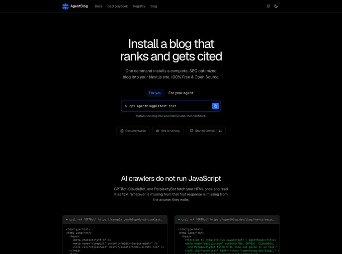

Agentblog
A complete blog for Next.js, installed like a component. Built to be read and cited by AI search engines.
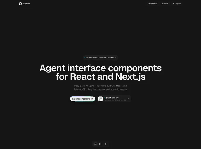

Agentui
Open-source React components for AI agent conversations, reasoning, tools, approvals, and streamed responses.
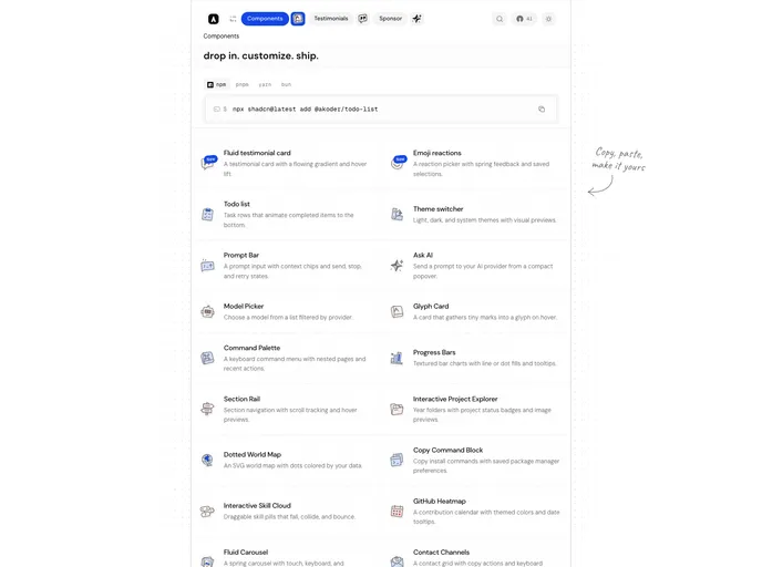

Akoder
Motion-rich React components and data visualizations — dotted world maps, GitHub activity maps, sliders, carousels, and terminal-style blocks built on Tailwind CSS v4 and Radix UI.
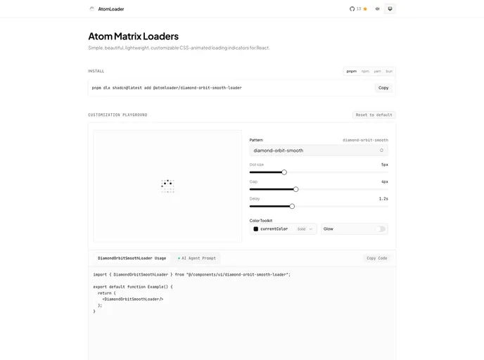
AtomLoader
Lightweight, customizable CSS-animated atoms loaders for React.
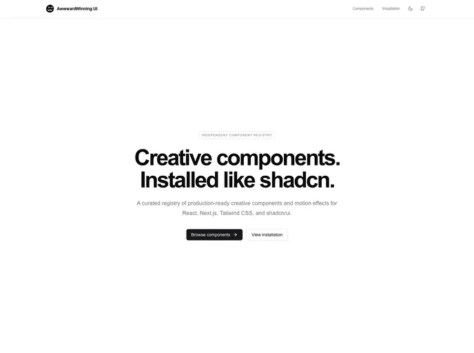

Awwwardedui
A curated registry of production-ready creative components and motion effects for React.
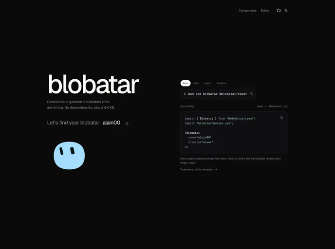

blobatar
Deterministic geometric avatars generated from any string — an Avatar that falls back to a blobatar when a user has no picture.
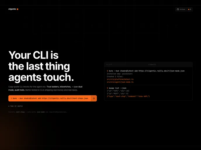

Cligentic
Copy-paste TypeScript primitives for agent-first CLIs: trust ladders, killswitches, JSON mode, audit logs, and cross-platform utilities.
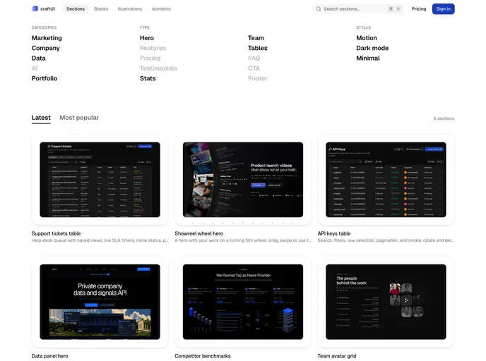
craftUI Pro
Animated, interaction-first components for React: 70+ loaders, interactive SVG icons, plus blocks, sections and UI primitives. Built with Tailwind CSS v4 and Motion, with every animation hand-tuned rather than generated.
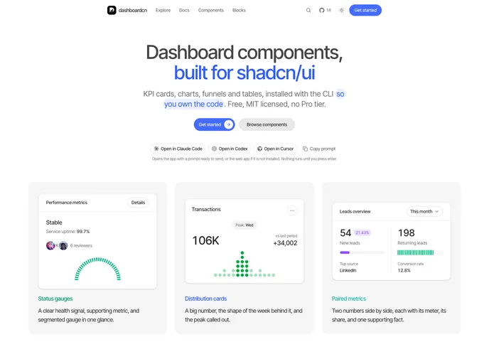

dashboardcn
Dashboard and analytics components for shadcn/ui. KPI cards, charts, funnels, ranked lists, heatmaps, data tables, and the cards that combine them. Free and MIT licensed.
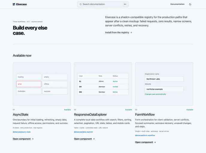

Elsecase
Production React workflows for loading, empty, error, responsive data, form validation, retry, and recovery.
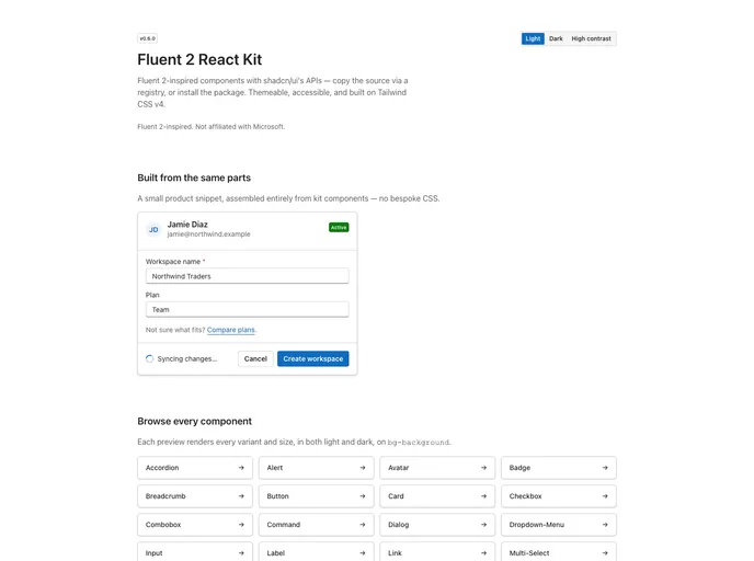
Fluent 2 React Kit
Fluent 2-inspired React components with shadcn-style APIs. Design tokens with light, dark, and high-contrast themes, Base UI primitives, Tailwind CSS v4. Independent open-source project, not affiliated with Microsoft.
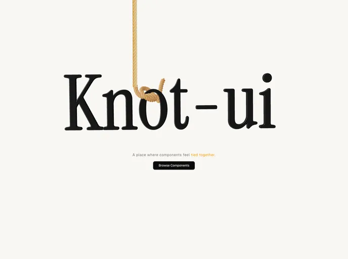

knot-ui
A registry of animated, cinematic React components and UI blocks for shadcn — buttons, cards, folders, navbars and more, built with Tailwind CSS v4 and Motion.
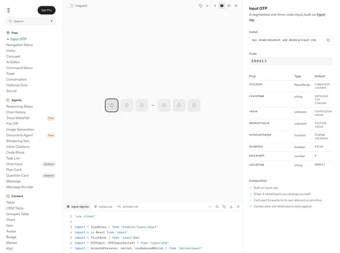

Kobra
Polished components for teams building exceptional products and experiences.
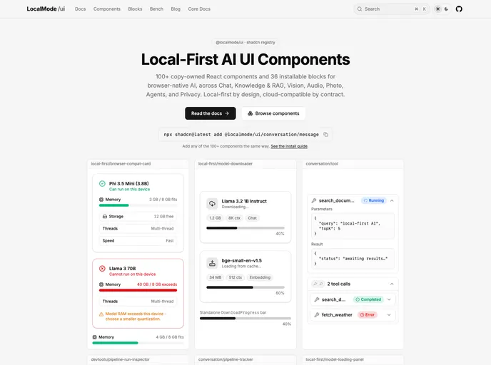

LocalMode UI
Local-first, offline AI UI primitives + blocks - run ML models (chat, RAG, vision, audio) entirely in the browser. No servers, no API keys.
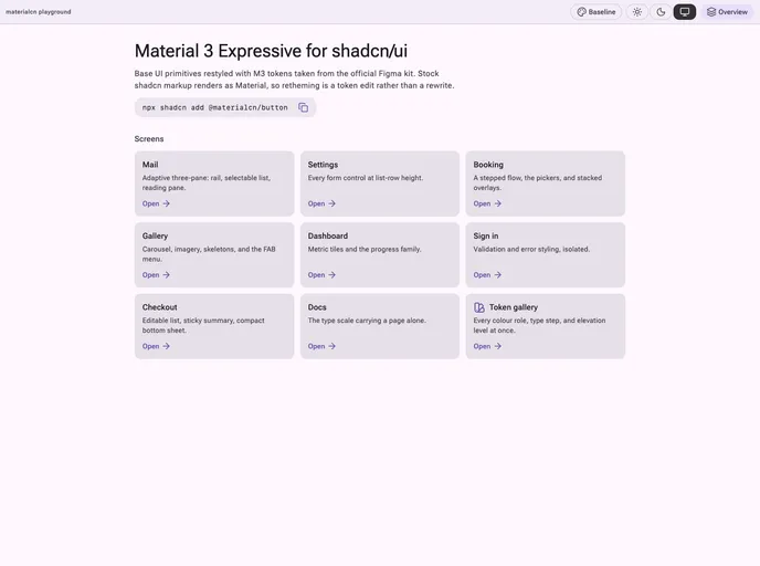

Materialcn
Material 3 Expressive for shadcn/ui. Base UI primitives restyled with M3 tokens extracted from the official Figma kit, so stock shadcn markup renders as Material — retheme an existing project with a single item.
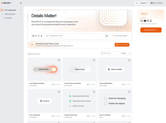

MicroKit UI
Copy-paste microinteractions for React: animated buttons, hover effects, tabs and inputs. Each one installs as a single self-contained TypeScript and Tailwind file. MIT licensed.
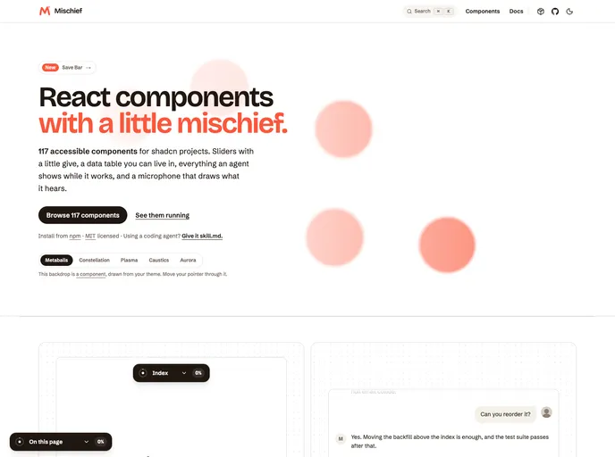

Mischief UI
A playful, high-utility shadcn registry: PDF, DOCX and JSON viewers, redaction and bounding boxes, agent chat with tool calls, data tables, command palettes, OTP inputs, and shader fields.
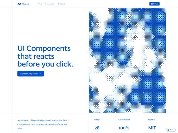

Morphiq
Interfaces that move. Refractive glass, motion and depth for React — a GPU-accelerated prism lens and a cursor-reactive ASCII field, with every setting exposed as a prop.
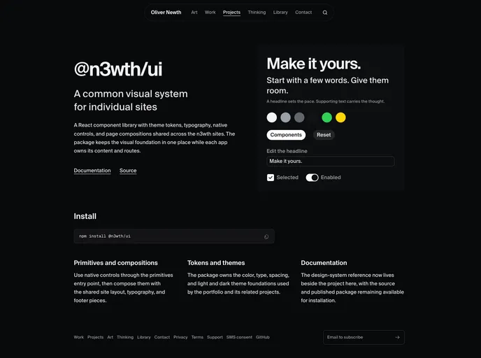

N3wth
Flat, minimal, iOS-inspired design system. 49 components, hooks, and blocks installable with the shadcn CLI.
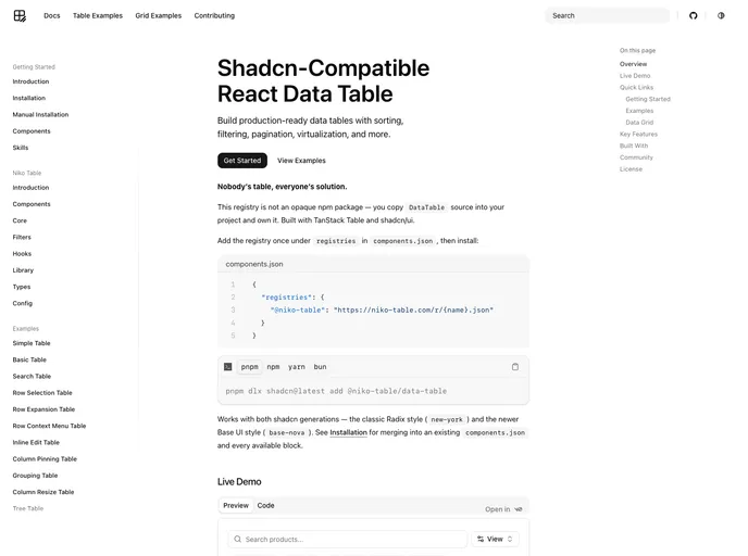

Niko Table
Composable, open-code data tables and an editable data grid built on TanStack Table: faceted and advanced filters, sorting, row and column drag-and-drop, virtualization, column resizing, and server-side pagination, installed a la carte.
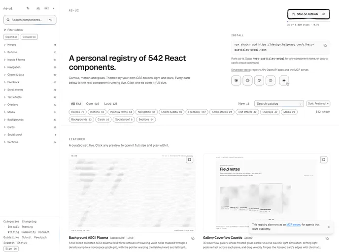

ns-ui
389 animated React components for Tailwind v4 and React 19, with a CLI and an MCP server.
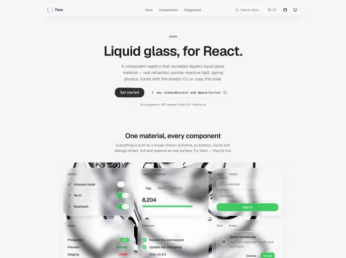
Pane
Liquid glass components for React.
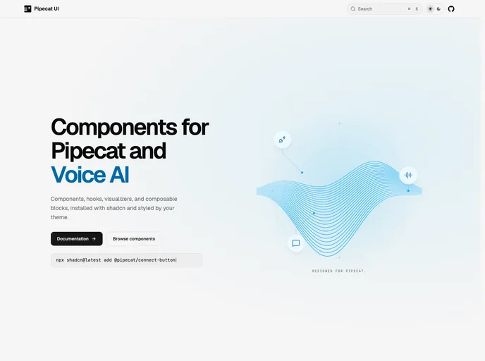

Pipecat UI
Components, hooks, visualizers, and composable blocks for Pipecat and voice AI.
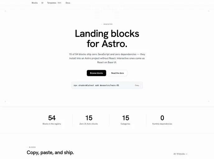

Saastro Blocks
Landing page blocks for Astro. Zero-JS .astro blocks with no dependencies — installable in an Astro project without React — plus interactive React blocks on Base UI.
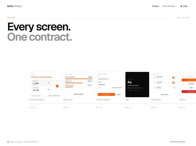

sc1m
Multi-brand design system components built on Base UI and Tailwind CSS v4 — semantic tokens, swappable brand layers, dark mode out of the box.
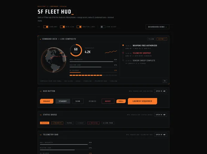
SF FLEET HUD
A dark sci-fi fleet-ops UI kit. Restyled primitives plus HUD widgets: radar, gauges, telemetry bars, an interactive dot globe and dependency-free charts. Dark-only, radius 0.
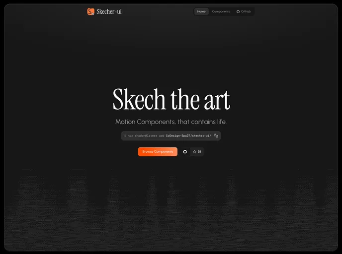

Skecher UI
React animated components that contains life, built with Tailwind CSS v4 and motion.
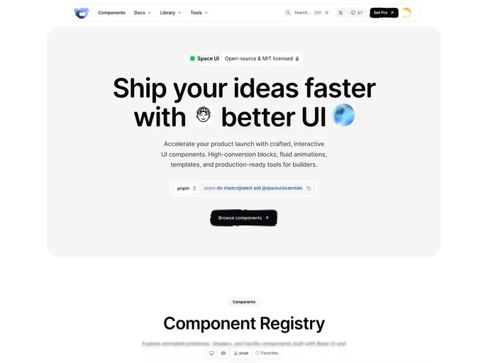

Space UI
An open-source design library built for humans and AI to create expressive, polished, and high-quality interfaces, helping you build better products, faster
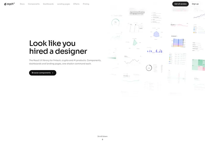

Ssych
Dark, data-dense React components for high-stakes decision surfaces: trading books, screeners, clinical dashboards. Hand-drawn SVG charts, no chart runtime.
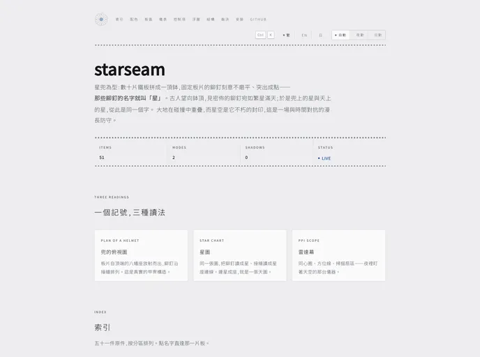
starseam
A registry modelled on the star-riveted helmet: plates on a lacquer ground, rivets only on real seams, console/report as two materials, ink-only code highlighting, and first-class CJK typography.
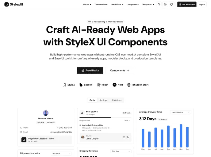

Stylexui
High-performance StyleX & Base UI toolkit for modern dashboards. Modular blocks and production templates, built with zero runtime CSS overhead.
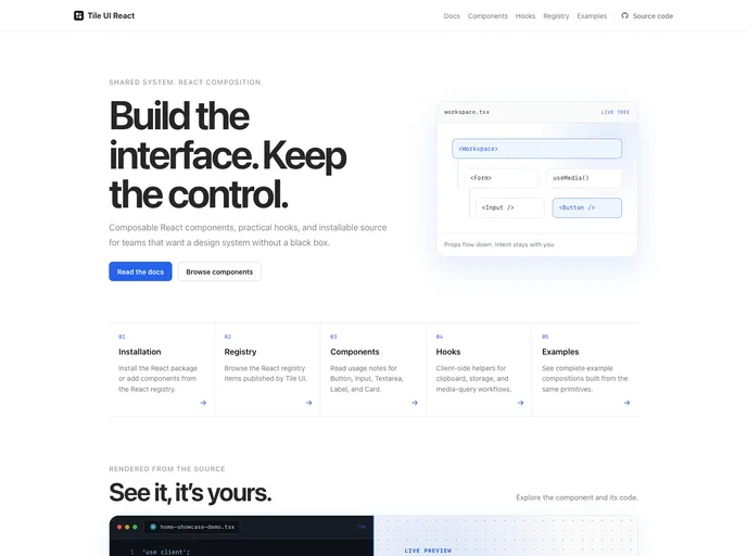

Tile UI
A lightweight React component library built around a shared SCSS design system and distributed as editable source through the shadcn CLI.

UI Shrushank
Free React and Tailwind components with Framer Motion interaction states and Tailwind CSS styling: buttons, badge, text field, toggle switch and breadcrumbs.


Uniquel
Minimalist components for React / Next.js: animated backgrounds, galleries, badges, and conversion blocks. Built with Tailwind CSS and Motion, installable with the shadcn CLI.
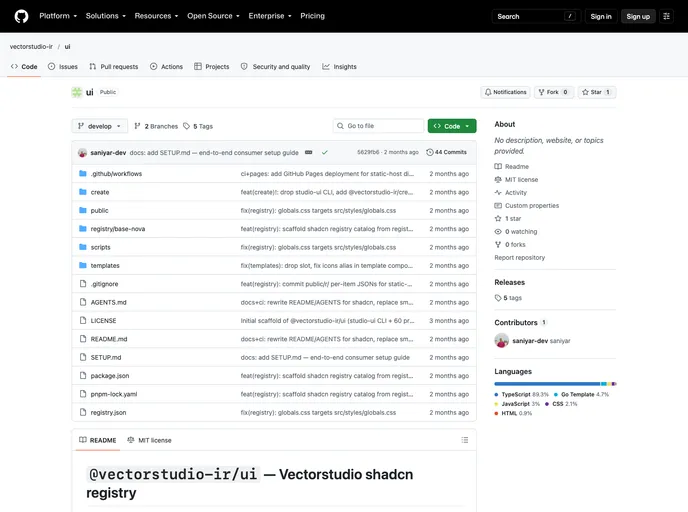

Vectorstudio Ir
Vectorstudio UI design system: 60 shadcn-compatible primitives on @base-ui/react, RTL/Persian first, 578-icon pixel-icon library, Tailwind v4 + orange brand palette.
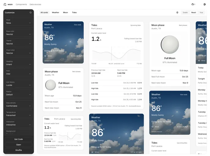

wxcn
Theme-aware React weather, tide, and moon forecast components built with shadcn/ui.

designali
Where thoughtful design meets production-ready code. I design and build digital experiences that look great, feel intuitive, and work beautifully.
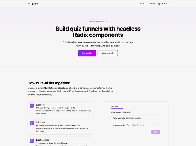

quiz-ui
Headless, Radix-based components for building quiz funnels — shadcn-style distribution, style entirely via className.
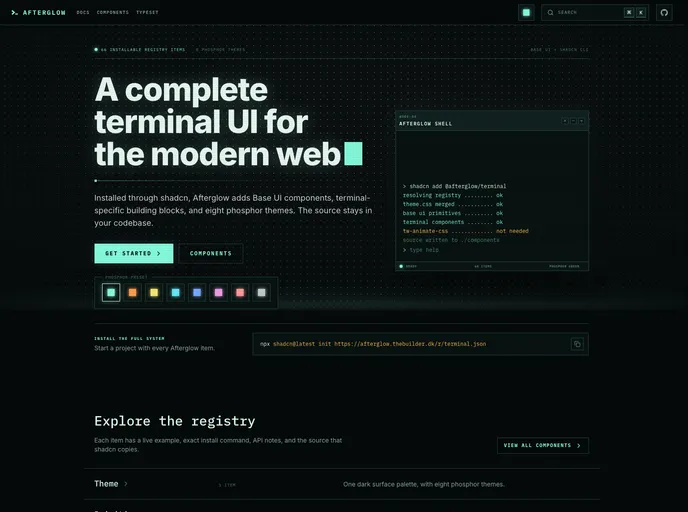

Afterglow
A complete terminal UI system for shadcn with Base UI components, terminal-specific building blocks, and eight phosphor color themes.
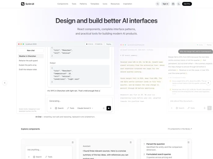

Scrimui
Free, open-source React components and patterns for AI interfaces, including prompts, streaming messages, reasoning, tool calls, citations, agents, memory, voice, and safety.

onchain-ui
Web3 components for shadcn apps. Wallet identity, token logos, balances, and market UI primitives for EVM products.
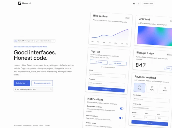

Honestui
React UI components, animated interactions, shaders, and charts distributed as editable source.
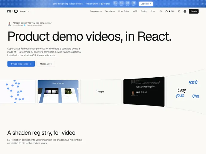

snapcn
Remotion video components for React: animation and motion graphics for product demo videos. Text reveals, karaoke captions, device mockups, logo stings and full scenes, owned as source.
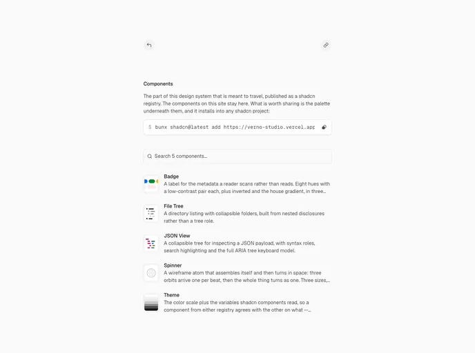

Vernostudio
The full OKLCH scale plus every variable shadcn components read, so anything you install lands on the same tokens instead of its own colors.
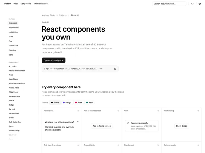

Blode
An open-source registry of accessible React components built on Base UI and Tailwind CSS v4. Install with one command, then own the source.
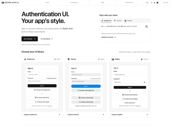

Better Auth UI
Drop-in authentication components for Better Auth applications.
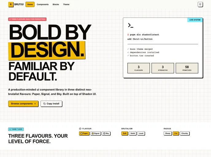

BRUT/UI
Production-minded neo-brutalist shadcn components with three configurable flavours, strengths, and radius modes.
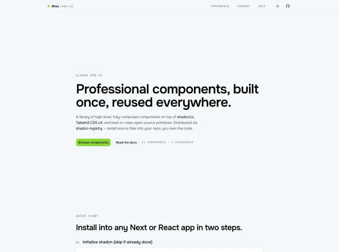

ilinxa pro-ui
High-level composed components for shadcn/ui — kanban, gantt, calendar, media editors, story viewers, flow canvas, forms, and more, each with optional demo fixtures.
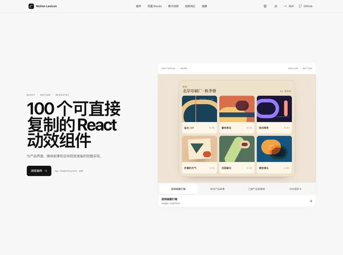

Motion Lexicon
Copy-ready React page blocks and motion components with bilingual previews, reduced-motion paths, and shadcn Registry delivery.
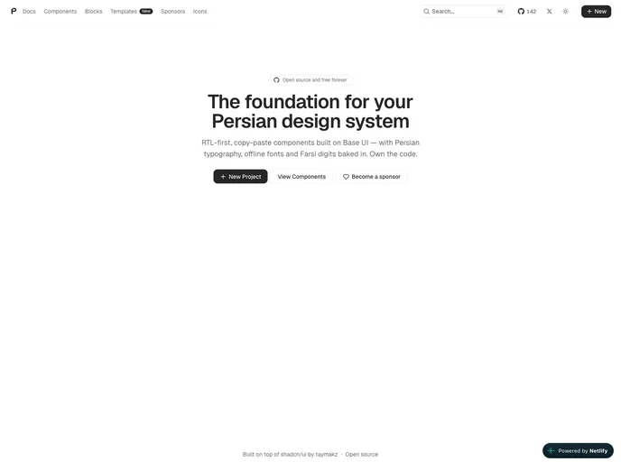

PersianLabs/ui
RTL-first, copy-paste React components and UI blocks for Persian interfaces, built on Base UI and Tailwind CSS. Includes unique Persian-focused patterns with full LTR support.
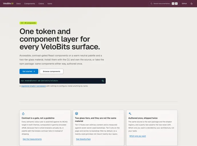

VeloBits UI
An open source collection of accessible, contrast-gated React components on a warm neutral palette and a two-tier glass material — the VeloBits design system, authored once and shipped both as an npm package and as this registry.
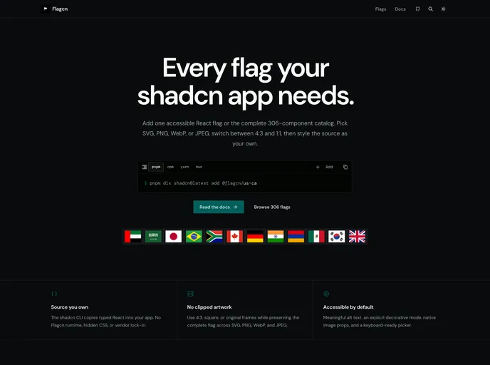

Flagcn
Accessible, source-owned flag components for shadcn/ui with 306 flags in SVG, PNG, WebP, and JPEG plus 4:3, 1:1, and original ratios.
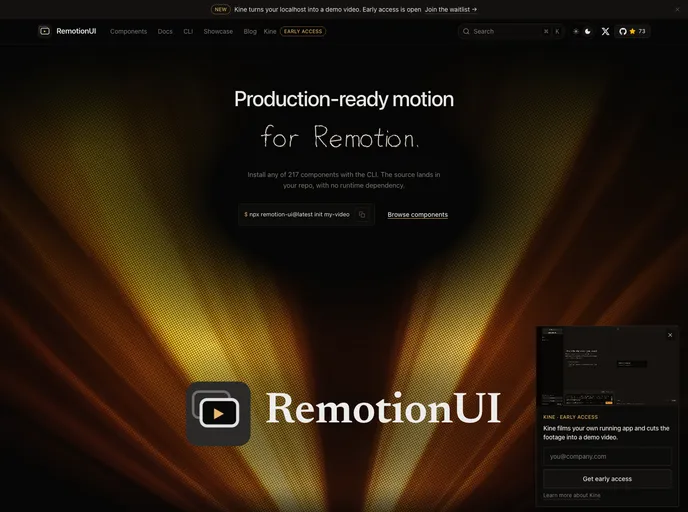

RemotionUI
Copy-paste motion components for Remotion video projects - 200 captions, charts, transitions, backgrounds, and full compositions.
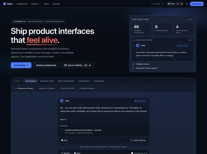

Motiq
Production-ready animated React and Next.js components — accessible, reduced-motion-safe and RSC-safe — installable as editable source with the shadcn CLI. Free and open source.


Initium
Conversion-focused marketing blocks and landing page sections for shadcn/ui, with a visual style editor, agent skills, and the first block of every category free to install.
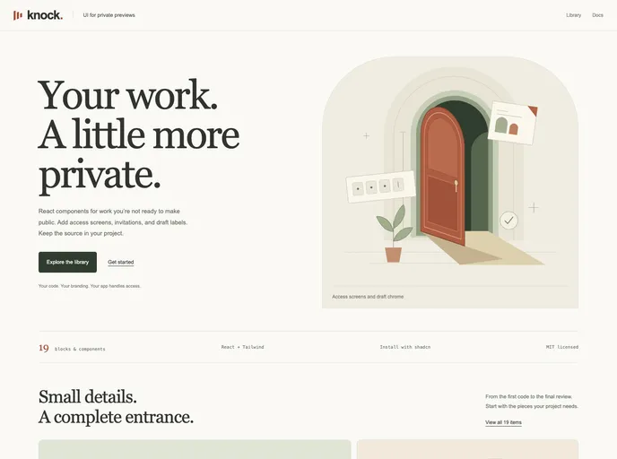

Knock Codes
Copy-paste, session-gated access blocks for React — PIN/Knock Code unlock screens, protected routes/layouts/modals, a headless useKnockCodes hook, and full-page templates.
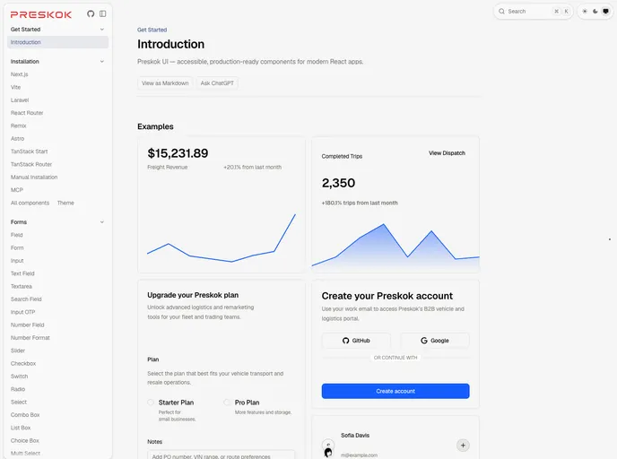

Preskok
Accessible, production-ready React components built with React Aria Components and Tailwind CSS.
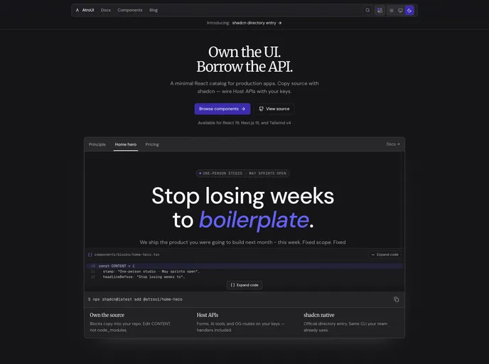

AtroUI
Dark-first React / Next.js components and marketing blocks. Install with the shadcn CLI and own the source.
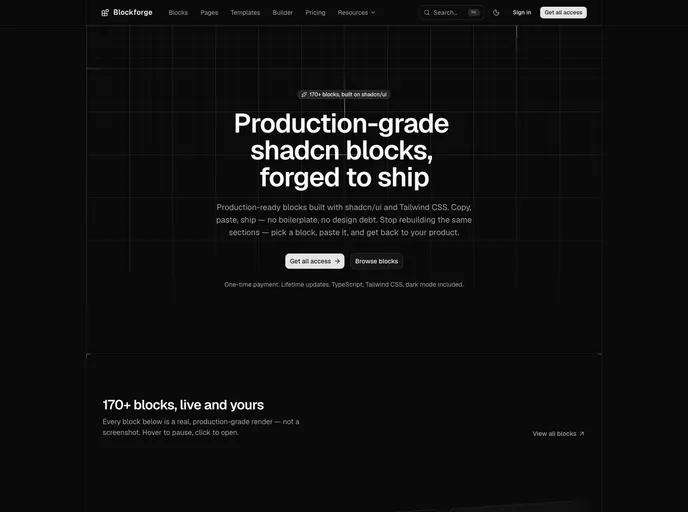

Blockforge
170+ production-grade shadcn/ui blocks, forged to ship. Full source in TypeScript + Tailwind CSS, plus a page builder and starter pages. Copy, paste, ship.
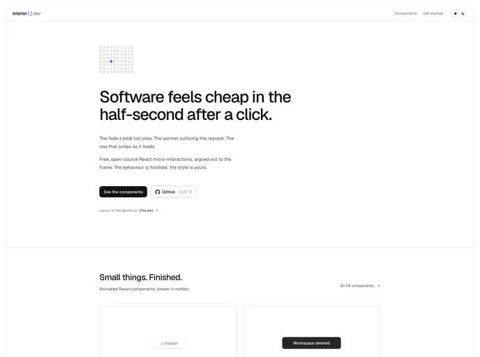
Interior
Copy-paste React micro-interactions: a headless hook plus a styled example in one self-contained file, with motion as the only dependency.
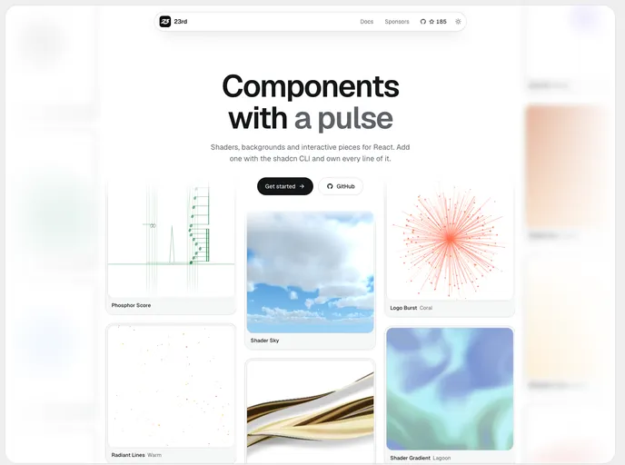

23rd
Opinionated components for shippers.
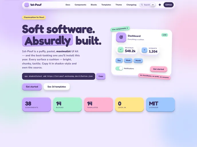

1st-Pouf
Puffy, pastel claymorphism components and app blocks for React, built with Tailwind CSS v4 and Radix UI.
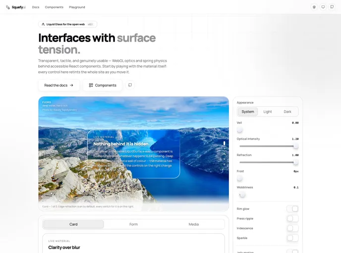
liquefy-ui
Liquid Glass components for React: WebGL edge refraction and pointer-driven springs over accessible Base UI primitives. TypeScript, RSC-ready, with an MCP server.
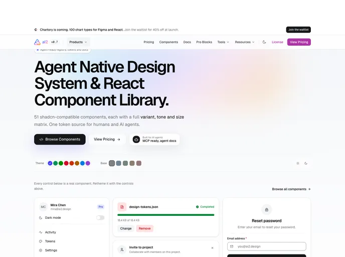

ai2
Agent-native design system for the shadcn CLI: 51 base components with a full variant, tone and size matrix on an OKLCH token layer, plus 307 styled variations. MIT.
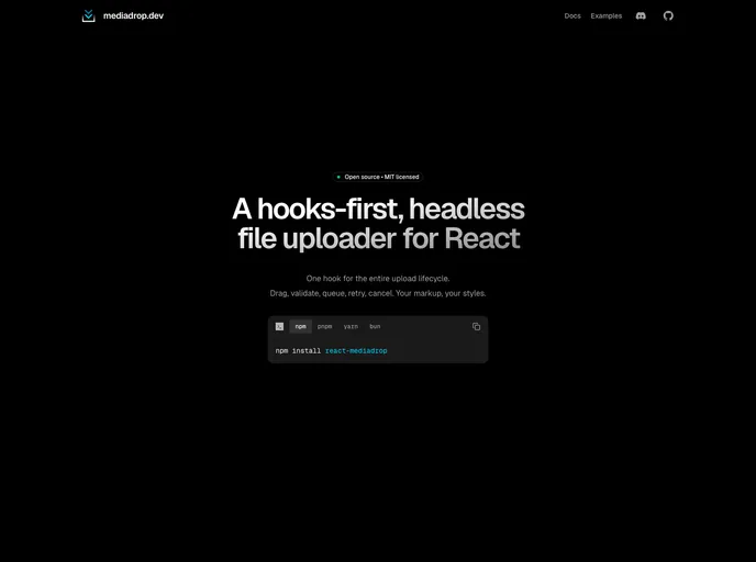

Mediadrop
Drag-and-drop file upload blocks for React built on react-mediadrop — dropzone, avatar uploader, multi-file upload form, and direct-to-S3 upload.
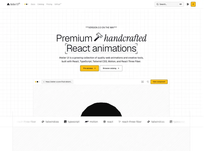

Atelier
A WebGL and Motion system for React that runs many effects on one shared canvas. Shader, cursor, scroll and text effects, 3D galleries, plus page transitions for Next.js. Built with Three.js, React Three Fiber, Motion, and Lenis smooth scroll.
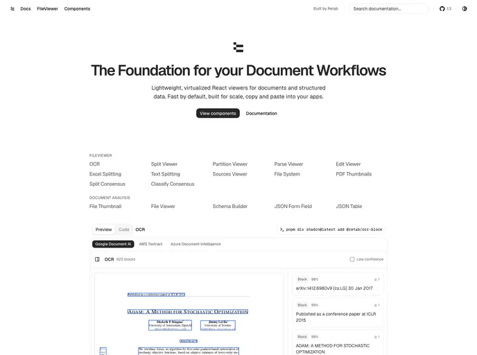

Retab
Document-processing UI components for Retab — file, OCR, and data viewers, schema builders, dropzones, and extraction blocks, built on shadcn/ui.
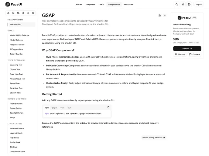

Paceui Gsap
Animated GSAP components crafted for smooth interaction and rich detail.
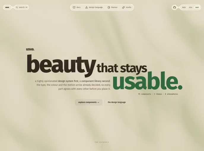

Usva
A React design language in three themes, where kajo is atmospheric and dark, sisu is dense and quick, and savi is the light ground. One token vocabulary underneath, including WebGL atmospheres that honour reduced-motion. Every component installs from npm or copies in from this registry.
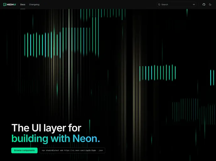

Neon UI
Production-ready components for agent platforms built on Neon. Database branching, connection strings, usage metering and project management UI, built with Base UI and Tailwind v4.
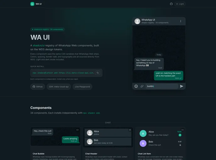

WA UI
Production-ready WhatsApp Web UI components built on WDS design tokens with Tailwind CSS v4 and @base-ui/react.
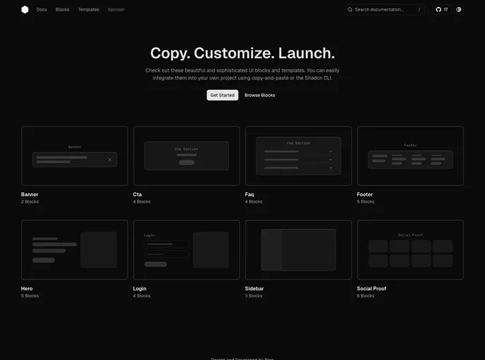
Hex UI
A shadcn/ui registry of high-quality React blocks and templates.
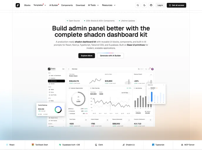

Shadcn Dashboard
Shadcn Dashboard is a collection of modern, production-ready dashboard layouts, components, and UI patterns built on top of shadcn/ui and Tailwind CSS. It’s designed to help developers build clean, scalable, and data-driven dashboards faster—without compromising on performance, accessibility, or customization.
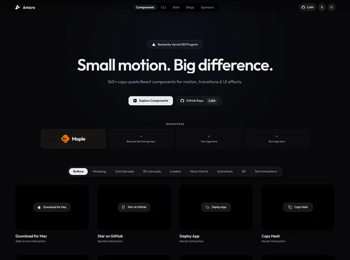

Amicro
Open-source React micro-interactions and UI component registry powered by Motion.

Motokoui
Components, application blocks, templates, and starter kits for modern React applications.
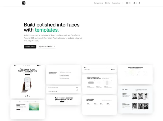

NavUI
shadcn-compatible components, blocks, and illustrations that adapt to your existing design configuration.
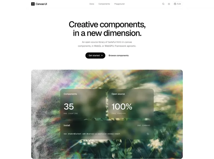

Canvas UI
Creative html-in-canvas components. React, Vue, Svelte, TS.
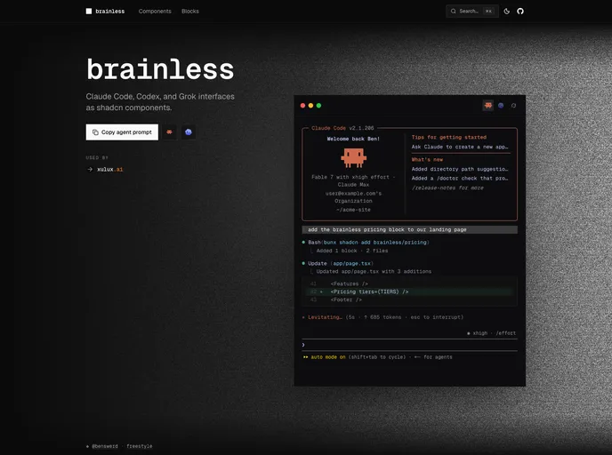

brainless
Claude Code, Codex, and Grok interfaces as shadcn components — accessible React terminal-agent UI for docs, demos, and product surfaces.
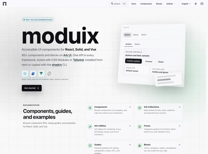

Moduix React
Ark-first React components, blocks, and themes with native CSS, available as a package or a shadcn-compatible copy-owned registry.
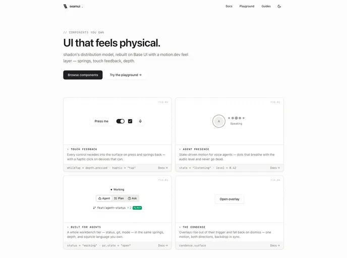

seamui
Own-your-code components rebuilt on Base UI with a motion.dev feel layer — springs, touch feedback, and depth — plus an agent-workbench tier (composer, voice, status, connectors) for AI-era interfaces.
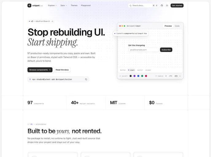

Cnippet UI
Cnippet UI is a production-ready, curated set of accessible and composable React components—built with Base UI and Tailwind CSS. Copy, paste, and ship stunning interfaces faster.
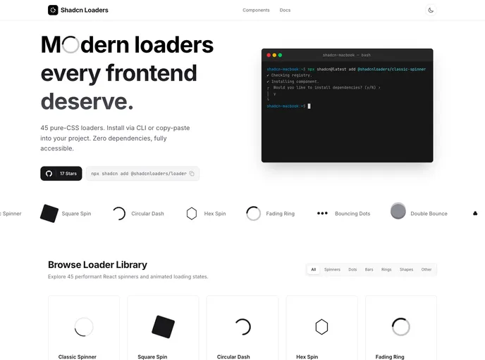

Shadcn Loaders
A public registry of shadcn-inspired animated loaders and loading states.
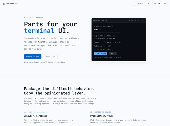

Tuiparts
OpenTUI recipes, made simple. Ready to use, customizable terminal UI recipes for Core, React, and Solid.
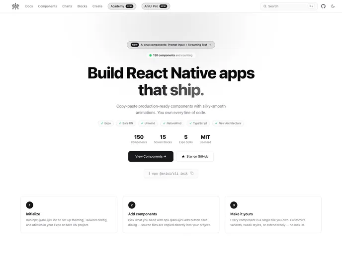

AniUI
Beautiful, accessible React Native components (Uniwind or NativeWind) — copy, paste, own the code. 93 components plus pre-built screen blocks, installable with the shadcn CLI.
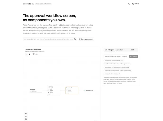

Approvals UI
Approval workflow components for React Flow: quorum gates, amount thresholds, a policy lint (segregation of duties, single approver on high value), and plain-language editing behind a human review gate.

VLLNT UI
VLLNT UI — agent-first React components for AI-native products, from UI primitives to finance and ops domains. Accessible, Radix + Tailwind, you own the code.

threecn
3D scenes for shadcn/ui. Theme-aware React Three Fiber components, one command away.

ericts/ui Registry
Motion-focused shadcn-compatible components, hooks, and blocks for polished React interfaces.
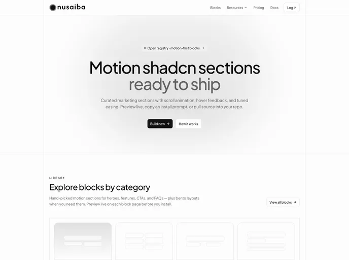

Nusaiba
Motion-first shadcn marketing blocks for landing pages — heroes, pricing, FAQs, footers, and more. Built on base-nova with intentional animation and CLI install.
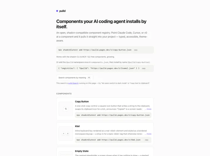

pulld
Typed, accessible, theme-aware React/Tailwind components installable by the shadcn CLI or your AI coding agent. Free atoms plus composed Pro blocks.
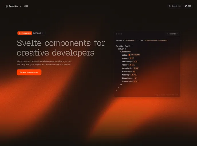

Svelte Bits
An open source collection of high quality, animated, interactive & fully customizable Svelte components for building stunning, memorable user interfaces.
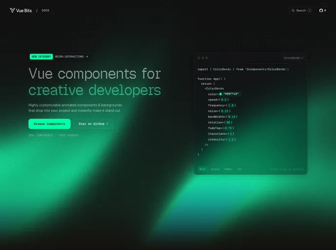

Vue Bits
An open source collection of high quality, animated, interactive & fully customizable Vue components for building stunning, memorable user interfaces.
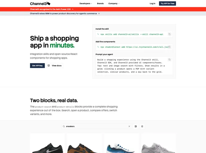

Channel3 UI
Open-source React components for building shopping experiences on the Channel3 product API: search, filters, product detail, offer comparison, and price history.
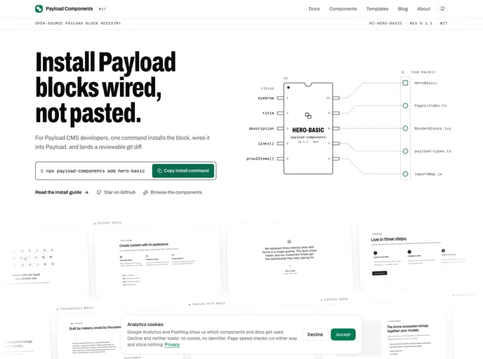

Payload Components
MIT registry of typed Payload CMS blocks for Payload v3 + Next.js. Each block installs as reviewable source; the companion CLI also wires collection config, RenderBlocks, types, and the admin import map.
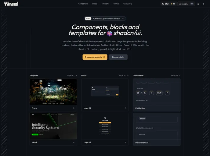

Hirael
The components shadcn/ui doesn't ship. A collection of high-utility React components built on top of shadcn/ui.


Paceui
Carefully built UI blocks for real apps and dashboards, designed to integrate smoothly from early ideas to production releases.
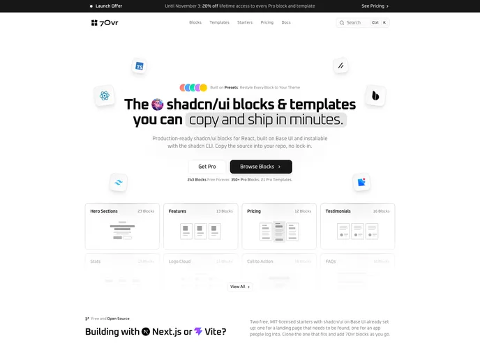

7ovr
A collection of shadcn/ui blocks and page templates for building modern, fast, and beautiful websites. Built on Base UI. Works with CLI and presets.
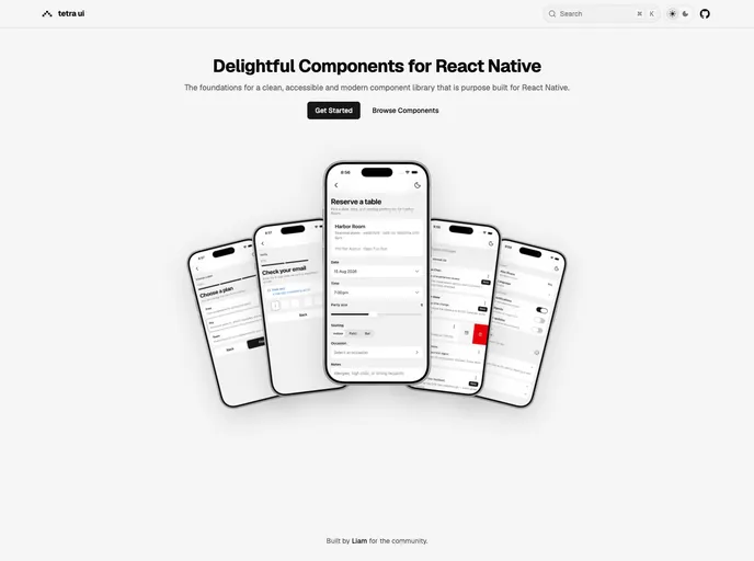

tetra-ui
Delightful components for a clean, accessible and modern component library for React Native.
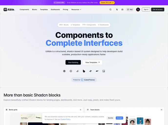

UIAble
Free, open-source UI component library built with Next.js, React 19, Tailwind CSS v4, and shadcn/ui — beautifully designed components you can copy, customize, and make your own.
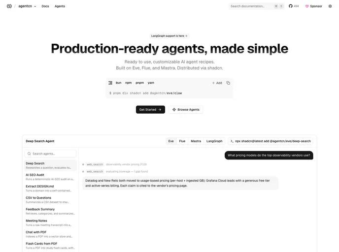

agentcn
Production-ready agents, made simple. Ready to use, customizable AI agent recipes. Built on Eve and Flue.
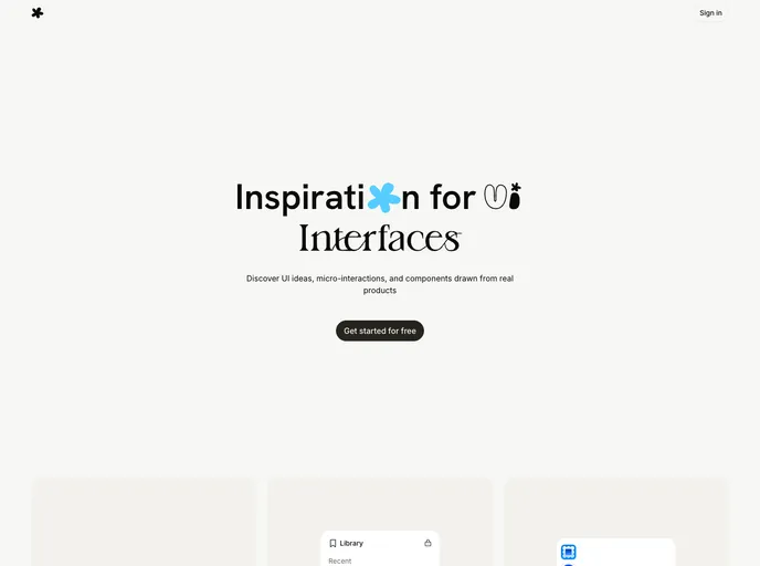

Uui
Inspiration for UI Interfaces. Discover UI ideas, micro-interactions, and components drawn from real products.
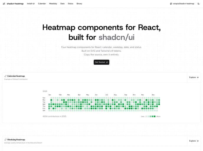

shadcn-heatmap
Beautiful, accessible heatmap components for React: GitHub-style calendar, weekday x hour matrix, date x hour, and status timeline. Built with shadcn/ui conventions.
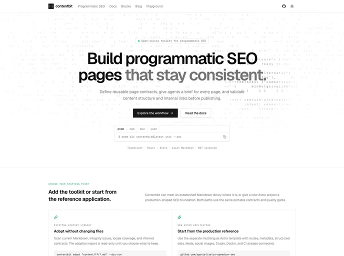

Contentbit
React components that render Content Blocks: plain Markdown with schema-validated directive blocks. Built for content written by humans, CMSes, and LLMs.
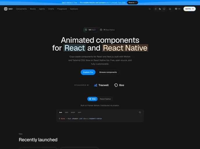

Beui
Bespoke motion components for React. Copy-paste components with shadcn-compatible installs, Tailwind CSS v4, and Motion.


Saaskit
10 essential shadcn/ui components for B2B SaaS: Pricing, Billing, Usage, and Onboarding. Minimalist Soft Brutalist design.
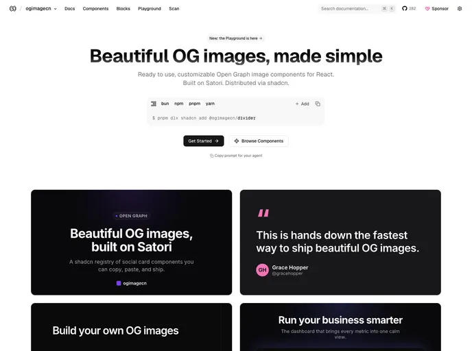

ogimagecn
Beautiful OG images, made simple. Ready to use, customizable Open Graph image components for React.
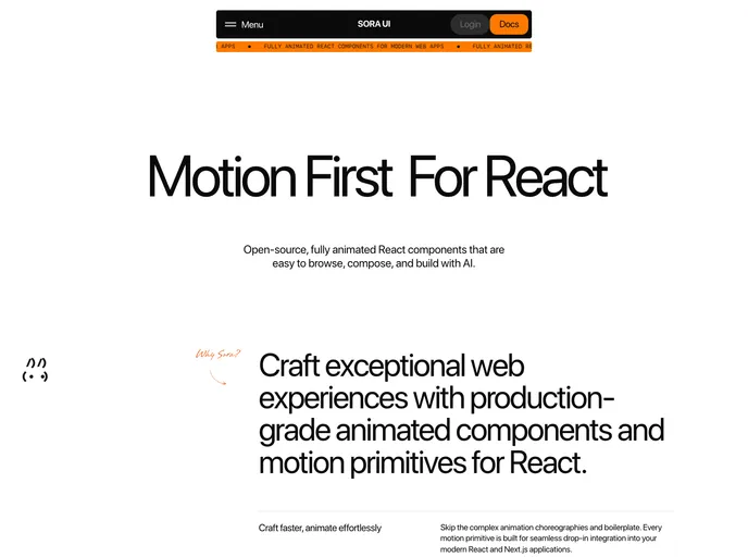

Soralabs
Motion-first React primitives and animated UI components for shadcn/ui. Copy, customize, and ship fluid interfaces.
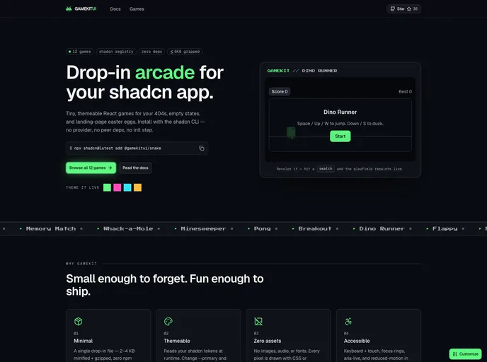

Gamekitui
Drop-in, themeable browser games for shadcn — Snake, 2048, Minesweeper, and more. Each is a single self-contained file with zero dependencies.
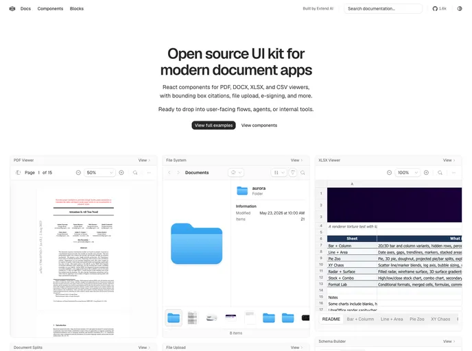

Extend
A collection of UI components for building document agents and human-in-the-loop review workflows.
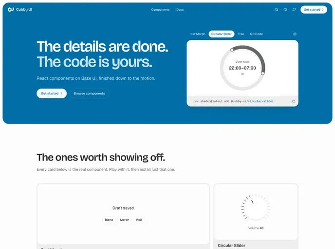

Cubby UI
An opinionated component library with curated styling and simplified patterns for common use cases. Built on Base UI and Tailwind CSS 4.
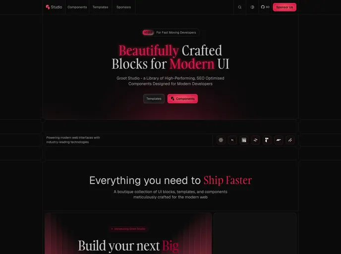

Groot Studio
A premium, open source component registry for SEO-friendly, high-performance React applications
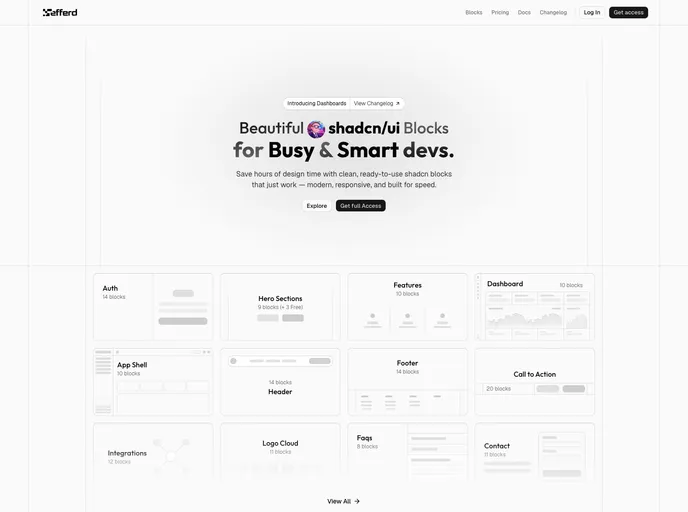

Efferd
Ready-to-use shadcn/ui blocks and components — modern, responsive sections installable via the @efferd registry.


Base UI
Unstyled, accessible React components for design systems and web apps. From the creators of Radix, Floating UI, and MUI — composable primitives with no bundled CSS.
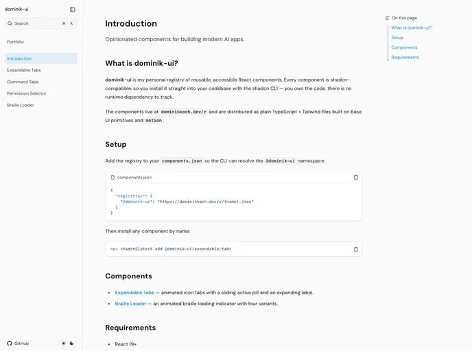

Dominik UI
Opinionated components and tools for building modern AI interfaces.


shadcn-map
Shadcn-map is a versatile map component designed specifically for shadcn/ui, utilizing the powerful Leaflet and React Leaflet libraries.

Square UI
Square UI is a comprehensive collection of beautifully crafted open-source layout user interfaces built specifically with shadcn/ui, designed for developers working with React and Next.js.


Systaliko UI
Systaliko UI is a versatile UI component library tailored for developers using shadcn/ui, providing a wide range of customizable components designed to enhance flexibility and scalability.


Emerald UI
Emerald UI is a collection of components designed for developers using Motion, GSAP, Tailwind CSS, and shadcn/ui.


FrameCN
FrameCN is a collection of beautiful video components designed specifically for React, aimed at developers looking to enhance their applications with visually appealing video functionalities.


nuqs
Nuqs is a collection of custom parsers, adapters, and utilities designed for type-safe URL state management, specifically tailored for developers utilizing shadcn/ui within their applications.


React Easy Modals
React Easy Modals is a robust modal component designed for developers working with React and Next.js, providing a simple and effective way to implement modals in applications.


Goose UI
Goose UI is an open-source component library designed to enhance the development experience for React and Next.js developers.


Clerk Shadcn UI
Clerk Shadcn UI is a powerful set of official components designed specifically for authentication and user management in React and Next.js applications.


Componentry
Componentry is a premium React UI component library designed for developers looking to create modern product UIs with beautiful and interactive elements.


Loading UI
Loading UI is a comprehensive collection of spinners, loaders, and loading animations designed specifically for modern web applications.
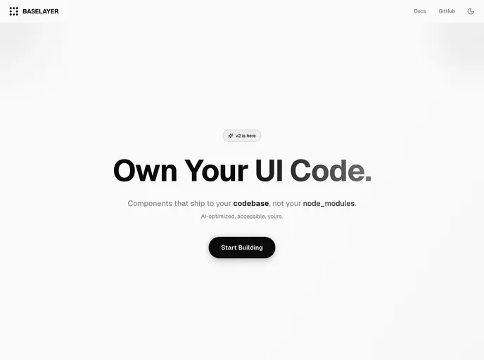

BaseLayer
BaseLayer is a versatile collection of components designed for developers working with shadcn/ui, leveraging the power of React Aria and Tailwind CSS.
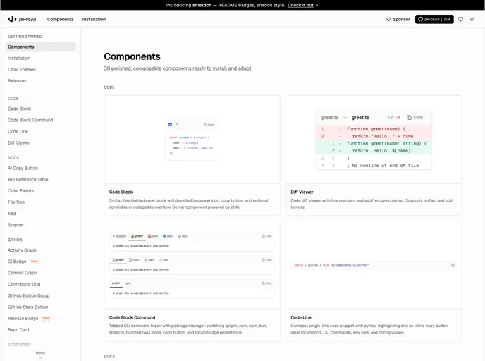

Jal-co UI
Jal-co UI is a component library designed specifically for developers working on shadcn/ui projects, offering a collection of GitHub-integrated and documentation-focused components.
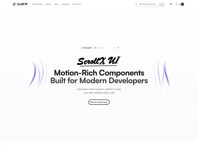

ScrollX UI
ScrollX UI is an open-source component library designed for developers utilizing React and shadcn/ui, providing animated and interactive elements for modern web interfaces.
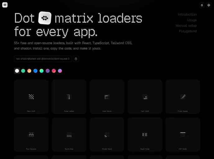

DotMatrix
DotMatrix is a collection of production-ready dot-matrix loading components designed specifically for React applications, catering to developers seeking to enhance user experiences with engaging animations.
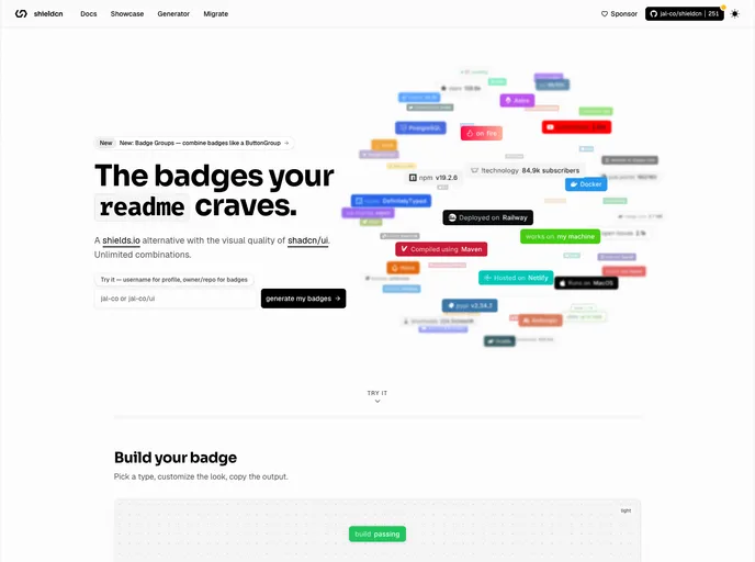

Shield CN
Shield CN is a service that provides beautiful README badges, serving as a compelling alternative to shields.io, specifically designed for developers using shadcn/ui.
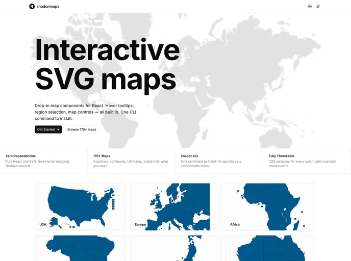

shadcnmaps
shadcnmaps is a collection of interactive map components designed specifically for shadcn/ui projects, utilizing pure SVG technology.
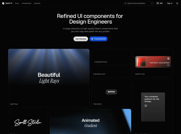

Spell UI
Spell UI is a collection of beautiful, sophisticated UI components tailored for modern React and Tailwind CSS applications, specifically designed for developers and design engineers.
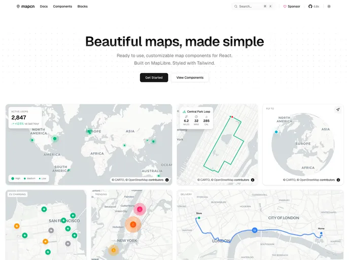

Mapcn
Mapcn is a collection of beautiful map components designed for developers who require dynamic mapping solutions in their applications.

Forgeui
A library of React components for smooth, fast front-end development.
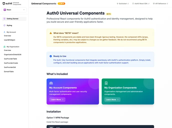

Auth0 Universal Components
Official Auth0 shadcn registry of pre-built React components for MFA, SSO, organization management, and identity workflows — install via @auth0 namespace or the ui.auth0.com registry.
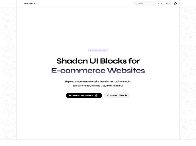

Commercn
Commercn is a collection of Shadcn UI blocks designed specifically for ecommerce websites, catering to developers looking to expedite their project builds.
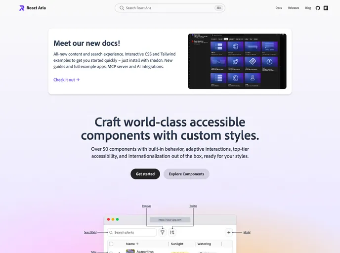

React Aria
Craft world-class accessible React components with custom styles — 50+ primitives with adaptive interactions, i18n, and shadcn-installable examples on the new docs.
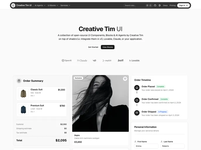
Creative Tim UI
Creative Tim UI is a collection of open-source UI components, blocks, and AI agents designed specifically for shadcn/ui projects.
AnimBits
50+ production-ready animation components for React, powered by Framer Motion. Copy-paste buttons, cards, text effects, loaders, icons, and page transitions into any shadcn/ui project with a single CLI command.


Iconiq
Iconiq is an open-source animated React icon component library tailored for developers using the shadcn/ui framework.

Shadcnspace
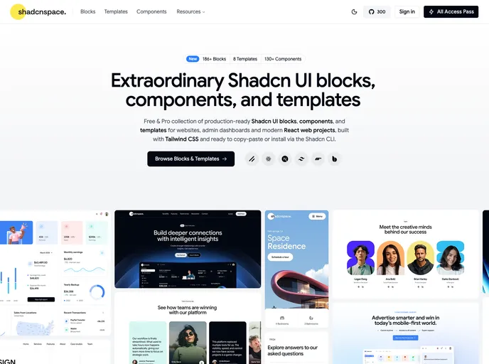
Open-source shadcn/ui blocks, components, and layouts built with React, Tailwind, and Base UI.
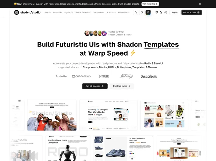

Shadcn Studio
Shadcn Studio is an open-source collection of shadcn/ui components, blocks, and templates designed for developers who are creating modern web applications using React and Next.js.


Wensity
Wensity is a collection of motion-rich React components designed specifically for building AI interfaces, SaaS blocks, and cinematic interactions.


BaseCN
BaseCN is a comprehensive collection of beautifully crafted shadcn/ui components designed specifically for developers working with Next.js and React.


COSS UI
COSS UI is a modern UI component library designed for developers and AI-assisted workflows, built on top of Base UI.


Termcn
Termcn is a collection of beautiful terminal UI components designed specifically for React, catering to developers who seek to create visually appealing and functional terminal interfaces.


Remocn
Remocn is a collection of production-ready animation components designed specifically for Remotion, making it perfect for developers looking to enhance their video projects with dynamic visual elements.


Delta Components
Delta Components is a high-performance component library designed for developers creating AI and media-rich interfaces, particularly those utilizing Next.js and React.


ElevenLabs UI
A collection of Open Source agent and audio components that you can customize and extend. Build voice-enabled AI applications with beautiful UI.
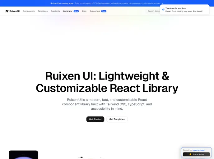

Ruixen UI
Ruixen UI is a lightweight and customizable React component library. Build beautiful interfaces with minimal overhead.


Shuip
Provides ready-to-use, business-focused components that help you ship faster. Build production-ready applications with pre-built UI components.


Billingsdk
Modern Billing & Monetization UI Components Library


AI Elements by Vercel
AI Elements is a component library and custom registry built on top of shadcn/ui and Vercels AI SDK to help you build AI-native applications faster. It provides pre-built components like conversations, messages and more.


Commerce UI
Collection of components to build e-commerce sites and commerce apps. Built for React, Next.js, Tailwind CSS and shadcn/ui.
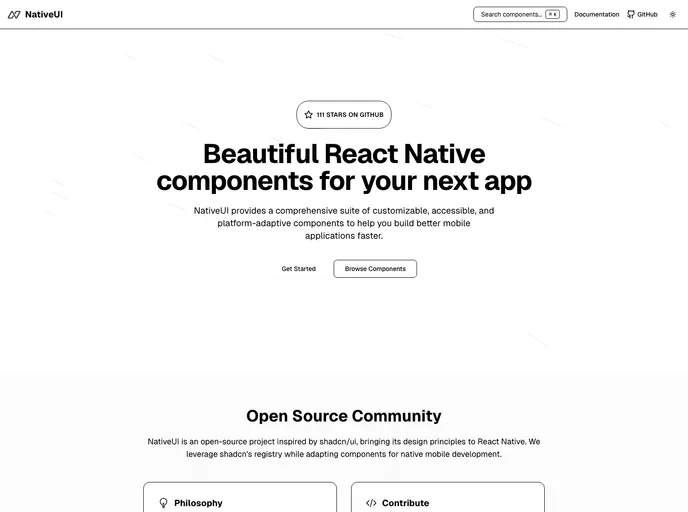

Native UI
A set of beautifully-designed, accessible React Native components distributed via the shadcn registry. Works with Expo and your favorite tools. Open Source.
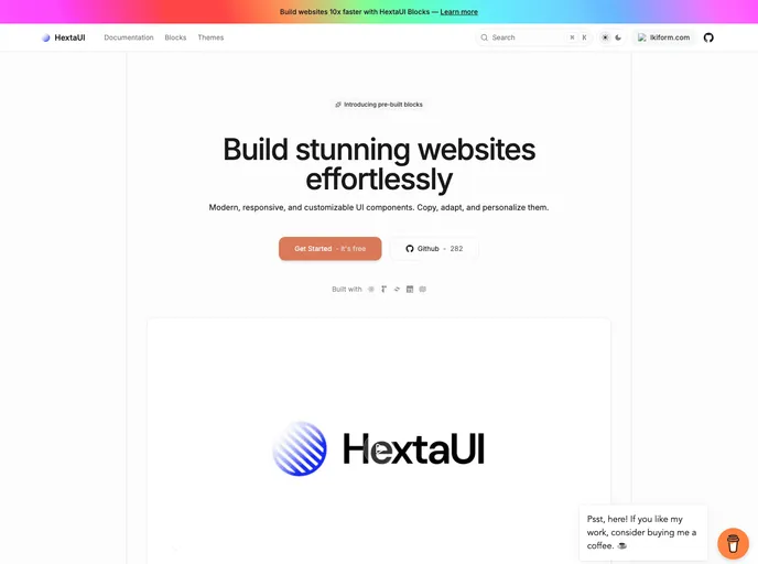

HextaUI
modern, responsive, and customizable ui components.
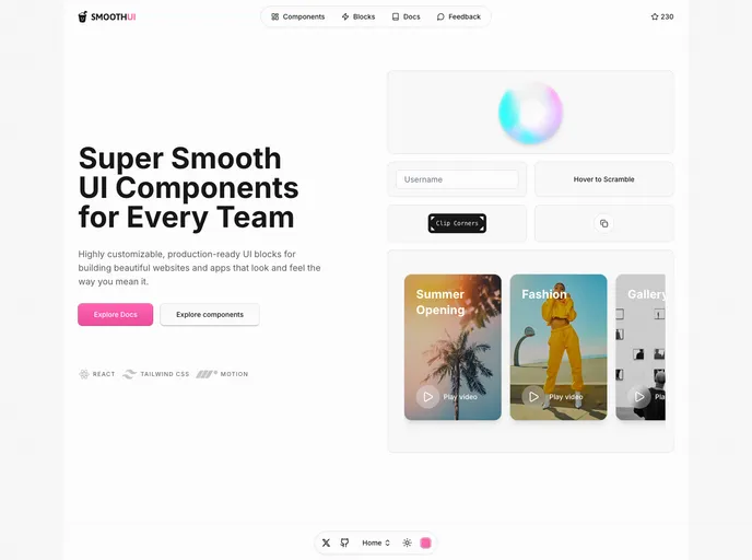

Smooth UI
SmoothUI is a collection of beautifully designed components with smooth animations built with React, Tailwind CSS, and Motion
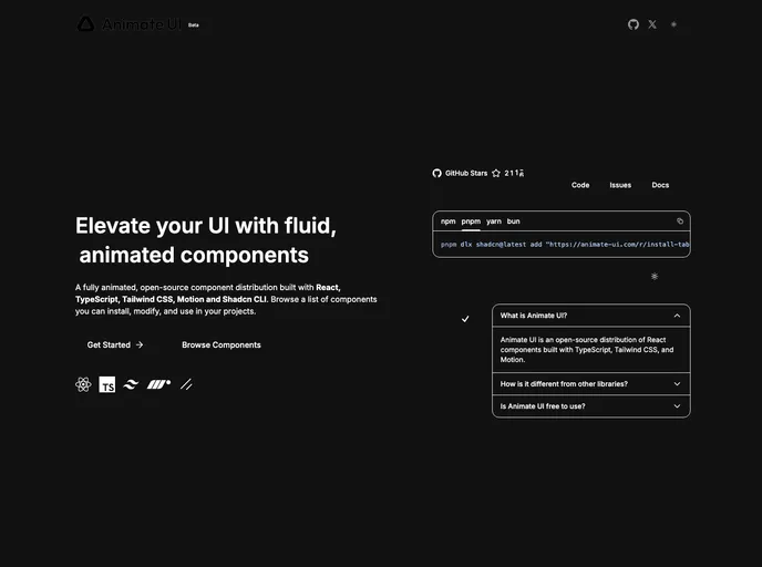

Animate UI
Fully animated, open-source component distribution built with React, TypeScript, Tailwind CSS, Motion, and Shadcn CLI. Browse a list of components you can install, modify, and use in your projects.
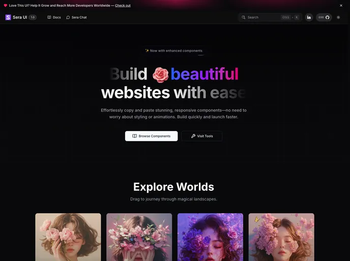

Sera UI
A helpful UI library for design engineers. Use cool animations and components with just a copy and paste. Free and open source


Intent UI
Intent UI is a chill set of React components, built on top of React Aria Components and Tailwind CSS. Easy to customize and just copy & paste into your React projects.


Blocks.so
An open-source library of UI blocks. Built with React, Tailwind and shadcn/ui


Tailark
Shadcn marketing blocks


NativeCN
A React Native UI component library inspired by shadcn/ui. Get beautiful, accessible UI components for your React Native apps by copying and pasting code.


8bitcn UI
A set of retro-designed, accessible components and a code distribution platform. Open Source. Open Code.


Zard UI
A collection of beautiful and accessible components for Angular based in Shadcn/ui and Ng-zorro. Fully open source and free


Indie UI
Collection of UI components and free shadcn form builder


Launch UI
Landing page kit built with React, Shadcn/ui and Tailwind that you can copy/paste into your project.


Prompt Kit
Core building blocks for AI apps. High-quality, accessible, and customizable components for AI interfaces.


Spectrum UI
Spectrum UI is a collection of re-usable components built using Aceternity UI Magic UI and ShadCN UI that you can copy and paste into your apps.


Assistant UI
Typescript/React Library for AI Chat


View Shadcn UI
View Shadcn UI 是一个基于 Tailwind CSS 构建的 Vue3 组件库。


Kokonut UI
Collection of components built for Next.js and React with Tailwind CSS and shadcn/ui


Solid UI
Beautifully designed components. Built with Kobalte & corvu. Styled with Tailwind CSS.


Shadcn Flutter
Shadcn/UI ported to Flutter (Unofficial)


UI Layouts
100+ Free beautifull interactive react/nextjs component based on tailwindcss, framer-motion, gsap etc


Simple AI
Components and blocks to easily build AI apps. A collection of ready-to-use UI components designed specifically for AI-powered applications.


Motion Primitives
UI kit to make beautiful, animated interfaces, faster. Customizable. Open Source.


Gluestack UI
React & React Native Components with Tailwind CSS. Universal components that work across web and mobile platforms.


RetroUI
A retro-styled UI library for modern web applications.


Inspira UI
Build beautiful website using Vue & Nuxt.


Eldora UI
Eldora UI is a collection of re-usable components that you can copy and paste into your web apps. It primarily features components, blocks, and templates.
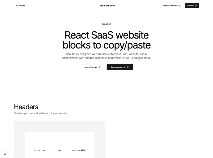

TWBlocks
Website blocks to copy/paste - based on shadcn & Radix using Tailwind and NextJS


Page UI
Landing page UI components for React & Next.js, built on top of TailwindCSS


Shadcn Vue
Vue port of shadcn-ui


Shadcn UI Expansions
More components built on top of shadcn-ui.


Neobrutalism Components
A collection of neobrutalism-styled Tailwind components.


Radix UI
Radix Primitives is an open-source UI component library for building high-quality, accessible design systems and web apps. Maintained by @workos.